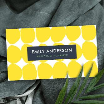
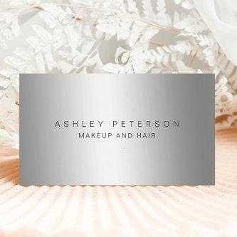
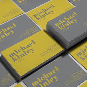
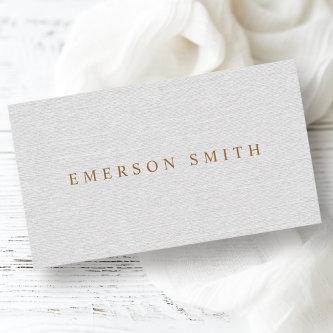
Fantastic Options for Gray Business Cards
We have plenty of great options for gray business cards. If you’re looking for the unique designs that will make you business stand out these cards are for you.
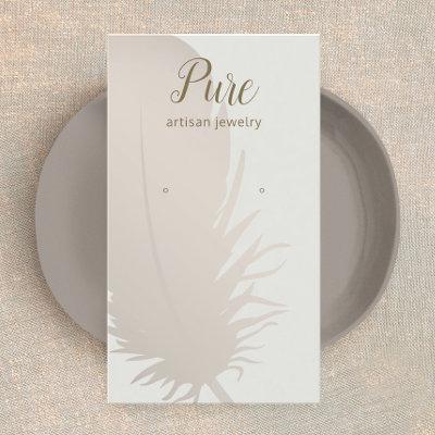
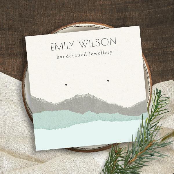 Pastel Aqua Kraft Mountain Wave Earring Display Square
If you need any further customisation please feel free to message me on
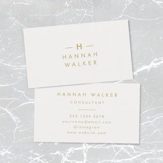
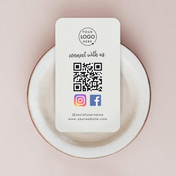 QR Scan to Connect | Instagram Facebook Gray
A simple bold custom gray business scan to connect with us on Instagram and Facebook QR code business cards in a modern minimalist style. The versatile template can easily be updated with your company logo, graphic or photo, QR code, custom text and social media icons (Facebook & Instagram). The icons can easily be replaced with your own to make a truly bespoke professional design for your own business! For example you could include other social media account such as Twitter, Linkedin, WhatsApp, YouTube and so much more! Need help? Feel free to contact me using the message button on the product page. I am happy to help with your personalization such as adding different icons.
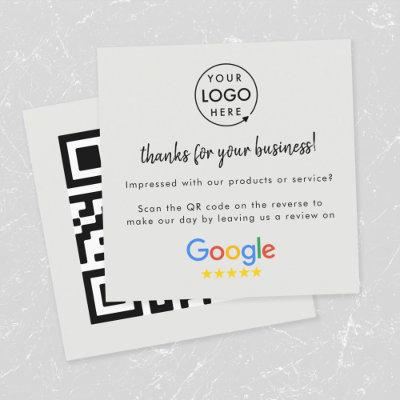
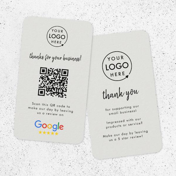 Google Reviews | Business Review Us Gray QR Code
A simple custom gray scan to leave a google review QR code business thank you cards in a modern minimalist style. The versatile template can easily be updated with your company logo, graphic or photo, QR code and custom text. The review site logo can easily be replaced with another (eg. Yelp, TripAdvisor, Facebook) to make a truly bespoke professional design to help you grow your business! I recommend you try ‘Gatherup Review URL Generator’ which is a free tool that allows you to create a website address that takes customers directly to the ‘write a review’ page for your business. You can then create a QR code online for free with the new direct URL for your business reviews! Need help? Feel free to contact me using the message button. I am happy to help with your personalization such as adding different icons, QR code generation and more!
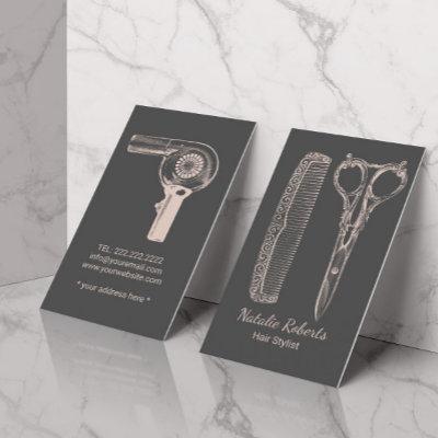
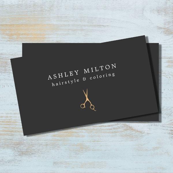 Minimal Gray Faux Gold Scissors Hair Stylist
Elegant customizable business card template with FAUX gold scissors icon and gray background. Minimalist design, perfect for beauty salon, hair stylist.
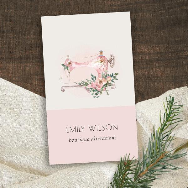 Elegant Blush Grey Sewing Machine Floral Tailor
If you need any further customisation please feel free to message me on
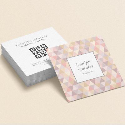
Simple custom corporate gray QR Code and company logo business card in a modern minimalist style. The template can easily be updated with your QR code, logo and contact information.
Related Designs
Here are related gray business cards. Find your business cards and create a buzz!
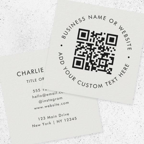 QR Code | Modern Professional Silver Gray Square
A simple custom gray QR code business card template in a modern minimalist style which can be easily updated with your QR code, business name or website and custom text, eg. scan me #QRcode
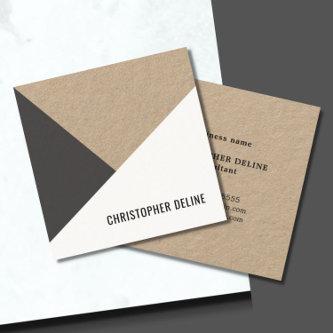
 MODERN ABSTRACT GEOMETRIC ART CERAMIC TEXTURE SQUARE
For any further customization or any other matching items, please feel free to contact me at
A simple and professional magnetic business card with your company logo and choice of website QR code. Minimalist and professional to represent your brand. Change the background and text color to reflect your branding.
 Modern MinimalHandwritten Script Dusty Rose Gray
Modern Minimalist Handwritten Script Business Card in Dusty Rose with Gray Text
Elegant, modern, square business cards with customizable logo on a dark gray background. It’s easy to upload your own logo to the template. The design is minimal with dark gray text against white on the back. Add your own name and contact information. Generic, professional business cards for any industry.
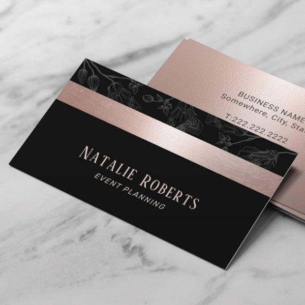 Rose Gold Stripe Dark Gray Floral Event Planning
Rose Gold Stripe Dark Gray Floral Event Planning Business Cards.

Alternative Designs
With so many great gray business cards to choose from it can be hard finding the right one. But it helps to know that Card Bee’s catalog of business cards has something for everyone. It only takes a moment to find what you are looking for. For example we offer many different gray business cards designs, but we also have plenty of related card designs to choose from and start growing your brand. Try one of these categories.
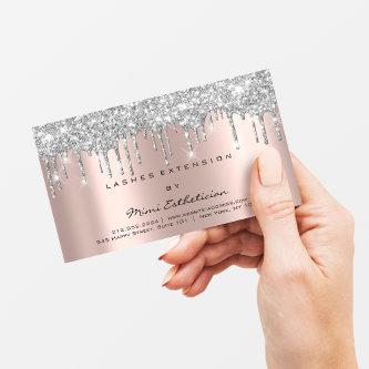
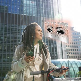
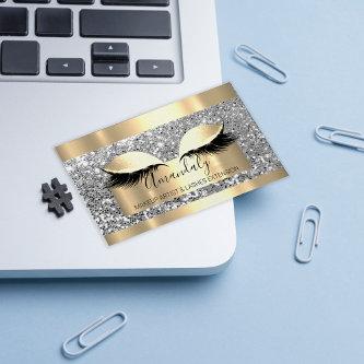
Are you a small business owner looking to stand out from the crowd? Look no further than our Makeup Artist Silver Gray Eyelash Hair Brows QR Code Logo Gray Business Card! Not only does this card feature a sleek and modern design, but the QR code allows potential clients to easily access your website or social media pages with just a simple scan. And let’s not forget about the eyebrow-raising (pun intended) feature – the silver-gray eyelash and hair design. Your clients will surely be impressed by your attention to detail and creativity. But wait, there’s more! This business card doubles as a mini makeover, thanks to the silver-gray eyelash and hair design. Hold the card up to your face, and voila – instant glam! Don’t believe us? Give it a try and watch as heads turn and jaws drop. This small but mighty business card is your secret weapon to take your makeup artist business to the next level. So what are you waiting for? Order your Makeup Artist Silver Gray Eyelash Hair Brows QR Code Logo Gray Business Card today and prepare to slay the competition! Have a Day, Nr1! FlorenceK
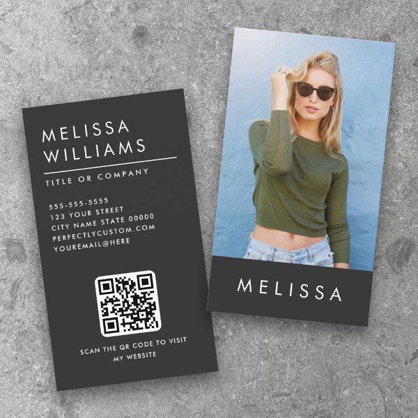 Modern dark gray minimalist custom photo QR code
Dark gray, vertical business cards with you name and photo on the front and name, title and contact information on the back.
 Monogram Modern Minimal Dusky Blue Gray
A simple stylish custom design with modern typography and a dusky blue gray feature color. The text, including your monogram, can easily be personalized to make a design as unique as you are! The perfect trendy bespoke design for personal or business use!
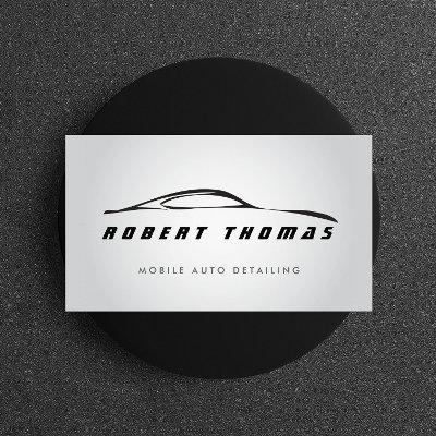
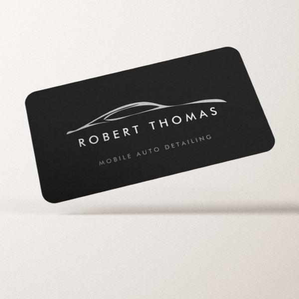 Dark Gray Auto Detailing, Auto Repair
A fluid illustration of a sportscar set on a dark gray background becomes the perfect identity for any auto business. Great for auto detailers, auto repair, auto painting, auto customization, car dealerships, etc. © AM CREATIVE
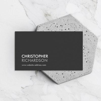
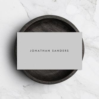
 Professional Modern Simple Gray Minimalist
Clean minimal design with solid black background. A professional, elegant card. A great networking card for many writing professions such as: a novelist, screenwriter, songwriter, columnist, screenwriter, freelance writer, fiction writer, artist, photographer, producers, consultants, designers, entrepreneur, bloggers, filmmaker, author, therapist and more. For matching marking materials please email me at For high quality premade logos visit Original design by Maura Reed.
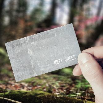
 Elegant Professional Charcoal Gray
Clean and professional design.
Here Are A Few Guidelines For Properly Using A Gray Corporate Card
Typography business cards have become as a visual language of their own, going beyond the mere sharing of contact information. Gone are the days of standard typefaces and repetitive designs. Today’s font business cards are creative works of art that not only create a strong impact but also leave a lasting impression. In this era of online comms, these physical pieces of art prompt us of the strength and beauty of printed design. So let’s plunge into the world of typeface business cards and explore how they can enhance your personal or professional brand with their unique typographic expressions.
Our inquiry leads us into the realm of gray business cards, where we discover about the significance of these items, as well as the elements of good design and strategies for effective implementation. Whether you’re an aspiring entrepreneur with dreams of creating your own distinctive brand or a seasoned specialist looking for opportunities to expand your personal network, trust that we have all aspects covered.
The era when people exchanged contact information by jotting it down on various pieces of paper or only using digital media is a thing of the past. A calling card that has been thoughtfully designed can become the ideal representation of your distinctive persona by incorporating elements of both business image and personal branding. It cements your reputation in the minds of potential clients or collaborators so that they can recall you long after your initial contact.
As an alternative, creating a powerful business card demands more than just putting your title and contact information on a piece of paper. One must thoughtfully think about various aspects, such as the color scheme, the font selection, and the overall design aesthetic that corresponds to their industry and their intended audience, in order to attain the desired outcome.
In the chapters ahead, we will give you with practical advice and innovative perspectives for designing exceptional gray name cards that make a mark on the minds of those who are handed one. Additionally, we’ll examine techniques for making the most of these small resources to forge powerful connections and advance your professional development.
With a multitude of doors opening for you at conferences and networking events, it’s smart to put some thought and effort into designing a corporate card that really stands out. Get ready to uncover its undeveloped potential and benefit from this relatively unassuming but effective advertising tool.
Let’s work together to figure out how to make gray business cards that people will actually remember, ones that will create new opportunities and foster connections on a more meaningful level than you’ve ever experienced before.
Think carefully about each of these factors before making your choice of a appropriate and efficient design for your company’s business cards.
-
Using cutting-edge techniques, infuse creativity into your calling cards: Embracing a range of printing techniques, such as hot foil stamping, raised printing, UV spot coating, or relief printing, which add textural intricacy and dimensionality, can help you unlock a new level of sophistication in the design of your business card. Utilizing these tactics not solely boosts the aesthetic appeal, but also creates a multi-sensory experience that makes your card unforgettable.
-
Get the fitting measurement and dimensions factor: Unleash your creativity by selecting a visiting card with an unconventional shape that strays from the norm, and use it to represent both the mission of your brand as well as its relevance to the sector in which it operates. Unlock innovative design solutions by going beyond established conventions—participating in playful experimentation that encompasses elements like elegantly curved contours, or stunningly detailed cut-out designs.
-
Aim for simplicity while staying away from clutter: Make sure the main points on your contact card stand out by not including too much text or design. Maintain a basic design while making sure that all necessary contact information can be seen. Skillfully utilizing white space allows for the establishment of equilibrium while highlighting significant aspects.
Search for Gray Business Cards
Business Cards Have Long-Lasting Value Because They Enhance Social Connections And Publicize One’s Personal Brand
Every element of your professional card should be given thoughtful consideration, and well designed typography helps you showcase the most significant elements. From the selection of typefaces to the alignment and placement of each letter, typography business cards offer a platform for showcasing your imaginative prowess. With a well-crafted layout that blends aesthetics and practicality, these cards can engage recipients and leave a lasting impression on their minds. Whether you opt for sleek and contemporary sans-serif fonts or classy and timeless serifs, typography business cards allow you to express your unique style and personality through the artistry of letterforms. So, next time you give out your thoughtfully created typography business card, be prepared for heads to turn and conversations to ignite as your professional brand takes center stage.
Conduct an in-depth analysis of the process by which the blend of visual elements will result in a visual representation that exemplifies the values of your organization. Consistency in font, color and imagery choices is essential for establishing a professional and cohesive brand image within your sector. Establishing an long-lasting image that strikes a chord regularly across every marketing medium enhances the foundation upon which strong brand recognition is constructed, fostering immediate consumer familiarity and affiliation.
The Art Of Synthesis
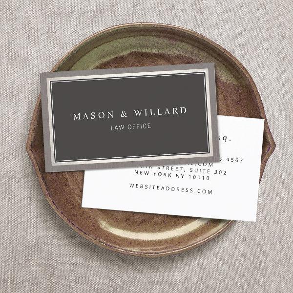
It holds significant significance to possess a complete knowledge of the complex dynamics that define your particular industry, as well as meeting its corresponding set of expectations diligently. Divergent industries impose contrasting demands regarding the necessary level of formality, originality, or innovation expected from business cards. In support of this argument, let’s take the specific case of a law firm whose deliberate choice would be to adopt an beautiful visual representation that signifies their commitment to upholding traditional conventions and displaying elegance; on the other hand, when it comes to a design studio, they tend to gravitate towards an aesthetic perspective fueled by dynamic visuals and artistic creativity. Establish purposeful connections and make a lasting impression through expertly designed gray business cards that adhere loyally to the established standards of your industry.
To fully appreciate the significance of cards for business, it is essential to first recognize that they have a level of core and significance that goes beyond their status as merely paper items in and of themselves. Instead, they function as significant instruments for networking that have the potential to reveal new prospects when thoroughly planned and shared. Grasp this precious chance to create an unforgettable self-presentation and consistently leave a lasting impression every time you share your business card.
Paper Types
Here is a list of available paper types. Each paper type has its own unique qualities that deliver amazing results for your marketing efforts. Choose the style that best suites your needs and make the opportunities you deserve.
All paper types are made in the US unless otherwise stated.
- Standard Matte
» 17.5 pt thickness — 120 lb weight — 324 GSM
» Light white, uncoated matte finish with an eggshell texture.
» Made and printed in the USA
- Standard Semi-Gloss
» 16 pt thickness — 150 lb weight — 400 GSM
» Bright white, semi-gloss finish
» 50% recycled content
» FSC certified
» Paper imported from Italy;
- Signature UV Gloss
» 18 pt thickness — 325 GSM
» Bright white, high-gloss finish
» UV coating adds an additional layer of protection
» Made and printed in the USA
- Signature UV Matte
» 6 pt thickness — 130 lb weight — 352 GSM
» Cream white, matte finish
» Made with 30% post consumer fiber
» Paper is easy to write on and won’t smudge
» FSC certified; made with 100% green electricity
» Made and printed in the USA
- Signature Cream
» 21 pt thickness — 325 GSM
» Bright white, velvety soft silk finish
» Premium laminate finish adds an additional layer of protection
» Made and printed in the USA
- Premium Silk
» 16 pt thickness — 130 lb weight — 352 GSM
» Solar white, uncoated linen finish
» Embossed texture adds depth and refinement
» Made with 30% post consumer fiber
» FSC certified; made with 100% green electricity
» Made and printed in the USA
- Premium Linen
» 16 pt thickness — 130 lb weight — 352 GSM
» Solar white, uncoated linen finish
» Embossed texture adds depth and refinement
» Made with 30% post consumer fiber
» FSC certified; made with 100% green electricity
» Made and printed in the USA
- Premium Pearl
» 16 pt thickness — 130 lb weight — 350 GSM
» Soft white, coated shimmer finish
» Adds an elegant subtle sheen
» FSC certified
» Paper imported from Italy; printed in the USA
- Premium Kraft
» Kraft, smooth and refined vellum finish
» Printed with a white underlayer to help color pop
» Made with 30% post consumer fiber
» FSC certified; made with 100% green electricity
- Premium Grey
» 16 pt thickness — 130 lb weight — 352 GSM
» Neutral grey, smooth finish
» Printed with a white underlayer to help color pop
» Made with 30% post consumer fiber
» FSC certified; Made with 100% green electricity
» Made and printed in the USA
- Premium Black
» 16 pt thickness — 130 lb weight — 352 GSM
» Deep black, smooth finish
» Printed with a white underlayer to help color pop
» Made with 30% post consumer fiber
» FSC certified; made with 100% green electricity
» Made and printed in the USA
- Premium Thick
» 32 pt thickness — 240 lb weight — 650 GSM
» Light white, uncoated matte finish with an eggshell texture
» Paper is easy to write on and won’t smudge
» Made and printed in the USA
» Not available for rounded corner option