

Fantastic Options for Pink and White Elegant Business Cards
We have plenty of great options for pink and white elegant business cards. If you’re looking for the unique designs that will make you business stand out these cards are for you.
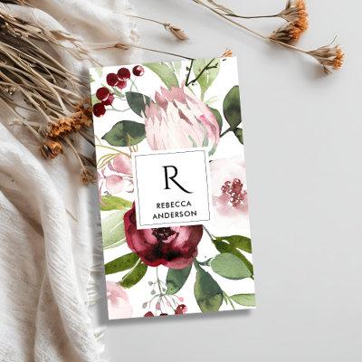
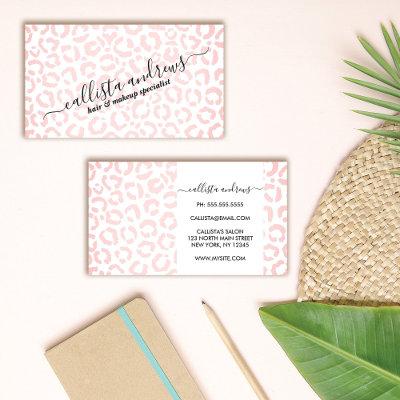
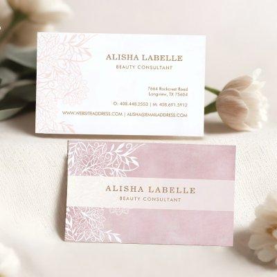
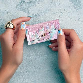
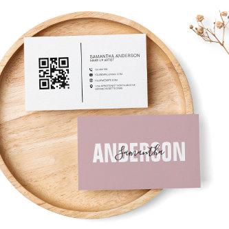
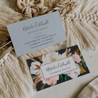
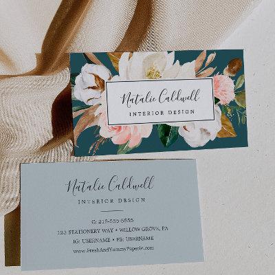
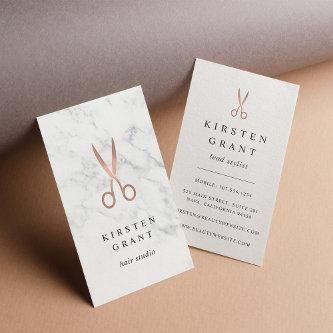
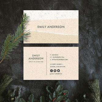
 Modern white bold text blush pink vintage florals
Modern white bold text blush pink vintage florals
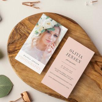
Elegant business cards with your name and title on a pink marble background with white border on the front and contact information and social media on the back. Follow us on Facebook: @businessstationery for more products, news, sales and more.
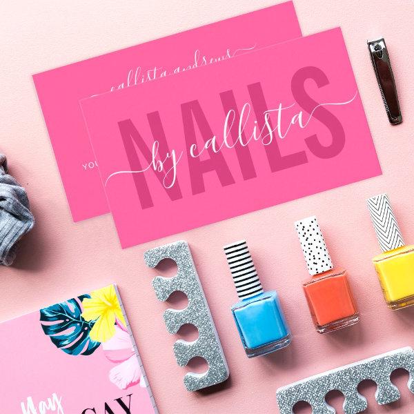
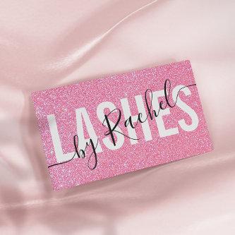
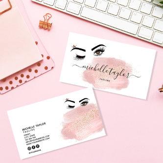
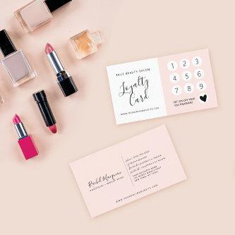
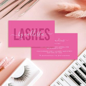
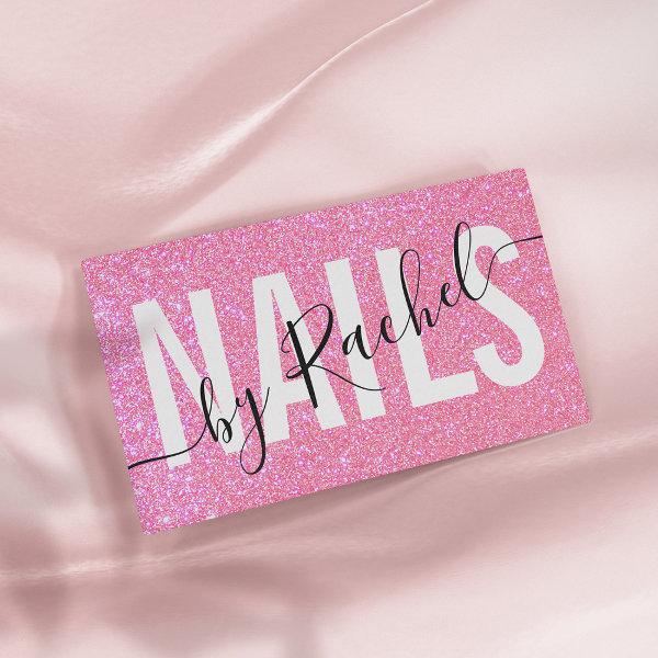 Pretty Sparkly Pink Glitter Typography Nail Artist
This modern, chic, pretty, and simple business card is perfect for any professional. It features elegant cursive and bold fonts on top of a faux printed sparkly pink glitter background. It’s elegant, glamorous, unique, and cool; the perfect design to attract potential customers. It’s a great choice for nail artists. ***IMPORTANT DESIGN NOTE: For any custom design request such as matching product requests, color changes, placement changes, or any other change request, please click on the “MESSAGE” button or email the designer directly at You can even email her a request for a completely custom and new design.
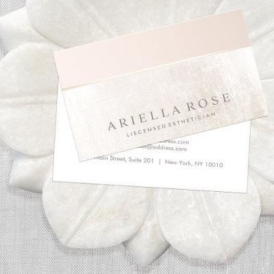
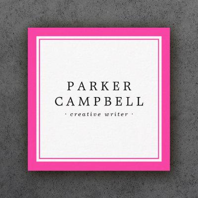
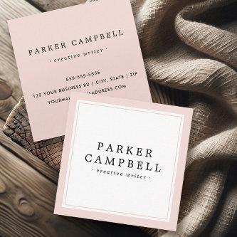
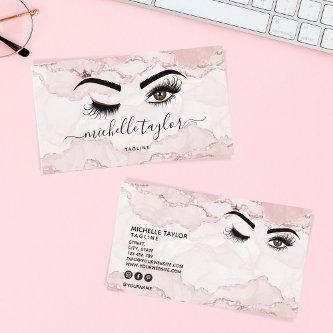
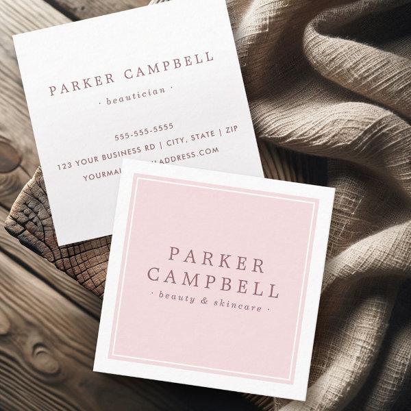 Elegant pink white beauty skincare minimalist square
Chic, pink and white, professional business cards or personal profile cards with your name and title/company name printed on the front with a white border along the edge of the card. On the back are customizable template fields for your name, title/company name/specialty and contact information. A minimal and trendy design for any industry
For any further customization or any other matching items, please feel free to contact me at
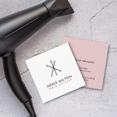
 Elegant Modern Simple Typography Nail Artist
This modern and simple business card is perfect for any professional. It features a contemporary and elegant white and dark pink and cursive fonts on top of a minimalist berry pink background; the perfect design to attract potential customers. It’s a great choice for nail artists. ***IMPORTANT DESIGN NOTE: For any custom design request such as matching product requests, color changes, placement changes, or any other change request, please click on the “MESSAGE” button or email the designer directly at You can even email her a request for a completely custom and new design.
Related Designs
Here are related pink and white elegant business cards. Find your business cards and create a buzz!
For any further customization or any other matching items, please feel free to contact me at
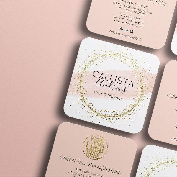 Pink Watercolor Brushstroke Glitter Confetti Salon Square
This modern, chic, elegant, and artsy business card is perfect for any makeup artist, hairstylist, esthetician, aesthetician, or beauty salon. It features a hand-painted blush pink watercolor brushstroke and faux printed gold sparkly confetti circle on top of a white background and includes your business information, logo, and pink background on the back. It’s an excellent way to advertise and spark new business. The design includes a black handwritten signature script typography. It’s elegant, cool, unique, trendy, minimalist, and stylish; the perfect card to attract customers. ***IMPORTANT DESIGN NOTE: For any custom design request such as matching product requests, color changes, placement changes, or any other change request, please click on the “message” button or email the designer directly at You can even email her a request for a completely custom and new design.
For any further customization or any other matching items, please feel free to contact me at
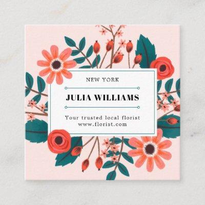
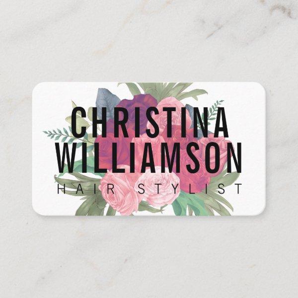
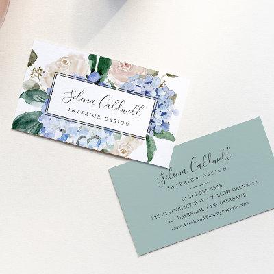
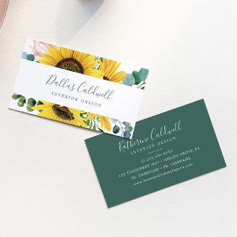
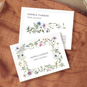
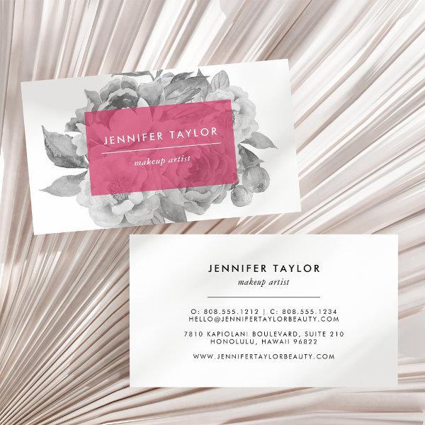 Vintage Floral | Berry
Elegant vintage style floral business cards feature a posy of black and white watercolor peonies with your name or company name and title displayed on a sheer berry pink overlay for a modern pop of color. Add your full contact information to the reverse side. Perfect for makeup artists, hair stylists, florists and any occupation.
For any further customization or any other matching items, please feel free to contact me at
Elegant Blush Pink White Trendy Add Your Logo Business Card. Perfect for Real Estate Agents, Accountants, Realtors, Brokers, Attorneys, Lawyers, Doctors, Corporate Professionals, Stylists, Architects, Engineers, Directors, Managers, all Professions.

Alternative Designs
With so many great pink and white elegant business cards to choose from it can be hard finding the right one. But it helps to know that Card Bee’s catalog of business cards has something for everyone. It only takes a moment to find what you are looking for. For example we offer many different pink and white elegant business cards designs, but we also have plenty of related card designs to choose from and start growing your brand. Try one of these categories.

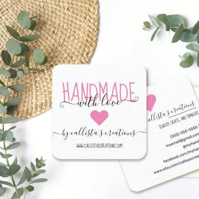
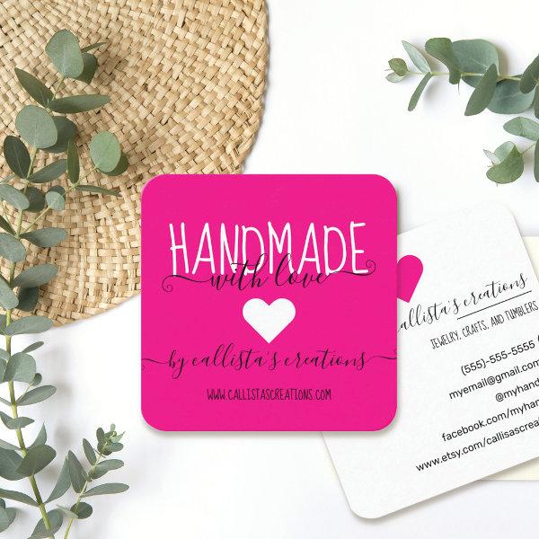 Handmade With Love Etsy Home Crafter Art Fair Square
This simple and cute business card is perfect for the home crafter, Etsy shop owner, or art fair creative. It features handwritten script font in black and white that says, “Handmade with love by (store name),” on top of a minimal neon pink background. It’s modern, elegant, sweet, and unique; the perfect design for your customers. ***IMPORTANT DESIGN NOTE: For any custom design request such as matching product requests, color changes, placement changes, or any other change request, please click on the “message” button or email the designer directly at You can even email her a request for a completely custom and new design.
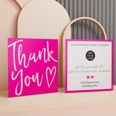
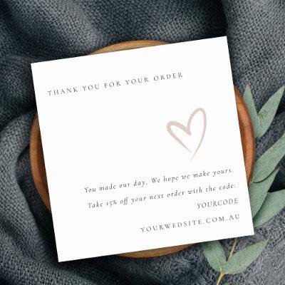
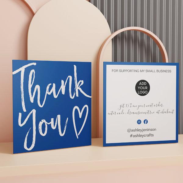 Modern thank you script order minimal chic blue square
Modern minimalist and stylish white and blue business order thank you brush script font with a heart. Add your social media. With an elegant signature script font, all the colors are editable , add your logo.
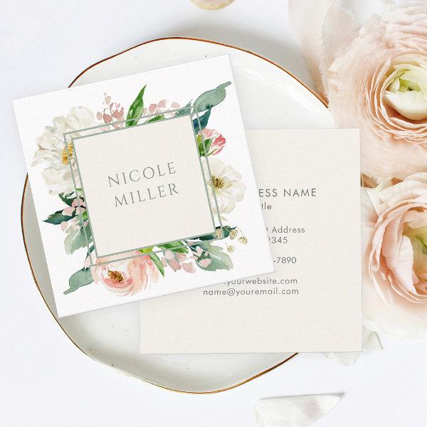 Elegant Feminine Blush Watercolor Floral Square
A beautifully feminine square business card design that is both simple and elegant. A bouquet of pastel blush pink and white roses and mixed flowers with greenery surround a double line frame in sage green. The typeface on the front of the card is stylish and sophisticated. The text template on the back of the card has lines for including your business name and contact information. You can edit these text elements with any text desired, and add or delete text as you prefer.
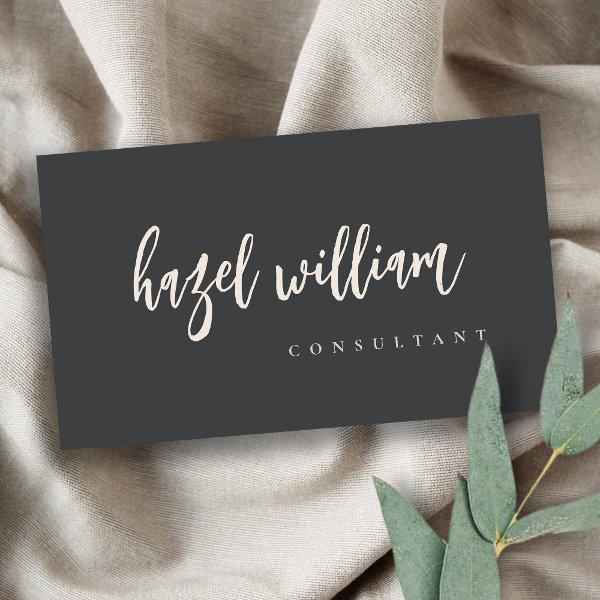 Minimal Modern Simple Blush Pink Black Script
If you need any further customisation please feel free to message me on
For any further customization or any other matching items, please feel free to contact me at
For any further customization or any other matching items, please feel free to contact me at
What To Perform And What Not To Perform When Swapping Pink And White Elegant Business Cards
Business cards, despite being unassuming in appearance, go beyond their role as tangible objects featuring crucial contact information of individuals and businesses. They are a strong tool that can leave a lasting impression and open doors to new opportunities. In a world where digital connections dominate, the simplicity of a well-crafted business card is refreshingly timeless. Today, we will explore the art of creating basic business cards that not only convey your information but also reflect your brand identity in a unique and memorable way. So, let’s move away from the ordinary and explore how simplicity can be the key to making your business card stand out in a large group.
Accompany us on an captivating journey through the world of business cards as we discover the significance of these cards, as well as their visual attributes and strategic usage practices. We’re here to be your preferred business resource, whether you’re a young entrepreneur with ambitious goals of making your mark or a seasoned pro looking to broaden your network.
It is no longer necessary to jot down contact information on scraps of paper or rely solely on online services because those practices have become obsolete. A meticulously planned pink and white elegant business card not only exemplifies professional image but also serves as a physical representation of your personal brand. It is capable of make an indelible impact on prospective clients or collaborators, ensuring they recall you well beyond the initial interaction.
In the same vein, if you want to make an successful contact card, you need to put in more effort than simply writing your name and phone number on a piece of paper. When considering various aspects of design, such as color scheme, choice of fonts, and overall design aesthetic, which effectively resonates with both the standards of your industry as well as the expectations of your target demographic, an in-depth analysis needs to be conducted.
We endeavor to offer you practical tips and invaluable perspectives on designing outstanding pink and white elegant business cards that leave an unforgettable impact on their recipients. In addition, we are going to explore the art of maximizing the use of these scarce assets to the fullest possible extent. This will make it possible for you to cultivate deep relationships and progress your career.
If you’re planning on participating in conventions, meetings, or social events where countless opportunities await discovery, allocating time to perfect your fitness networking card can have a transformative effect. Get ready to explore its secret capabilities and enjoy the perks offered by this compact yet potent marketing tool.
Together, let us begin on a joint exploration of the art of creating visiting cards that not only captivate but also serve as catalysts for transformative connections like no other.
When selecting your pink and white elegant business cards, you should consider the following factors:
-
Use inventive prints: Explore the innovative potential of printmaking by trying out novel approaches to handyman business card design, such as foil stamping, embossing, spot UV coating, or letterpress. Adopting these techniques not only enhances the card’s aesthetic attractiveness but also cultivates a tangible sense of involvement, which distinguishes your card as a noteworthy keepsake.
-
Stay consistent with branding: Ascertain that the design decisions made on your company cards are in sync with your organization’s overall branding strategy. Create a unified visual brand for your company by using the same typefaces, hues, and graphics throughout all of your marketing materials. This will help your customers recognize your brand more readily.
-
Indelible impressions on others: Employ visually arresting characteristics such as eye-catching color combinations, impactful typographical arrangements, or exceptional pattern selections in order to design a handyman company card that is incredibly captivating and one that will stick in the mind forever. Think about incorporating a emblem or other representation that captures your company’s brand.
-
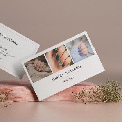
Show off your portfolio: If you work in an artistic profession, it’s a good idea to give some thought to including examples of your work on the back of your business card. This could be a useful marketing strategy. Embracing this strategy grants potential clients a direct view into your work, exciting their curiosity and driving them towards learning more about how your services can cater to their needs.
Physical Remembrances That Strengthen Brand Identity And Promote Engagement With Potential Clients
When it comes to business cards, sometimes less is truly more. Simple minimal business cards bring the concept of elegance and polish to a whole new level. By removing extraneous design elements and focusing on sleek lines and crisp typography, these cards exude a sense of professionalism that speaks volumes. With just a few thoughtfully chosen details, such as a branding or contact details, these clean cards make a bold statement without overwhelming the recipient. So if you’re looking for a way to make a memorable impact while keeping things stylishly subtle, minimal business cards are the perfect choice. Remember, sometimes all it takes is straightforwardness to make a lasting impression in the eyes of potential customers or collaborators.
Embarking on extensive research endeavors alongside acquiring an inclusive knowledge of existing guidelines and foreseeable expectations within one’s particular industry certainly constitutes a crucial course of action when it comes to diligently selecting visiting cards that accurately cater to individual needs. Utilizing this instrument will help you determine whether your job calls for an approach that is more old-fashioned or one that is more modern. One ought to consistently remind themselves of the similar value attributed to both upholding expertise and building a unique and individual identity amidst competition.
Individuals have the ability to cultivate expertise within their brand by deliberately picking the information that is showcased on their calling card and applying detailed scrutiny to doing so. We politely request that you exercise caution in concisely encapsulating all essential information encompassing your entire legal name for precise identification purposes, current official designation held within your organization, accurate contact details and any pertinent online resources such as website URLs or social media profiles that may be applicable. To avoid confusion and maintain an uncluttered look, it is advisable not to incorporate excessive or obsolete information on the card.
When it comes to the design of effective visiting cards, keep in mind that minimalism can go a long way. This is especially true when it comes to keeping things neat and tidy. When faced with an overwhelming amount of provided information or when faced with a cluttered composition in the layout design, recipients are likely to become overwhelmed, thus diminishing material efficiency and efficacy. Choose to emphasize only on the important elements, highlighting the significant elements like your company’s official name, recognizable brand logo, practical contact information, and, where applicable, a memorable tagline.
Before finalizing the design elements for your professional calling cards, it is advisable to carefully consider the precise stipulations pertinent to your line of work. To design monogram name cards that will undoubtedly impress recipients within your industry, you must have an in-depth knowledge of the needs of your sector and a complete embrace of technological innovations at hand; use nothing but top-tier materials; implement minimalist design concepts; and maintain unwavering consistency with your branding efforts.
Search
Use our website to discover tailor-made pink and white elegant corporate cards that reflect your unique style and professional identity.
Paper Types
Here is a list of available paper types. Each paper type has its own unique qualities that deliver amazing results for your marketing efforts. Choose the style that best suites your needs and make the opportunities you deserve.
All paper types are made in the US unless otherwise stated.
- Standard Matte
» 17.5 pt thickness — 120 lb weight — 324 GSM
» Light white, uncoated matte finish with an eggshell texture.
» Made and printed in the USA
- Standard Semi-Gloss
» 16 pt thickness — 150 lb weight — 400 GSM
» Bright white, semi-gloss finish
» 50% recycled content
» FSC certified
» Paper imported from Italy;
- Signature UV Gloss
» 18 pt thickness — 325 GSM
» Bright white, high-gloss finish
» UV coating adds an additional layer of protection
» Made and printed in the USA
- Signature UV Matte
» 6 pt thickness — 130 lb weight — 352 GSM
» Cream white, matte finish
» Made with 30% post consumer fiber
» Paper is easy to write on and won’t smudge
» FSC certified; made with 100% green electricity
» Made and printed in the USA
- Signature Cream
» 21 pt thickness — 325 GSM
» Bright white, velvety soft silk finish
» Premium laminate finish adds an additional layer of protection
» Made and printed in the USA
- Premium Silk
» 16 pt thickness — 130 lb weight — 352 GSM
» Solar white, uncoated linen finish
» Embossed texture adds depth and refinement
» Made with 30% post consumer fiber
» FSC certified; made with 100% green electricity
» Made and printed in the USA
- Premium Linen
» 16 pt thickness — 130 lb weight — 352 GSM
» Solar white, uncoated linen finish
» Embossed texture adds depth and refinement
» Made with 30% post consumer fiber
» FSC certified; made with 100% green electricity
» Made and printed in the USA
- Premium Pearl
» 16 pt thickness — 130 lb weight — 350 GSM
» Soft white, coated shimmer finish
» Adds an elegant subtle sheen
» FSC certified
» Paper imported from Italy; printed in the USA
- Premium Kraft
» Kraft, smooth and refined vellum finish
» Printed with a white underlayer to help color pop
» Made with 30% post consumer fiber
» FSC certified; made with 100% green electricity
- Premium Grey
» 16 pt thickness — 130 lb weight — 352 GSM
» Neutral grey, smooth finish
» Printed with a white underlayer to help color pop
» Made with 30% post consumer fiber
» FSC certified; Made with 100% green electricity
» Made and printed in the USA
- Premium Black
» 16 pt thickness — 130 lb weight — 352 GSM
» Deep black, smooth finish
» Printed with a white underlayer to help color pop
» Made with 30% post consumer fiber
» FSC certified; made with 100% green electricity
» Made and printed in the USA
- Premium Thick
» 32 pt thickness — 240 lb weight — 650 GSM
» Light white, uncoated matte finish with an eggshell texture
» Paper is easy to write on and won’t smudge
» Made and printed in the USA
» Not available for rounded corner option