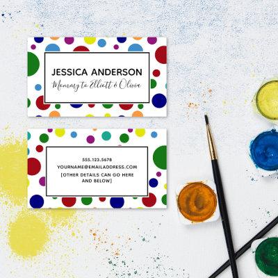


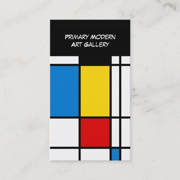
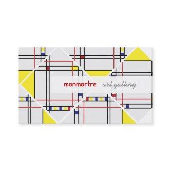
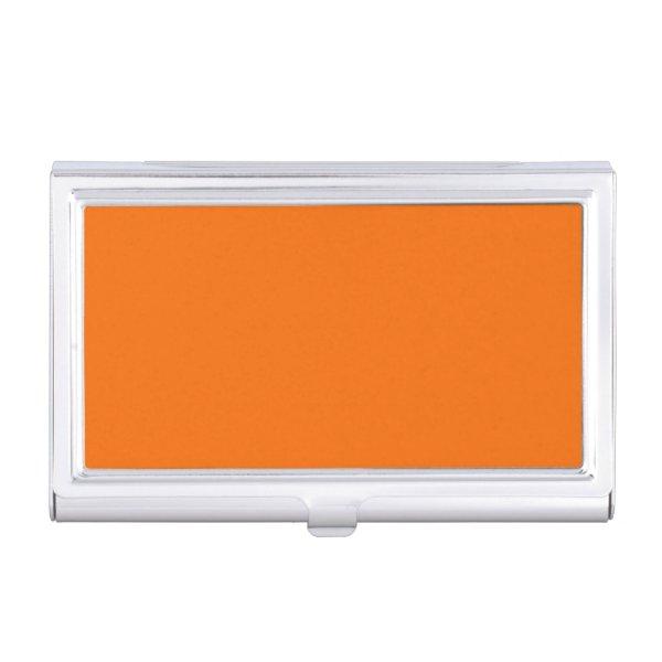
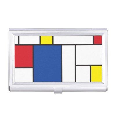
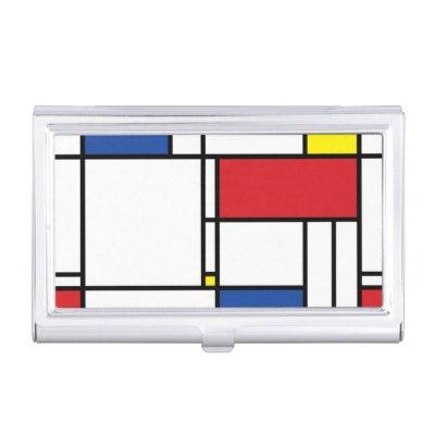
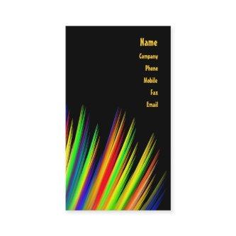
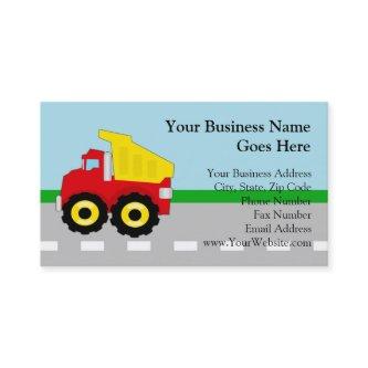
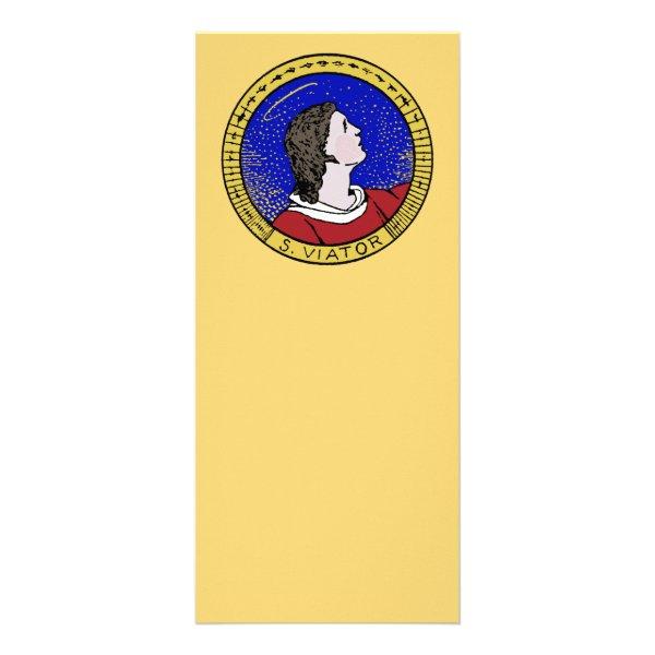
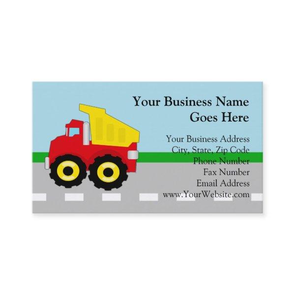
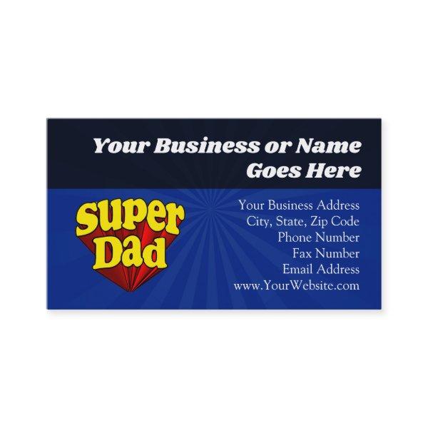
Fantastic Options for Primary Colors Business Cards
We have plenty of great options for primary colors business cards. If you’re looking for the unique designs that will make you business stand out these cards are for you.

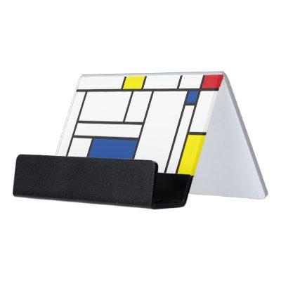
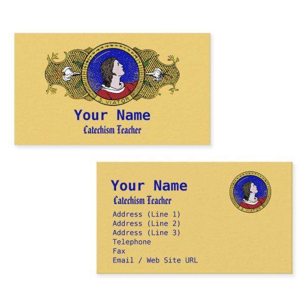
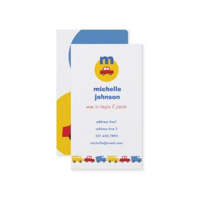
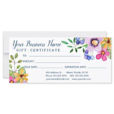
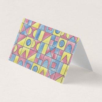
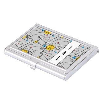
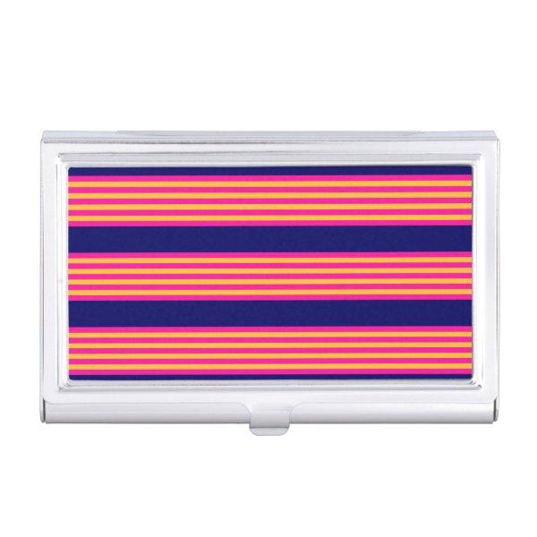
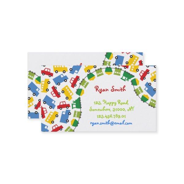
Related Designs
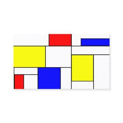
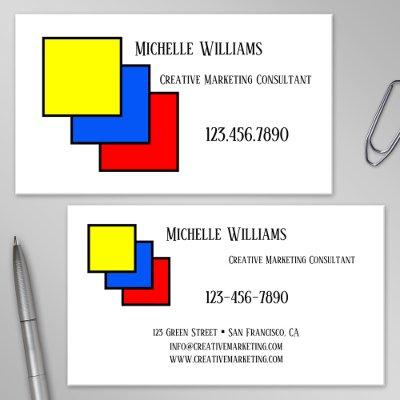
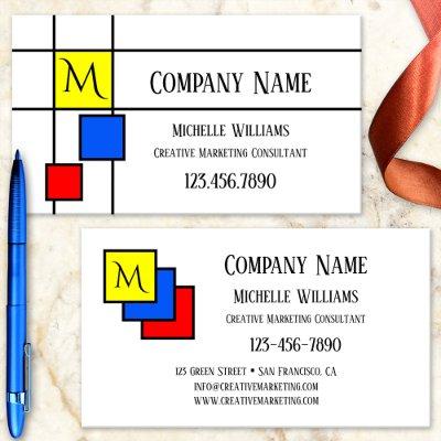
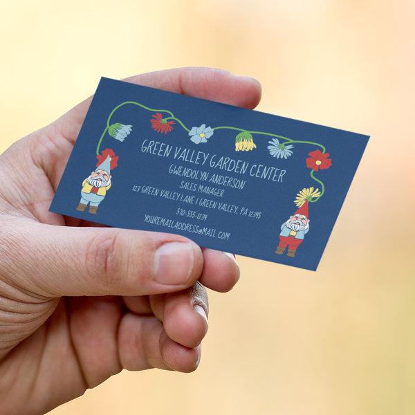
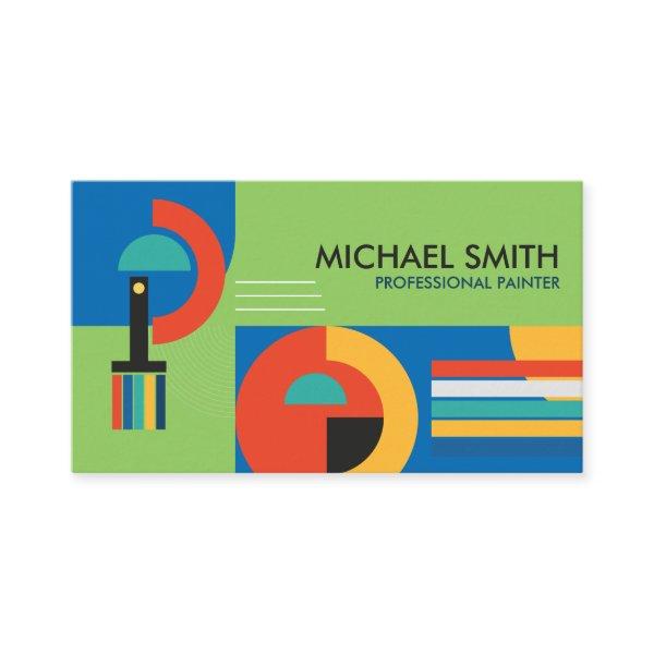
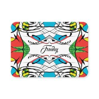
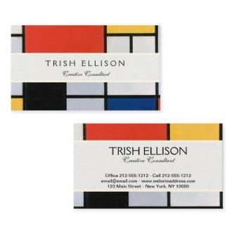
Here are related primary colors business cards. Find your business cards and create a buzz!


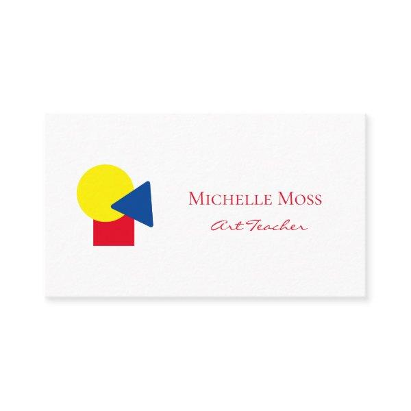

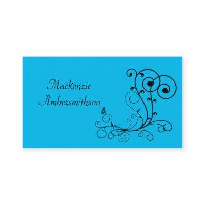


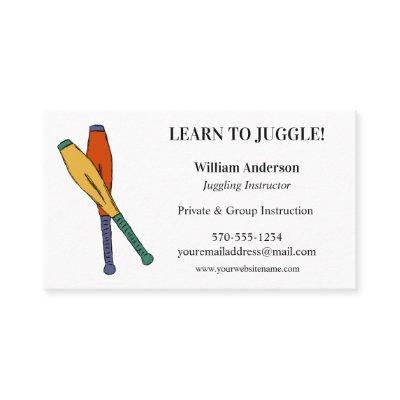
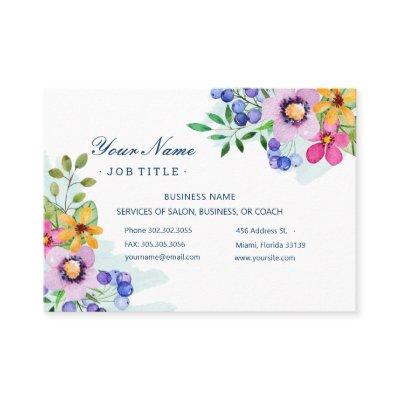
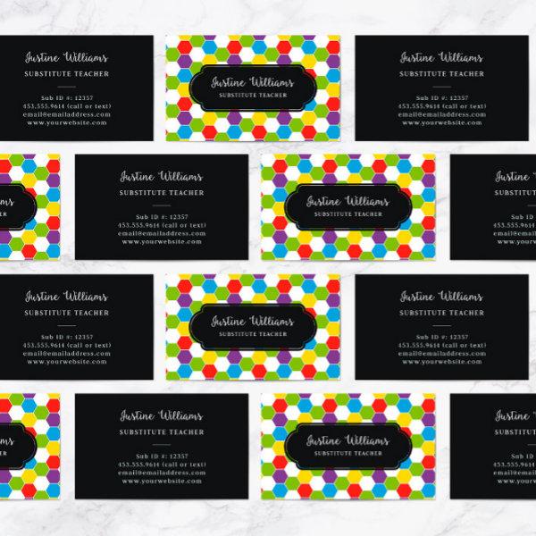
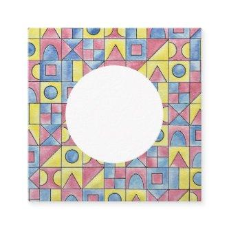
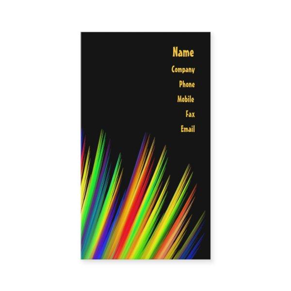
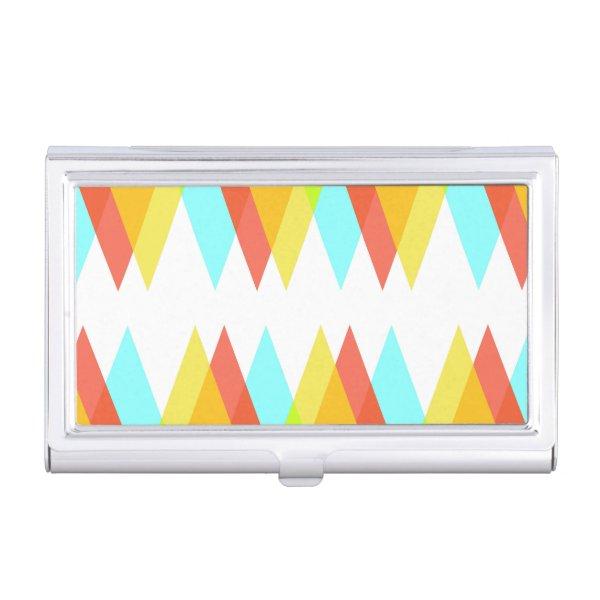
Alternative Designs
With so many great primary colors business cards to choose from it can be hard finding the right one. But it helps to know that Card Bee’s catalog of business cards has something for everyone. It only takes a moment to find what you are looking for. For example we offer many different primary colors business cards designs, but we also have plenty of related card designs to choose from and start growing your brand. Try one of these categories.


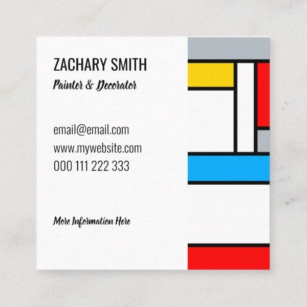
Impress Clients And Co-Workers Alike With Our Premium Primary Colors Calling Card Selection
Join us on this connection journey as we establish enduring moments on each other. It’s increasingly vital to set yourself apart in today’s competitive business environment and forge lasting partnerships. This objective is within reach with the assistance of none other than the modest business card.
Together, we will explore the complex terrain of professional contact cards in order to gain an understanding of their importance, the visual elements that make up them, and the best deployment strategies. Whether you are a budding entrepreneur trying to build your personal brand or a veteran professional trying to broaden your network of contacts, you can depend on us for unmatched coverage.
We have stepped into a new era in which sharing contact information is no longer limited to hurriedly writing it down on torn papers or relying solely on digital media. Instead, we can now exchange information in a range of ways. A standard primary colors business card can be upgraded to the level of an extraordinary representation that embodies professionalism and vividly captures your personal brand with the application of thorough attention to detail. It creates a lasting impression on your potential customers or associates, keeping you in their minds for an extended period of time you’ve encountered them.
On the flip side, carving your name and contact details into a piece of paper and calling it a professional plain business cards isn’t enough to make an impact on potential clients. Color scheme, font choice, and general design aesthetic all need careful consideration to ensure they meet the needs of your industry and the expectations of your target audience.
Inside you’ll find a abundance of helpful tips and innovative perspectives to create girly business cards that grab attention and be memorable to your clients. In addition, we shall expand on strategies enabling you to optimize the advantages offered by these portable tools by establishing significant connections and propelling your career trajectory forward.
Spending time perfecting your contact information is time well spent if you plan on participating in conventions, gatherings, or social events that offer ample opportunities. Get ready for the revealing of its hidden features and take advantage presented by this small but mighty marketing tool.
Let’s embark on this adventure together and discover how to create business cards that will get you noticed and help you make connections with people on a deeper level than ever before.
Take into account the following aspects when deciding on primary colors contact cards:
-
Stay consistent with branding: Ensure that every component of the formatting of your primary colors business cards supports, rather than hinders, the overarching image efforts being put forth by your company. By using the same typefaces, shades, and graphics throughout all of your marketing materials, you can improve consumers’ ability to remember your brand and create a visually appealing aesthetic that is seamless.
-
Consider the paper’s quality: With the correct feel of your direct sales visiting card, you can create a enduring impact. Pay adequate attention to assessing and preserving ideal qualities associated with the makeup and excellence of your chosen paper type. Choose a paper stock that is both substantial and luxurious to the feel. To incorporate a hint of sophistication to your design, use flat or glossy coatings.
-
Simplify, and make sure to keep it clear of any clutter: Minimize the amount of copy and visual overload on your hair visiting card design. Continue using a straightforward style that makes it simple to read the crucial contact details. Skillfully utilizing white space allows for the establishment of equilibrium while highlighting significant details.
-
Make the right choice of measurement and dimensions: Explore uncharted ground in the realm of design by veering away from the conventional square or rectangular shape of business cards. Instead, consider selecting a unique form or measurement that embodies your company’s identity within the context of the sector in which it operates. Unleash your innovative spirit and embrace unorthodox approaches, considering design elements like rounded corners or boldly sculpted embellishments.
The Importance Of Visiting Cards: Exchanging Contact Details And Demonstrating Expertise
In the complex world of business networking, sometimes the simplest things can make the greatest impression. While bold and intricate designs may grab the eye, minimalist business cards convey a sense of professionalism and understated confidence. The lack of detailed images or excessive data allows for a neat and targeted display, putting the emphasis squarely on your talents and expertise. A carefully selected typeface, a hint of hue, or even an embossed logo can add just the right amount of sophistication to these simple cards. Ultimately, it is their unassuming elegance that sets them apart, leaving a lasting impression that speaks volumes about your commitment to dedication and attention to detail. Embrace the power of simplicity with professional plain business cards and let your credentials do the communicating.
One must stay aware of the deep effect that exemplary printing techniques and high-quality materials can yield at all times. Elevating the overall perception of expertise and distinctiveness tied to your brand is attainable through the use of high-quality paper stock, incorporating finishes like embossing or foil stamping, and even experimenting with unique shapes.
To make an informed choice about minimalist business cards, it is essential to pay careful consideration to the ways in which technology manifests itself within the context of your professional endeavor. Given the current landscape defined by advanced digital technology, it is wise to deliberately incorporate barcode squares or personalized URLs on your business cards. This rational approach enables recipients to easily access additional information and establish online connections with you. Ensuring that there is a easy method for users to connect with you online is crucial in attaining this goal. Your readiness to embrace and fully embrace these technological advancements is indicative of a deep dedication towards staying up-to-date with the latest developments within your industry.
Think thoughtfully about how the blend of graphical aspects can most effectively capture and convey the defining spirit of your company, and do so in a presentation that you give careful consideration to. Exercising careful consideration by assessing whether or not the chosen typefaces, colors, and imagery meet established criteria while remaining consistent with anticipated outcomes constitutes an vital step within your field. The development and maintenance of an unvarying visual representation across various marketing platforms will lend credence to the framework supporting your brand recognition.
If you want your personal brand to be effective, don’t underestimate the power of minimalism in design. Given that you supply an overwhelming amount of data or implement a cluttered arrangement within your materials’ format, expect this surplus to overpower your receivers and consequently reduce their overall efficacy significantly. Make a conscious choice to avoid getting distracted by unimportant details and concentrate solely on what is really important: prominently displaying your company’s name and logo creation, while also including clear contact information and an effective tagline where appropriate.
Putting It All Together
Thoroughly assess and comprehend the specialized requisites associated with your line of work when choosing design attributes for inclusion in your architect company card layout. This harmonious blend takes form into professional plain business cards that definitely mesmerize and leave a memorable impression on those in your work circle. By combining an in-depth understanding of what is anticipated within your industry with a wholehearted embrace of technological advancements at hand, deploying only top-tier materials, distilling designs down to their purest essence, and meticulously maintaining brand coherence, for example, this harmonious blend creates professional plain business cards that leave a lasting impression on those in your professional circle.
Search for Company Cards
Paper Types
Here is a list of available paper types. Each paper type has its own unique qualities that deliver amazing results for your marketing efforts. Choose the style that best suites your needs and make the opportunities you deserve.
All paper types are made in the US unless otherwise stated.
- Standard Matte
» 17.5 pt thickness — 120 lb weight — 324 GSM
» Light white, uncoated matte finish with an eggshell texture.
» Made and printed in the USA
- Standard Semi-Gloss
» 16 pt thickness — 150 lb weight — 400 GSM
» Bright white, semi-gloss finish
» 50% recycled content
» FSC certified
» Paper imported from Italy;
- Signature UV Gloss
» 18 pt thickness — 325 GSM
» Bright white, high-gloss finish
» UV coating adds an additional layer of protection
» Made and printed in the USA
- Signature UV Matte
» 6 pt thickness — 130 lb weight — 352 GSM
» Cream white, matte finish
» Made with 30% post consumer fiber
» Paper is easy to write on and won’t smudge
» FSC certified; made with 100% green electricity
» Made and printed in the USA
- Signature Cream
» 21 pt thickness — 325 GSM
» Bright white, velvety soft silk finish
» Premium laminate finish adds an additional layer of protection
» Made and printed in the USA
- Premium Silk
» 16 pt thickness — 130 lb weight — 352 GSM
» Solar white, uncoated linen finish
» Embossed texture adds depth and refinement
» Made with 30% post consumer fiber
» FSC certified; made with 100% green electricity
» Made and printed in the USA
- Premium Linen
» 16 pt thickness — 130 lb weight — 352 GSM
» Solar white, uncoated linen finish
» Embossed texture adds depth and refinement
» Made with 30% post consumer fiber
» FSC certified; made with 100% green electricity
» Made and printed in the USA
- Premium Pearl
» 16 pt thickness — 130 lb weight — 350 GSM
» Soft white, coated shimmer finish
» Adds an elegant subtle sheen
» FSC certified
» Paper imported from Italy; printed in the USA
- Premium Kraft
» Kraft, smooth and refined vellum finish
» Printed with a white underlayer to help color pop
» Made with 30% post consumer fiber
» FSC certified; made with 100% green electricity
- Premium Grey
» 16 pt thickness — 130 lb weight — 352 GSM
» Neutral grey, smooth finish
» Printed with a white underlayer to help color pop
» Made with 30% post consumer fiber
» FSC certified; Made with 100% green electricity
» Made and printed in the USA
- Premium Black
» 16 pt thickness — 130 lb weight — 352 GSM
» Deep black, smooth finish
» Printed with a white underlayer to help color pop
» Made with 30% post consumer fiber
» FSC certified; made with 100% green electricity
» Made and printed in the USA
- Premium Thick
» 32 pt thickness — 240 lb weight — 650 GSM
» Light white, uncoated matte finish with an eggshell texture
» Paper is easy to write on and won’t smudge
» Made and printed in the USA
» Not available for rounded corner option