Fantastic Options for Script Typography Lettering Calligraphy Business Cards
We have plenty of great options for script typography lettering calligraphy business cards. If you’re looking for the unique designs that will make you business stand out these cards are for you.
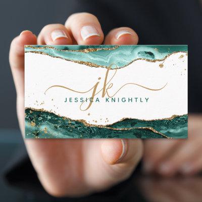
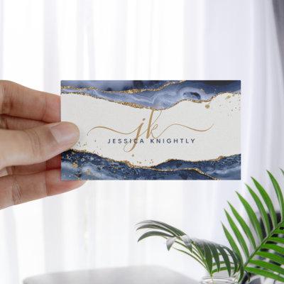
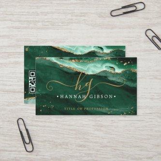
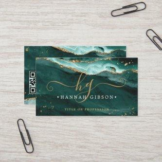
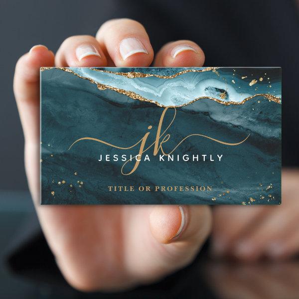 Elegant Teal Agate Gold Glitter Script Monogram
Modern, stylish professional business card with teal agate with gold glitter sparkle accents personalized with chic, elegant calligraphy script monogram initials and name. CHANGES: Change the text font style, color, size and placement by clicking on EDIT. Contact the designer via Zazzle Chat or if you’d like this design modified, on another product or would like coordinating items.
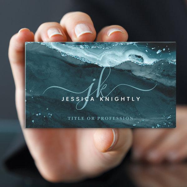
 Elegant Teal Agate Glitter Monogram Script
Modern, stylish professional business card with teal agate and faux glitter sparkle accents personalized with chic, elegant calligraphy script monogram initials. CHANGES: Change the text font style, color, size and placement by clicking on EDIT. ASSISTANCE: For help with design modification or personalization, color change, resizing, transferring the design to another product or if you would like coordinating items, contact the designer BEFORE ORDERING via the Zazzle Chat MESSAGE tab below or email
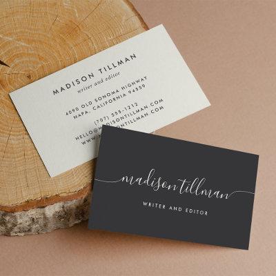
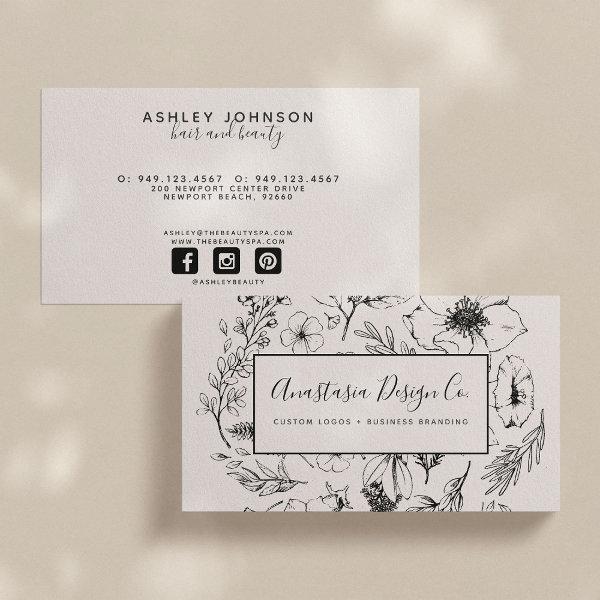 Modern Botanical Blush Pink and Black Script
Ooooh, we’re just LOVING this gorgeous new design! This botanical blush and black horizontal business card features a beautiful hand drawn black floral design over a blush background, and overlaid with a black bordered blush rectangle featuring your name and title, or occupation. The back of the card features the same blush background, and you may personalize all your contact information easily. Includes social media icons and a field for your username. It’s a beautiful, modern aesthetic! WOULD YOU LIKE A MATCHING LOGO? Just connect through the Zazzle Chat feature! Design copyright Anastasia Designs, all rights reserved.
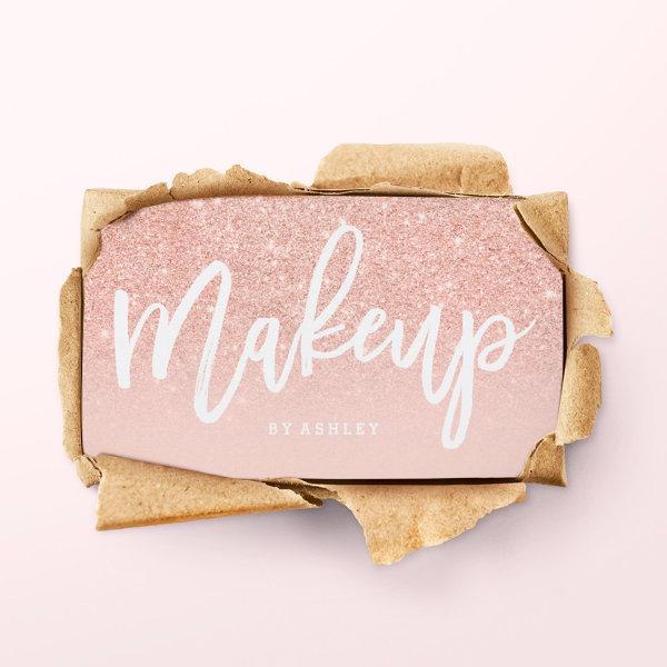 Makeup artist elegant typography blush rose gold
An elegant modern, stylish makeup artist business card with elegant script hand lettering style typography in white on a faux rose gold glitter and pastel blush pink trendy and elegant background. If you need any customization, don’t hesitate in contacting me
 Elegant Teal Agate Glitter Script Monogram Initial
Modern, stylish professional business cards with teal agate and glitter sparkle accents personalized with chic, elegant calligraphy script monogram initials and name. CHANGES: Change the text font style, color, size and placement by clicking on EDIT. ASSISTANCE: For help with design modification/personalization, color change, transferring the design to another product or if you would like coordinating items, contact the designer BEFORE ORDERING via the Zazzle Chat MESSAGE tab or email at
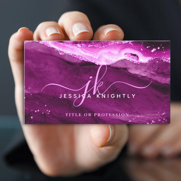
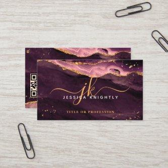
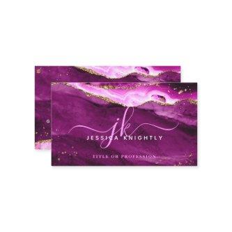
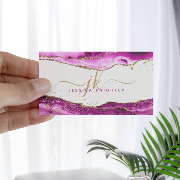 Pink Magenta Agate Gold Glitter Monogram Script
Modern, stylish professional business card with pink magenta agate with faux gold glitter sparkle accents personalized with chic, elegant calligraphy script monogram initials. CHANGES: Change the text font style, color, size and placement by clicking on EDIT. ASSISTANCE: For help with design modification or personalization, color change, resizing, transferring the design to another product or if you would like coordinating items, contact the designer BEFORE ORDERING via the Zazzle Chat MESSAGE tab below or email
Related Designs
Here are related script typography lettering calligraphy business cards. Find your business cards and create a buzz!


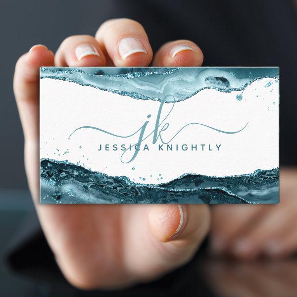
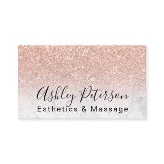
An elegant modern, stylish makeup artist business card with elegant script hand lettering style typography in white on a faux gold glitter and teal ocean trendy and elegant background. If you need any customization, don’t hesitate in contacting me
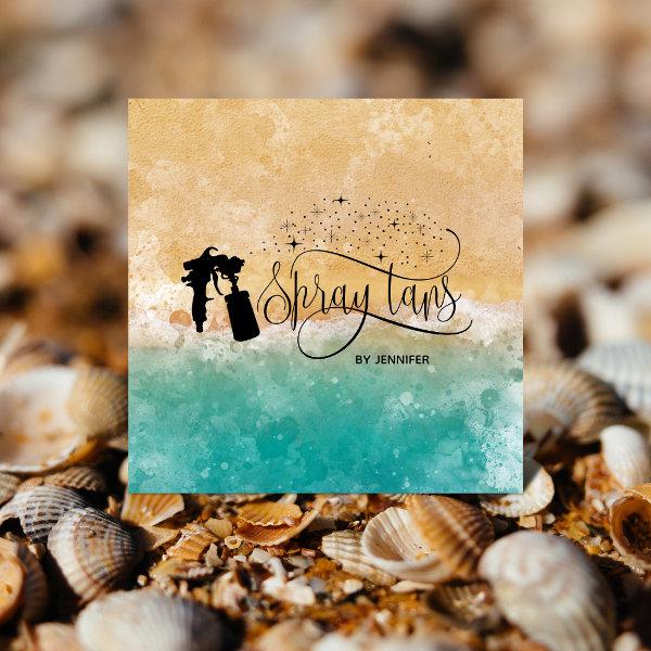
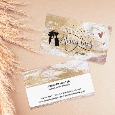
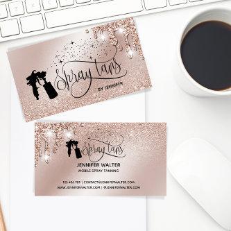
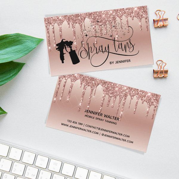 Spray tan script dripping glitter gold
This modern script dripping glitter gold background illustration with spray tan machine blowing confetti hearts is ideal for spray tan studio, mobile spray tanning studio, beauty salons, spray
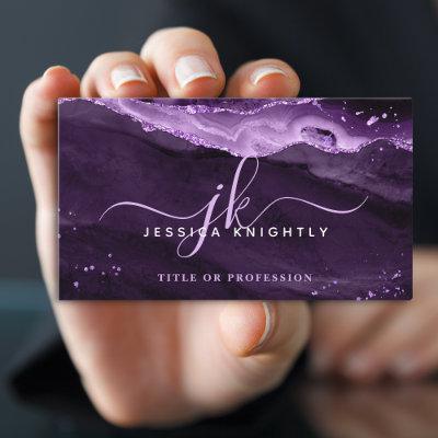
 Elegant Pink Magenta Agate Glitter Script Monogram
Modern, stylish professional business cards with trendy pink magenta agate geode with faux glitter sparkle accents personalized with chic, elegant calligraphy script monogram initials. CHANGES: Change the text font style, color, size and placement by clicking on EDIT. ASSISTANCE: For help with design modification/personalization, color change, transferring the design to another product or if you would like coordinating items, contact the designer BEFORE ORDERING via the Zazzle Chat MESSAGE tab or email at
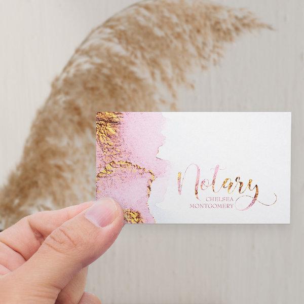 Notary Pink Watercolor and Gold Calligraphy
Notary business card with pink and gold border and elegant calligraphy. Versatile template to customize for mobile notary or office based consultants, loan signing agents etc with your contact details, services or area covered and any additional information you would like to include.
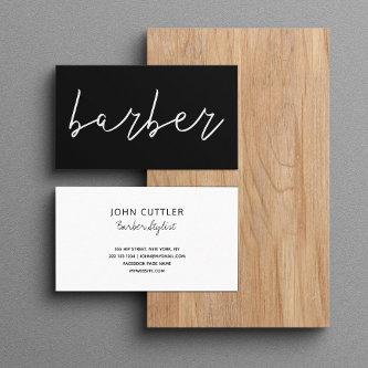
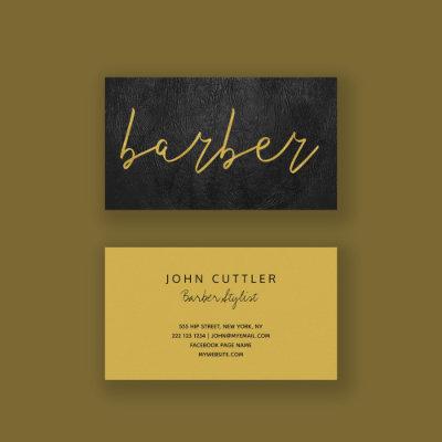
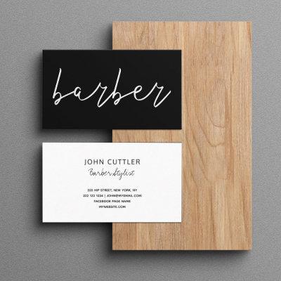
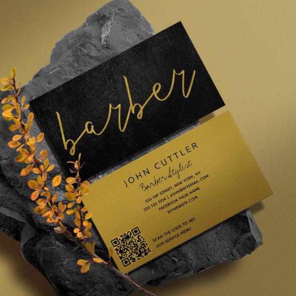 QR CODE black leather barber gold typography
Minimal elegant hand lettering typography script black and faux gold luxe modern barber stylist business card with your automatically generated QR CODE. ++++++++++++++ Suitable for freelancers, barber salon owners, or employees.
 Beach Ocean Spray tan script dripping glitter gold Square
This modern script with ocean – beach background and spray tan machine blowing confetti hearts is ideal for spray tan studio, mobile spray tanning studio, beauty salons, spray
Alternative Designs
With so many great script typography lettering calligraphy business cards to choose from it can be hard finding the right one. But it helps to know that Card Bee’s catalog of business cards has something for everyone. It only takes a moment to find what you are looking for. For example we offer many different script typography lettering calligraphy business cards designs, but we also have plenty of related card designs to choose from and start growing your brand. Try one of these categories.

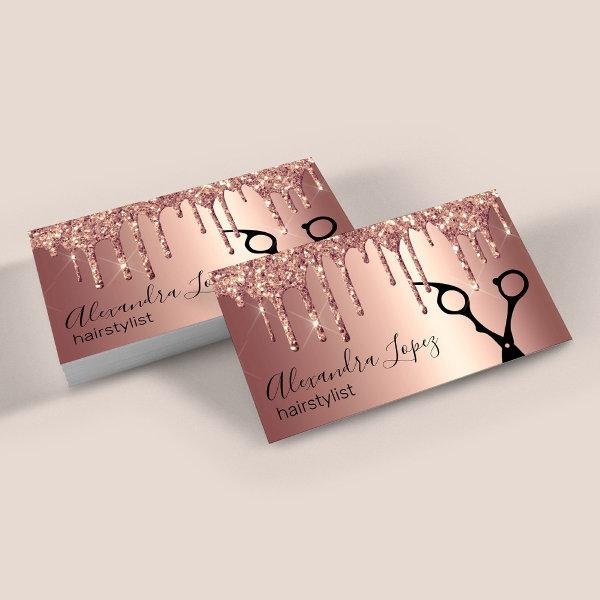 Elegant copper rose gold glitter drips hairstylist
This gorgeous hairstylist business card design features faux pink & copper rose gold dripping glitter metallic texture, scissors and elegant calligraphy font.
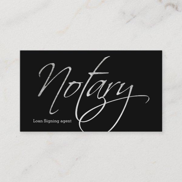 Notary script faux silver typography black
An elegant script typography ,modern, stylish notary business card with stylish script hand lettering style typography in faux silver foil on a simple customizable black background. If you need any customization, don’t hesitate in contacting me
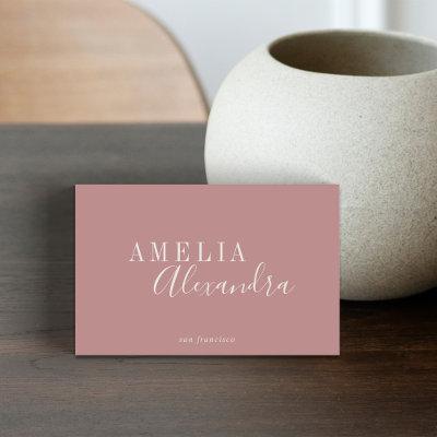
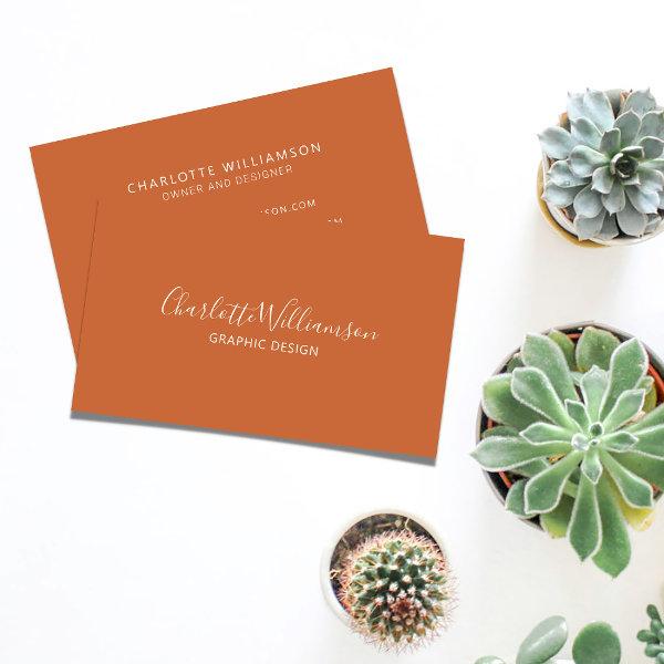 Stylish Elegant Monogram Minimalist Terracotta
Stylish Chic Elegant Monogram Minimalist Terracotta Business Card
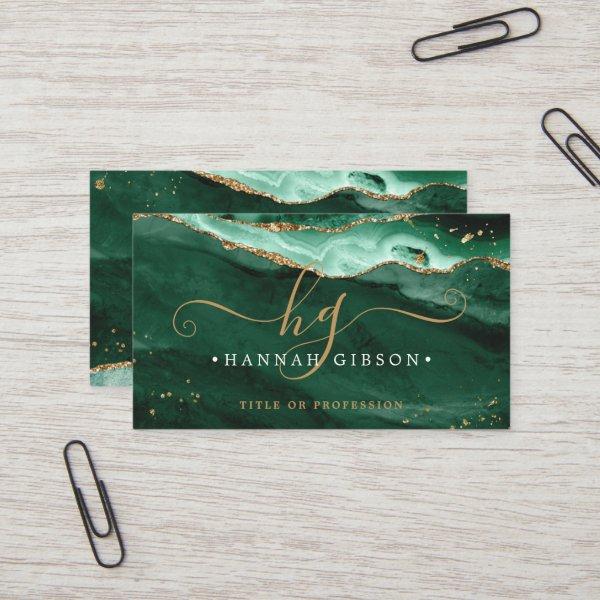 Green Agate Script Monogram Faux Gold Glitter
Modern, stylish professional business card with green agate and faux gold glitter sparkle accents personalized with chic, elegant calligraphy script monogram initials and name on the front and your custom contact information on the back. CHANGES: Change the text font style, color, size and placement by clicking on EDIT. ASSISTANCE: For help with design modification or personalization, color change, resizing, transferring the design to another product or if you would like coordinating items, contact the designer BEFORE ORDERING via the Zazzle Chat MESSAGE tab below or email
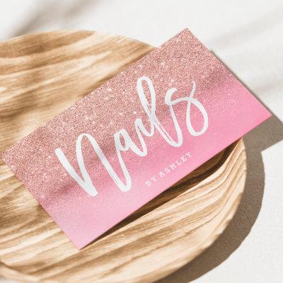
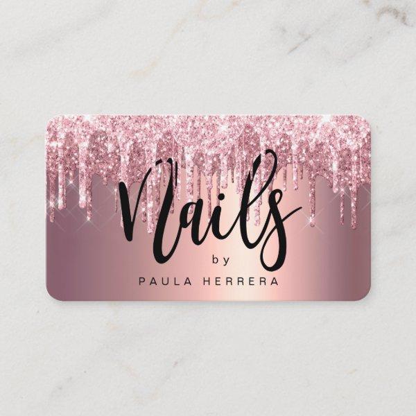 Elegant copper rose gold glitter drips nails
This gorgeous nails technician business card design features faux pink & copper rose gold dripping glitter metallic texture and elegant calligraphy font.
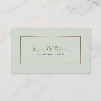
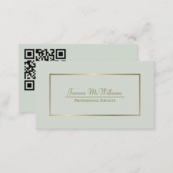 Sage Green & Gold Elegant Professional QR Code
These business cards are simple, sophisticated, professional, stylish and elegant. They feature gold lettering and a faux golden border on a pale sage green background with contact information, including a customizable QR code, on the back. Perfect for a wide variety of professions, they are easily customized to meet your needs.
Script Typography Lettering Calligraphy Business Cards – Boost Your Influence In The Business World
Metal or plastic QR code business cards can be scanned by smartphones for instant digital contact saving and website access.
Are you weary of searching through your wallet, frantically searching for a contact’s information during an crucial business meeting? Would you like it if prospects and colleagues had something physical to keep as a reminder of your expertise and your work together? Do not prolong your search beyond the modest calling card. This compact document is extremely significant in the networking world and is still used by professionals from a wide range of industries. A journey into the fascinating world of designing business cards awaits you, where the secrets to creating designs that capture the spirit of your brand while conveying essential information will be revealed. Rally with us as we reveal the techniques for creating unique script typography lettering calligraphy business cards that will revolutionize the way you network, whether you are an expert at navigating the complexities of entrepreneurship or are venturing into uncharted waters in search of success.
Design And Arrangement Factors For Script Typography Lettering Calligraphy Business Cards
-
Show off your portfolio: In situations in which one’s preferred professional trajectory calls for regular utilization of creative genius and innovative dexterity, it would be prudent to contemplate strategies that would enable them to exhibit tactile instances or graphical renderings effectively evoking their creative output on the typically ignored but fundamentally operative rearmost facade featuring prominently within their customary networking apparatus, which is commonly known as a business card. By using this method, you can rest assured that prospective customers will quickly comprehend what you offer and be interested in discovering the range of your offerings.
-
Stay consistent with branding: Make sure that the general branding tactics of your organization is represented in the design of your visiting cards by giving them thoughtful consideration. Employ a consistent selection of typefaces, colors, and graphics in all promotional items to enhance brand recognition and create a cohesive visual identity.
-
Adopt a straightforward strategy devoid of added confusion or disorder: Keep your script typography lettering calligraphy business card simple, emphasizing the information that matters most. Keep things clean and simple, with the focus on making contact details conveniently accessible. By incorporating blank space on purpose, you can create balance while calling attention to key details.
-
Consider functionality: Develop a sense of individuality in the designs of your visiting cards by including components that go beyond the provision of standard contact information. Amplify the impact of sharing information by including additional functional elements like QR codes, appointment reminders, or even miniature calendars that provide enhanced functionality.
Search for Similar Visiting Cards
Exploring The Touch-Based Encounter
In an era characterized by an abundance of digital communication, typography name cards present a refreshing and palpable means of leaving a lasting impact. The meticulous picking of fonts can convey not only your personal style but also the essence of your brand. From stylish and modern sans-serif fonts to refined and classy serif options, the possibilities are limitless. By combining the right typography with eye-catching visual elements, these cards become a strong tool for showcasing your imagination and attention to detail. So why settle for generic business cards when you can create a font-based masterpiece that embodies the spirit of your industry? Remember, in the realm of professional branding, choosing the appropriate typeface is just as important as choosing the right words to convey your message. Make sure your typography speak volumes about who you are and what you bring to the table – because sometimes, it’s not just what you say, but how you say it that truly matters.
When it comes to the design of effective visiting cards, those who are involved in the process of making them need to keep in mind that giving minimalism and clearness a higher priority is a significant factor that contributes significantly to achieving the desired results. By bombarding the recipients with an excess of information or overloading the layout, you inadvertently reduce the effectiveness of the materials. Opt for prioritizing the fundamentals rather than getting caught up in superfluous details; specifically focusing on vital elements such as effectively presenting your company through its official name and symbolic representation, as well as available means of communication and, if applicable, an engaging slogan.
Never undervalue the significant impact that high-quality materials and innovative printing methods can have on a project. The enhancement of the overall notion of skill and distinctiveness tied to your brand may be attained by harnessing the benefits provided by employing high-quality paper stock, integrating luxurious finishes like imprinting or foil stamping, and even venturing into non-traditional outlines.
Consider the particular creative choices that were made during the design process that effectively communicate and represent the distinctive brand identity plan for your company. Conforming to recognized norms and expectations within your sector necessitates thoughtful attention to color selection as well as selecting fonts and utilizing images. Establishing a uniform graphic identity throughout all promotional materials is essential for boosting the consolidation of your brand recognition.
Bearing in mind the unique nature of your trade, carefully curate design elements for your script typography lettering calligraphy business cards that aptly reflect its essence. Business cards that leave a positive and memorable impact on people in your field can be created through familiarity with industry standards, openness to new technology, use of high-quality materials, simplification of design elements, and consistency with your brand identity.
Popular on Card-Bee.com
Paper Types
Here is a list of available paper types. Each paper type has its own unique qualities that deliver amazing results for your marketing efforts. Choose the style that best suites your needs and make the opportunities you deserve.
All paper types are made in the US unless otherwise stated.
- Standard Matte
» 17.5 pt thickness — 120 lb weight — 324 GSM
» Light white, uncoated matte finish with an eggshell texture.
» Made and printed in the USA
- Standard Semi-Gloss
» 16 pt thickness — 150 lb weight — 400 GSM
» Bright white, semi-gloss finish
» 50% recycled content
» FSC certified
» Paper imported from Italy;
- Signature UV Gloss
» 18 pt thickness — 325 GSM
» Bright white, high-gloss finish
» UV coating adds an additional layer of protection
» Made and printed in the USA
- Signature UV Matte
» 6 pt thickness — 130 lb weight — 352 GSM
» Cream white, matte finish
» Made with 30% post consumer fiber
» Paper is easy to write on and won’t smudge
» FSC certified; made with 100% green electricity
» Made and printed in the USA
- Signature Cream
» 21 pt thickness — 325 GSM
» Bright white, velvety soft silk finish
» Premium laminate finish adds an additional layer of protection
» Made and printed in the USA
- Premium Silk
» 16 pt thickness — 130 lb weight — 352 GSM
» Solar white, uncoated linen finish
» Embossed texture adds depth and refinement
» Made with 30% post consumer fiber
» FSC certified; made with 100% green electricity
» Made and printed in the USA
- Premium Linen
» 16 pt thickness — 130 lb weight — 352 GSM
» Solar white, uncoated linen finish
» Embossed texture adds depth and refinement
» Made with 30% post consumer fiber
» FSC certified; made with 100% green electricity
» Made and printed in the USA
- Premium Pearl
» 16 pt thickness — 130 lb weight — 350 GSM
» Soft white, coated shimmer finish
» Adds an elegant subtle sheen
» FSC certified
» Paper imported from Italy; printed in the USA
- Premium Kraft
» Kraft, smooth and refined vellum finish
» Printed with a white underlayer to help color pop
» Made with 30% post consumer fiber
» FSC certified; made with 100% green electricity
- Premium Grey
» 16 pt thickness — 130 lb weight — 352 GSM
» Neutral grey, smooth finish
» Printed with a white underlayer to help color pop
» Made with 30% post consumer fiber
» FSC certified; Made with 100% green electricity
» Made and printed in the USA
- Premium Black
» 16 pt thickness — 130 lb weight — 352 GSM
» Deep black, smooth finish
» Printed with a white underlayer to help color pop
» Made with 30% post consumer fiber
» FSC certified; made with 100% green electricity
» Made and printed in the USA
- Premium Thick
» 32 pt thickness — 240 lb weight — 650 GSM
» Light white, uncoated matte finish with an eggshell texture
» Paper is easy to write on and won’t smudge
» Made and printed in the USA
» Not available for rounded corner option