Fantastic Options for Simple Typography Business Cards
We have plenty of great options for simple typography business cards. If you’re looking for the unique designs that will make you business stand out these cards are for you.
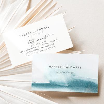
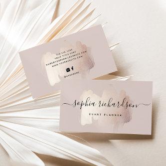
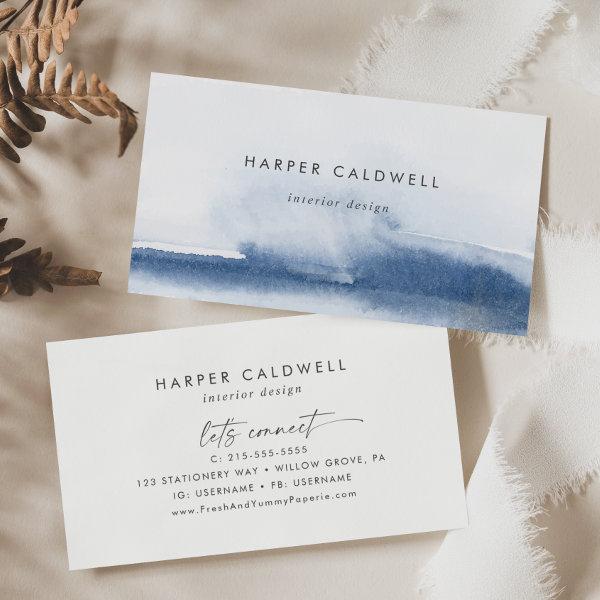 Modern Watercolor | Blue
This modern watercolor blue business card is perfect for a small business owner, consultant, stylist and more! The minimalist, classic and elegant design collection features simple water color paint brush strokes in pretty jewel tones.
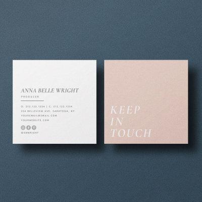
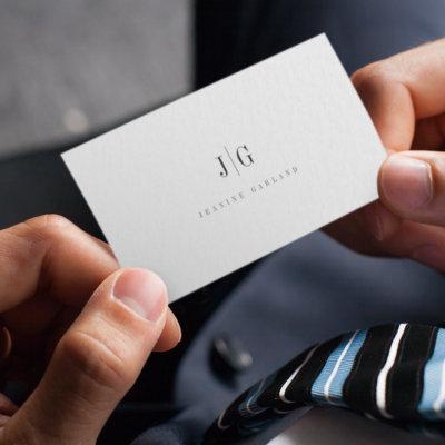
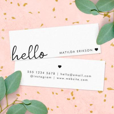
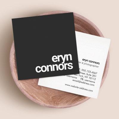
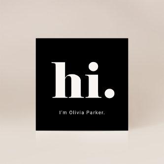
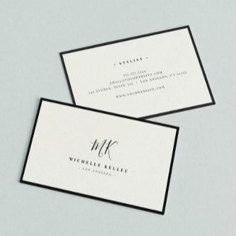
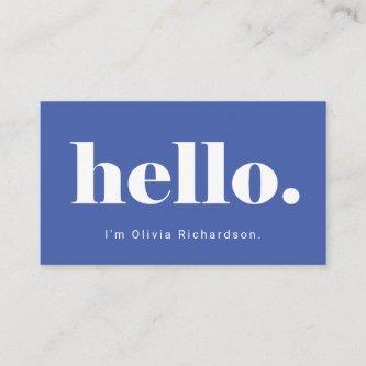
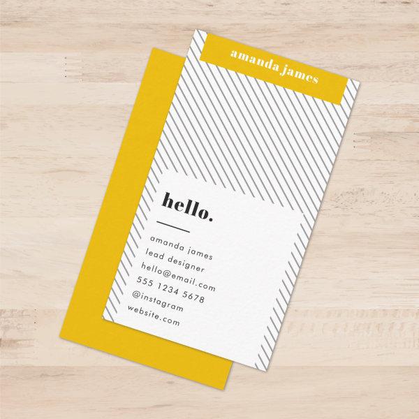
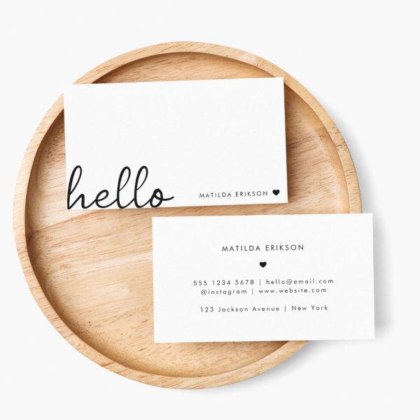 Minimal Hello | Modern Heart Clean Simple White
A minimal business card design with a stylish handwritten script large typograhy quote “hello” paired with your own name and a simple black heart. Designed in a modern mininalist style in clean simple black and white. The perfect personalized gift or accessory for any time of year!
Modern arch retro boho earth tone terracotta and beige photo qr code logo makeup photo , add your business photo . Add your social media. With a bold font, all the colors are editable , add your logo.
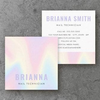
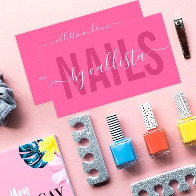
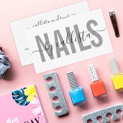
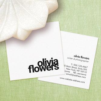
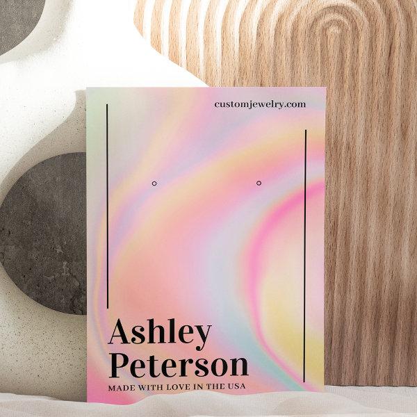 Modern girly marble rainbow script earring display
A modern simple and minimalist pink rainbow unicorn marble stylish jewelry earring display with hole markers that you can move around or delete with elegant modern simple bold font , all text and backgrounds colors are customizable, add your social media. With geometric stripes.
 Gold Black Bold Script 2 Photo Minimal QR Code Square
These modern, trendy business cards in black & gold would be great for any service/occupation. Easily add your details by clicking on the “personalize” option.
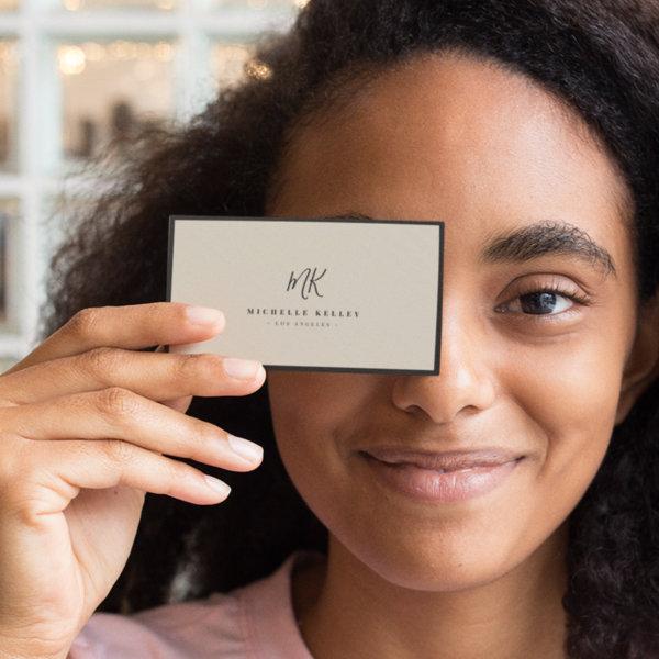 Luxury Minimal Monogram Natural Linen
Chic and stylish, this modern monogram business card on printed natural linen is a sophisticated minimalist design that combines your monogram in a hand lettered script along elegant serif typography. The thin black frame highlights the classic, timeless feel of this layout.
Related Designs
Here are related simple typography business cards. Find your business cards and create a buzz!


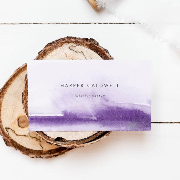 Modern Watercolor | Purple
This modern watercolor purple business card is perfect for a small business owner, consultant, stylist and more! The minimalist, classic and elegant design collection features simple water color paint brush strokes in pretty jewel tones.
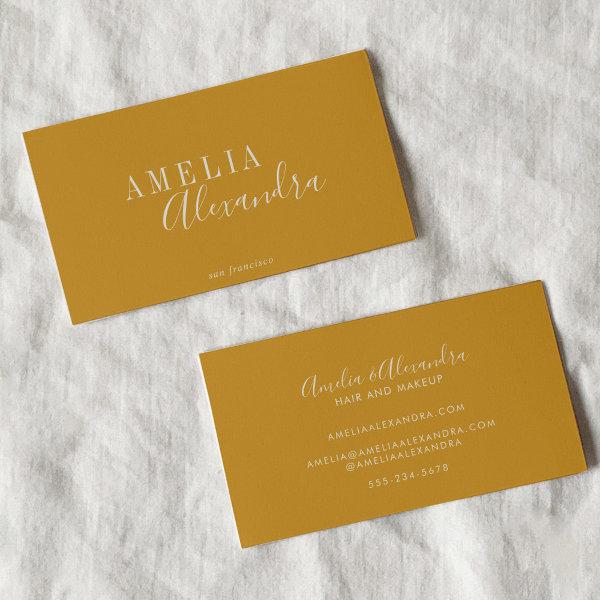 Minimalist Modern Script Boho Chic Mustard Yellow
Bold Minimalist Modern Professional Mustard Yellow Script Typography Business Card
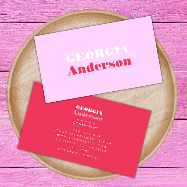 Retro Typography Pink and Red Minimalist Trendy Bu
These modern, trendy business cards would be great for both, personal or professional use. Easily add your details by clicking on the “personalize” option.
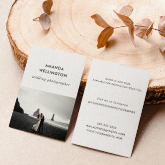
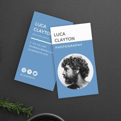
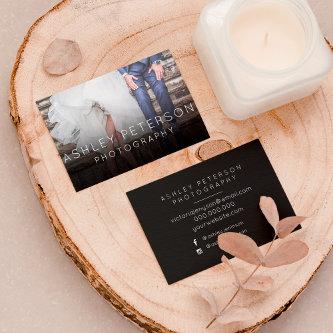
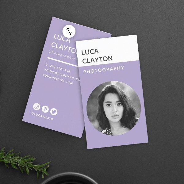 Modern Bold Stylish Typography Photographer
Modern and professional photography business cards featuring your photo in a circle frame with trendy minimalist typography. Add your contact information to the back. Includes three social media icons and a field for your username. Please delete any icons you don’t need in the design tool (bottom of personalization tab). This is the lavender version.
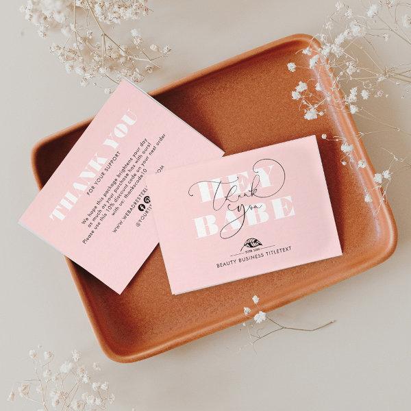 Prestige Brand Look Elegant Business Thank You Note Card
Editable colors cute, elegant script calligraphy business cards ‘Hey Babe Thank You’. These modern little note cards will get your customers’ attention and will stun everyone that opens your package.
 Minimal Simple Dusky Pink Feminine Soft Blush
A minimalist vertical business card design in a Scandinavian design style with a dusky blush pink feature color and contemporary typography. The text can easily be customized for a design as unique as you are!
Alternative Designs
With so many great simple typography business cards to choose from it can be hard finding the right one. But it helps to know that Card Bee’s catalog of business cards has something for everyone. It only takes a moment to find what you are looking for. For example we offer many different simple typography business cards designs, but we also have plenty of related card designs to choose from and start growing your brand. Try one of these categories.
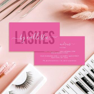

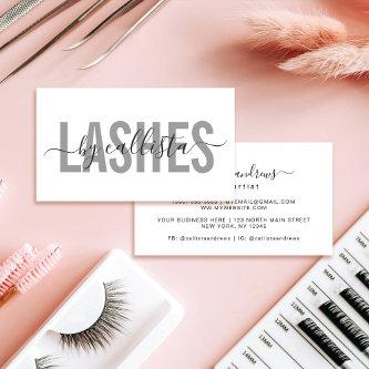
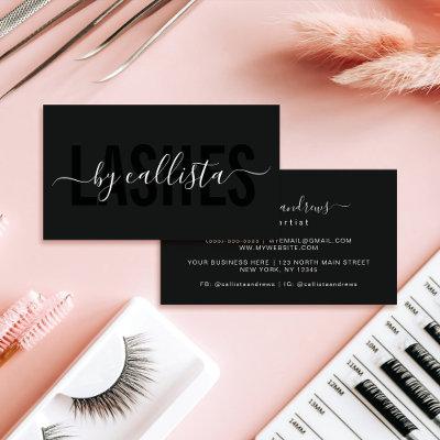
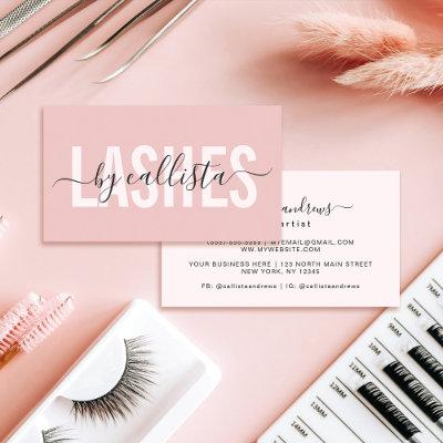
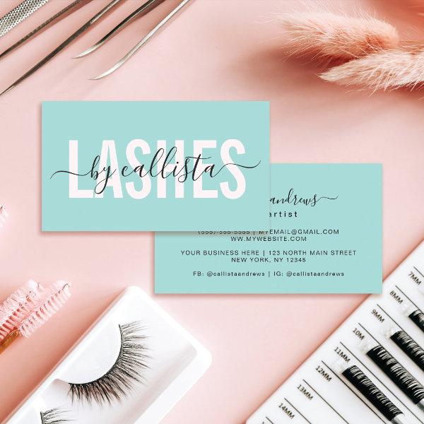 Elegant Modern Simple Mint Typography Lashes
This modern and simple business card is perfect for any professional. It features a contemporary and elegant black and white and cursive fonts on top of a minimalist mint pastel green background; the perfect design to attract potential customers. It’s a great choice for lash artists. ***IMPORTANT DESIGN NOTE: For any custom design request such as matching product requests, color changes, placement changes, or any other change request, please click on the “MESSAGE” button or email the designer directly at You can even email her a request for a completely custom and new design.
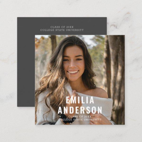 Simple Modern Black Graduation Photo QR Code Info Calling Card
Simple Modern Black Graduation Photo QR Code Info Calling Card
 Simple luxury black leather barber gold typography
Minimal elegant hand lettering typography script black and faux gold luxe modern barber stylist business card. ——- Suitable for freelancers, barber salon owner or employees.
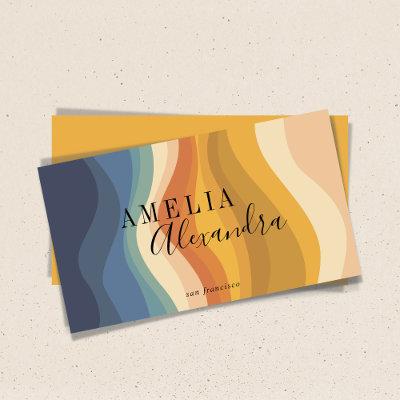
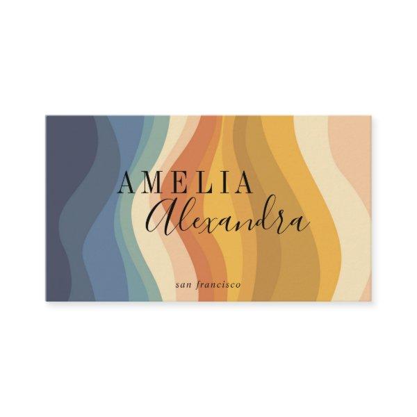 Boho Retro Script Abstract Wavy Lines Yellow QR
Boho Retro Script Abstract Wavy Lines Yellow Blue Business Card with QR Code
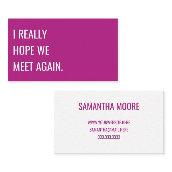 Unique Modern Bold Pink Typography Creative
I really hope we meet again: A simple, unique and creative business card design with modern typography in bold radiant pink and white. Fully customizable to fit your needs as a professional.
 Stylish Trendy Mustard Yellow Diagonal Stripe
A minimalist diagonal stripe pattern business cards in mustard yellow with retro vintage and contemporary typography. The text can easily be customized for a design as unique as you are!
Unleash Your Professionalism With Impressive And Polished Simple Typography Business Cards
In the realm of connecting, contact cards assume the role of unsung heroes. Small, modest, and often neglected, they hold the power to connect people in ways that goes beyond time and space. In a world where online communication dominates, these simple paper rectangles still manage to leave a lasting impression. But what if I told you that business cards could be more than just personal details on a sheet of paper? What if these humble cards had the possibility to become magnetic icebreakers and physical extensions of your brand? The craft of creating simple visiting cards that pack a impactful punch. Get ready to unleash the hidden potential of these unassuming small blocks.
Taking a more comprehensive look at the mysterious world of simple minimal business cards, we unravel their meaning, the components of their design, and the best strategies for putting them into practice. Whether you are just starting out as an business owner with big plans for your brand, or you are a seasoned pro looking to expand your professional circle, we’re here to help.
We have stepped into a new era where sharing contact details is not restricted to hurriedly writing it down on torn papers or relying only upon digital media. A meticulously crafted simple typography company card that captures professionalism and physical representation gives your personal brand voice. It creates a lasting impact on potential clients or business associates long after the initial introduction.
Additionally, designing an efficient simple typography business card requires more than just printing your full name and contact information on a piece of paper. When you are trying to achieve a certain result, you need to give careful consideration to a number of different elements, such as the palette, the choice of fonts, and the overall design aesthetic that appeals to both your industry and the demographic you are trying to reach.
We want to provide you practical tips and insightful observations that will enable you to create remarkable simple typography networking cards that will make an impression on everyone who receives them. We’ll also discuss tactics for fully utilizing these small devices to make connections, job search, and advance in your career.
When you attend activities such as conferences, meetings, or social gatherings that provide a wealth of opportunities, you should devote some of your time and effort to improving your simple minimal business cards because it has the potential to significantly change the course of your career. Equip your team to unlock its hidden powers and harness the advantages provided by this modest, yet captivating marketing device.
Let’s set out on this adventure together and see what we can learn about the art of making extraordinary business cards that can open doors and help people make genuine connections by pushing the boundaries of what was previously thought to be possible.
If your organization has multiple staff members or departments, consider incorporating different color variations for each team member’s business card. Take a comprehensive approach by examining and integrating all pertinent forgotten elements as well:
-
Choosing the printing technique (offset vs. digital).
-
Don’t forget to write your signature and provide up-to-date contact details.
-
Both the target audience and industry have crucial roles.
-
Giving it a sophisticated finish through debossing and foiling.
Making A Enduring First Impression And Fostering Relationships With Potential Customers And Partners

Sometimes, the most straightforward solutions are the highly efficient ones in the business industry. Simple minimal business cards are a testament to the influence of understated elegance and refined professionalism. With crisp lines, muted colors, and a restrained design, these cards allow your name and contact information to take center stage. By adopting a simple approach, you showcase a level of confidence and clarity in your brand that is sure to leave a lasting impression on those who receive your card. In a sea of flashy designs and busy layouts, simple business cards catch the eye as a refreshing change, allowing you to make a statement without saying too much. So why make things complicated things? Embrace the simplicity of simplicity and let your business card do the talking for you.
It is vital beyond measure to achieve a thorough comprehension of the complexities inherently present in your unique industry and its corresponding set of expectations. The degree of formality, innovation, or innovation needed in calling cards can differ across many sectors. To exemplify, a legal practice might opt for a design that emanates a sense of tradition and elegance, while a graphic design agency may lean towards an aesthetic that is dynamic and artistic. Create professionally designed business cards that adhere to industry standards, facilitating seamless connections with your intended audience while ensuring a unforgettable and long-lasting effect.
Business Cards: The Art Of Synthesis
One can masterfully create a graphic narrative that is in line with the fundamental principles and identity of their company if they give careful consideration to the incorporation of a selection of graphic components. Giving careful attention to detail during the picking process is essential in order to ensure that the fonts, colors, and imagery align with widely recognized standards and expectations specific to your sector. Establishing an enduring visual representation that reliably resonates across every advertising platform enhances the foundation upon which robust brand recognition is erected, fostering instant consumer familiarity and allegiance.
Consideration of business-specific requirements should be of utmost priority when choosing design components for a visiting card. You can make simple minimal business cards that really stick with people in your industry if you let your imagination run wild, master the ins and outs of the industry, fully embrace technological advances, use only the highest quality materials, pare down designs to their essence, and never stray from your brand’s core values.
Search for Related Simple Typography Business Cards
Dive into the selection to find the perfect name cards that are tailored precisely to match both your personal aesthetic and the professional field in which you work.
Paper Types
Here is a list of available paper types. Each paper type has its own unique qualities that deliver amazing results for your marketing efforts. Choose the style that best suites your needs and make the opportunities you deserve.
All paper types are made in the US unless otherwise stated.
- Standard Matte
» 17.5 pt thickness — 120 lb weight — 324 GSM
» Light white, uncoated matte finish with an eggshell texture.
» Made and printed in the USA
- Standard Semi-Gloss
» 16 pt thickness — 150 lb weight — 400 GSM
» Bright white, semi-gloss finish
» 50% recycled content
» FSC certified
» Paper imported from Italy;
- Signature UV Gloss
» 18 pt thickness — 325 GSM
» Bright white, high-gloss finish
» UV coating adds an additional layer of protection
» Made and printed in the USA
- Signature UV Matte
» 6 pt thickness — 130 lb weight — 352 GSM
» Cream white, matte finish
» Made with 30% post consumer fiber
» Paper is easy to write on and won’t smudge
» FSC certified; made with 100% green electricity
» Made and printed in the USA
- Signature Cream
» 21 pt thickness — 325 GSM
» Bright white, velvety soft silk finish
» Premium laminate finish adds an additional layer of protection
» Made and printed in the USA
- Premium Silk
» 16 pt thickness — 130 lb weight — 352 GSM
» Solar white, uncoated linen finish
» Embossed texture adds depth and refinement
» Made with 30% post consumer fiber
» FSC certified; made with 100% green electricity
» Made and printed in the USA
- Premium Linen
» 16 pt thickness — 130 lb weight — 352 GSM
» Solar white, uncoated linen finish
» Embossed texture adds depth and refinement
» Made with 30% post consumer fiber
» FSC certified; made with 100% green electricity
» Made and printed in the USA
- Premium Pearl
» 16 pt thickness — 130 lb weight — 350 GSM
» Soft white, coated shimmer finish
» Adds an elegant subtle sheen
» FSC certified
» Paper imported from Italy; printed in the USA
- Premium Kraft
» Kraft, smooth and refined vellum finish
» Printed with a white underlayer to help color pop
» Made with 30% post consumer fiber
» FSC certified; made with 100% green electricity
- Premium Grey
» 16 pt thickness — 130 lb weight — 352 GSM
» Neutral grey, smooth finish
» Printed with a white underlayer to help color pop
» Made with 30% post consumer fiber
» FSC certified; Made with 100% green electricity
» Made and printed in the USA
- Premium Black
» 16 pt thickness — 130 lb weight — 352 GSM
» Deep black, smooth finish
» Printed with a white underlayer to help color pop
» Made with 30% post consumer fiber
» FSC certified; made with 100% green electricity
» Made and printed in the USA
- Premium Thick
» 32 pt thickness — 240 lb weight — 650 GSM
» Light white, uncoated matte finish with an eggshell texture
» Paper is easy to write on and won’t smudge
» Made and printed in the USA
» Not available for rounded corner option