


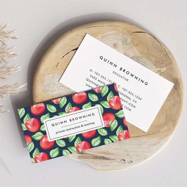
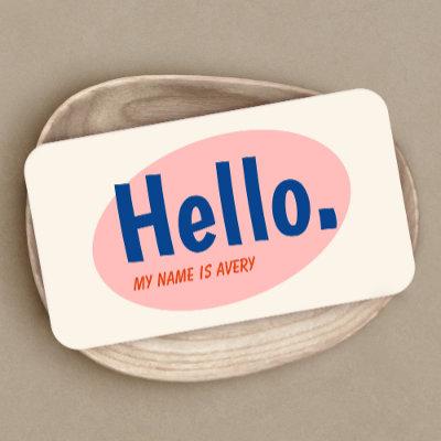
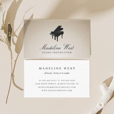
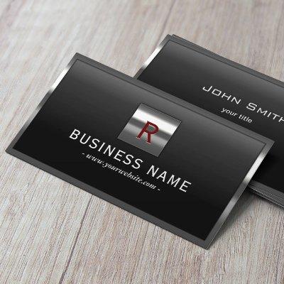
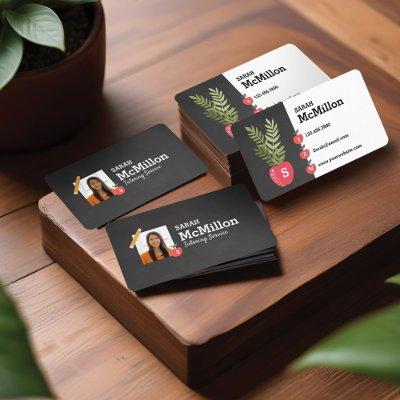
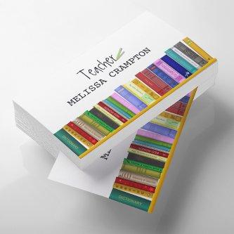
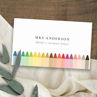
Fantastic Options for Teacher Instructor Business Cards
We have plenty of great options for teacher instructor business cards. If you’re looking for the unique designs that will make you business stand out these cards are for you.

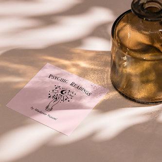
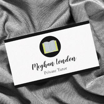
Related Designs
Here are related teacher instructor business cards. Find your business cards and create a buzz!

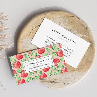


Alternative Designs
With so many great teacher instructor business cards to choose from it can be hard finding the right one. But it helps to know that Card Bee’s catalog of business cards has something for everyone. It only takes a moment to find what you are looking for. For example we offer many different teacher instructor business cards designs, but we also have plenty of related card designs to choose from and start growing your brand. Try one of these categories.


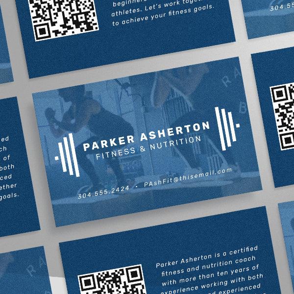

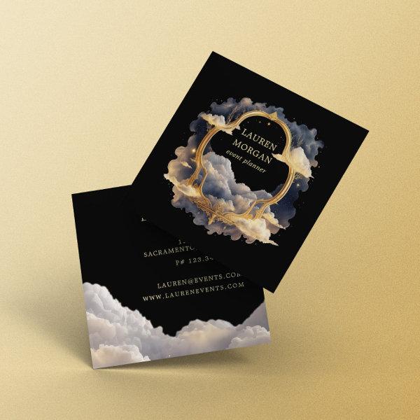
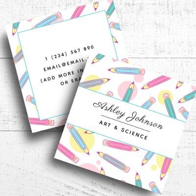
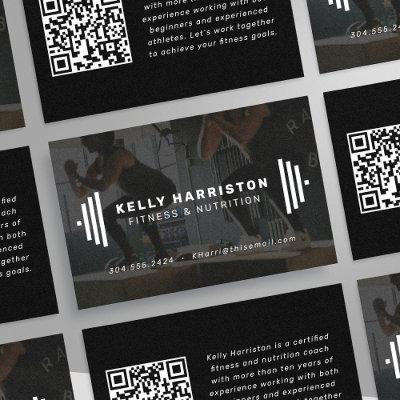
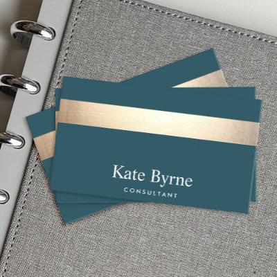
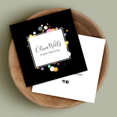
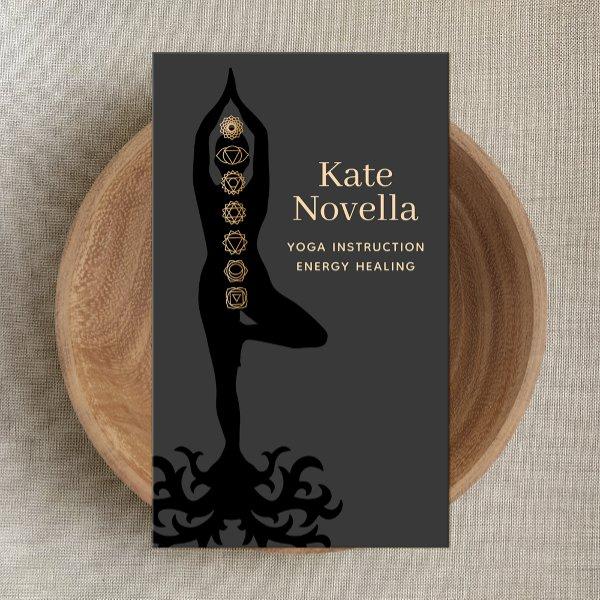
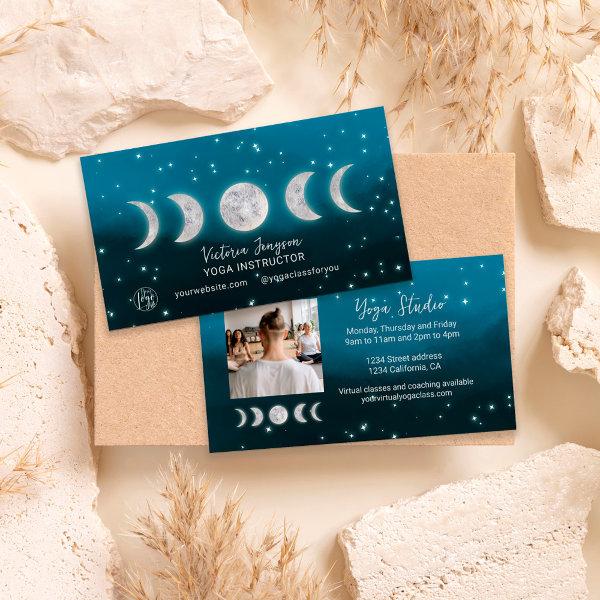
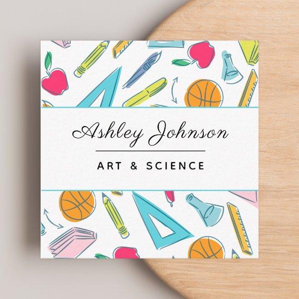
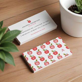
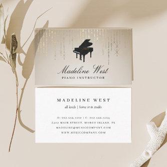
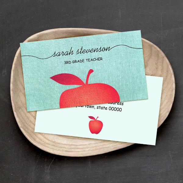
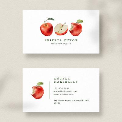
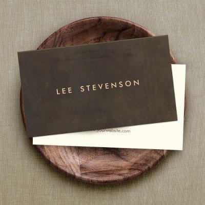
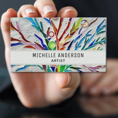
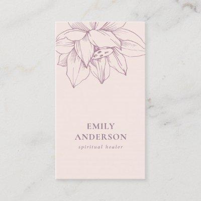
Impress Customers With Unique Teacher Instructor Business Cards
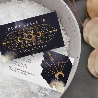
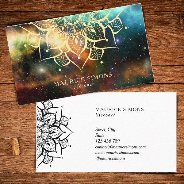
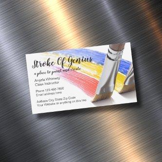
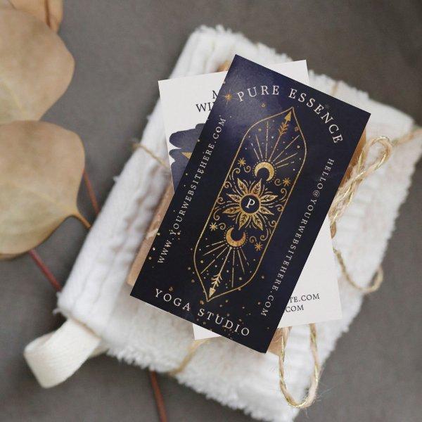
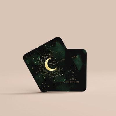
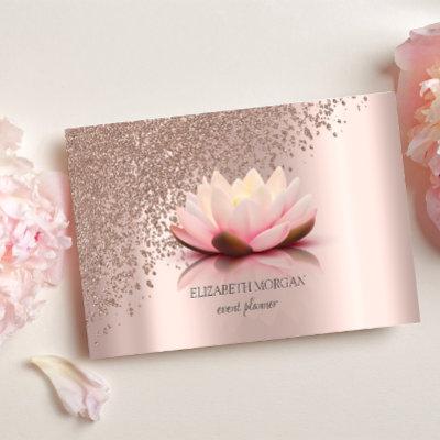
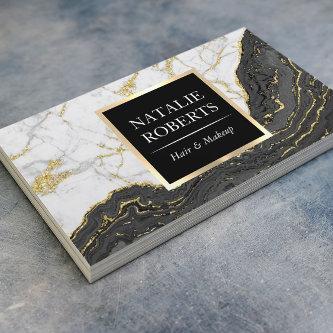
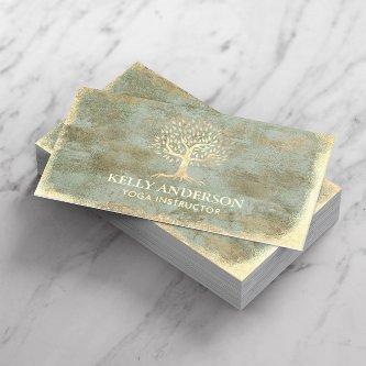
The use of watercolor business cards have become increasingly popular in recent years, as they offer a unique and artistic approach to representing one’s brand or business. This captivating medium allows for the use of vibrant colors and delicate brushstrokes that can evoke a sense of creativity and professionalism. With their eye-catching design and personalized touch, watercolor business cards are sure to make a lasting impression on clients and potential customers. Whether you are an artist, designer, or simply want to stand out from the crowd, watercolor business cards provide an elegant and memorable way to showcase your identity.
Design components and ideal implementation tactics. For those aspiring entrepreneurs focused on establishing their own one-of-a-kind brand or experienced professionals intent on expanding their network, look no further than our inclusive assistance.
We have said goodbye to the times when sharing contact details required putting it on paper on scraps of paper or only using digital channels. Your personal identity is brought to life by a name card that has been designed by a expert and that exudes sophistication while also providing a physical representation of your brand. It creates a memorable impression on potential clients or partners even well after the initial meeting.
But designing an impactful watercolor business cards involves more than just slapping your name and phone number onto a piece of paper. Taking into account the preferences of both your industry and your clientele is essential when deciding on design elements like palette, font choice, and overall design style.
In the following text, we will discuss valuable tips and informative viewpoints to assist you in creating impressive teacher instructor business cards that will leave a lasting impression. In additionally, we’ll show you how to make the most of these small but powerful resources to advance your professional life and develop influential connections.
When it comes to activities such as going to conferences, sessions, or networking functions that offer a range of opportunities and prospects for advancement, putting in the effort to perfect your networking card has the potential to completely alter the path that your accomplishments will take in the future. Get ready to promote its unseen benefits and gain the benefits of this simple yet powerful advertising tool.
Side by side, let’s embrace the challenge of perfecting the craft of creating professional cards that go beyond mere paper, serving as gateways to remarkable connections and untapped potential.
Consider using different color variations for each team member’s corporate card if your company has several employees or departments. Remember to consider these further factors:
-
Choosing a typeface.
-
Using techniques like embossing and foiling to create a high-end appearance.
-
Include your name, title, and your precise contact information.
Search
Expanding Future Collaborations And Prospects
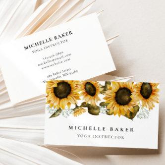
The use of watercolor to create one’s business cards provides a novel and artistic approach to the process of establishing one’s individual branding. Featuring vibrant colors and elaborate patterns rooted in nature, these cards possess the unique power to instantly grab attention while leaving an unforgettable mark on potential clients or partners. Whether you are engrossed in the world of artistic expression or merely search for an identity that stands out, watercolor business cards offer an outstanding avenue to showcase your unique blend of artistry and professionalism. By deliberately selecting pertinent design elements alongside top-notch materials through a rigorous process, individuals have the means to develop business cards which aptly resonate within existing industry norms while emanating an authentic representation of themselves. Should one not strive for greatness and reject to settle for anything less, particularly when given the option of choosing business cards featuring captivating watercolor designs?
Gaining a comprehensive awareness concerning the varied nature pervasive within one’s specific field or sector is crucial for effectively aligning oneself with its accompanying expectations. The required level of professionalism, innovation, or innovation in teacher instructor calling cards varies among industries. By way of illustration, we can examine how law firms often choose to adopt specific aesthetics that exude an atmosphere steeped in time-honored traditions and graceful sophistication—this choice serves as a representation of their unwavering commitment to upholding conventional values. On the other hand, one may observe how graphic design agencies tend to gravitate towards an aesthetic characterized by its dynamic nature and artistic expression. Ensuring that you follow the established standards and practices within the industry when designing your visiting cards is crucial for forging an important connection with your desired market and making a lasting impression.
When talking about the creation of triumphant business cards, it should be noted that including minimalism into their design promotes optimal effectiveness and ensures positive outcomes. When too much quantities of data are introduced or when there is an excess of visual elements in the layout design, it tends to overwhelm recipients and subsequently undermines material effectiveness considerably. Focus instead on the fundamentals: the name of your company, its logo, how to get in touch with customers, and, if applicable, a unforgettable slogan.
Finding Unity In Diversity
Upon being presented with the responsibility to select calling cards, it becomes apparent and undoubtedly that a key determination lies in opting for an suitable material option. Making conscious decisions becomes essential when striving for longevity and sustainability; thus, opting for durable resources like top-grade cardstock or eco-sensitive substitutes becomes crucial. The act of personally gripping a meticulously created greeting card can have an unforgettable impact on the psychological well-being of the people fortunate enough to receive it.
Thoughtfully consider the composition of visual elements that perfectly represents your company’s ethos. Thoroughly examining the suitability between selected fonts, colors, and imagery against established guidelines and commonly held expectations in your field is a matter of great significance. Paving the path towards stronger brand recognition involves creating and sustaining a visually congruent presence throughout all promotional materials, promoting quicker consumer recall.
In order to make a prudent choice regarding visual elements for one’s business cards, it is paramount to carefully consider and understand the explicit prerequisites unique to their respective profession. When designing watercolor business cards that leave a profound and long-lasting impression on those who get them within your professional sphere, it is essential to conduct research into the depths of the standards that are placed on your industry, to enthusiastically adopt emerging technologies with open arms, to utilize only the best materials that are available, to distill your design down to its simplest form, and to ensure unwavering consistency with your brand identity. These are the essential ingredients.
Paper Types
Here is a list of available paper types. Each paper type has its own unique qualities that deliver amazing results for your marketing efforts. Choose the style that best suites your needs and make the opportunities you deserve.
All paper types are made in the US unless otherwise stated.
- Standard Matte
» 17.5 pt thickness — 120 lb weight — 324 GSM
» Light white, uncoated matte finish with an eggshell texture.
» Made and printed in the USA
- Standard Semi-Gloss
» 16 pt thickness — 150 lb weight — 400 GSM
» Bright white, semi-gloss finish
» 50% recycled content
» FSC certified
» Paper imported from Italy;
- Signature UV Gloss
» 18 pt thickness — 325 GSM
» Bright white, high-gloss finish
» UV coating adds an additional layer of protection
» Made and printed in the USA
- Signature UV Matte
» 6 pt thickness — 130 lb weight — 352 GSM
» Cream white, matte finish
» Made with 30% post consumer fiber
» Paper is easy to write on and won’t smudge
» FSC certified; made with 100% green electricity
» Made and printed in the USA
- Signature Cream
» 21 pt thickness — 325 GSM
» Bright white, velvety soft silk finish
» Premium laminate finish adds an additional layer of protection
» Made and printed in the USA
- Premium Silk
» 16 pt thickness — 130 lb weight — 352 GSM
» Solar white, uncoated linen finish
» Embossed texture adds depth and refinement
» Made with 30% post consumer fiber
» FSC certified; made with 100% green electricity
» Made and printed in the USA
- Premium Linen
» 16 pt thickness — 130 lb weight — 352 GSM
» Solar white, uncoated linen finish
» Embossed texture adds depth and refinement
» Made with 30% post consumer fiber
» FSC certified; made with 100% green electricity
» Made and printed in the USA
- Premium Pearl
» 16 pt thickness — 130 lb weight — 350 GSM
» Soft white, coated shimmer finish
» Adds an elegant subtle sheen
» FSC certified
» Paper imported from Italy; printed in the USA
- Premium Kraft
» Kraft, smooth and refined vellum finish
» Printed with a white underlayer to help color pop
» Made with 30% post consumer fiber
» FSC certified; made with 100% green electricity
- Premium Grey
» 16 pt thickness — 130 lb weight — 352 GSM
» Neutral grey, smooth finish
» Printed with a white underlayer to help color pop
» Made with 30% post consumer fiber
» FSC certified; Made with 100% green electricity
» Made and printed in the USA
- Premium Black
» 16 pt thickness — 130 lb weight — 352 GSM
» Deep black, smooth finish
» Printed with a white underlayer to help color pop
» Made with 30% post consumer fiber
» FSC certified; made with 100% green electricity
» Made and printed in the USA
- Premium Thick
» 32 pt thickness — 240 lb weight — 650 GSM
» Light white, uncoated matte finish with an eggshell texture
» Paper is easy to write on and won’t smudge
» Made and printed in the USA
» Not available for rounded corner option