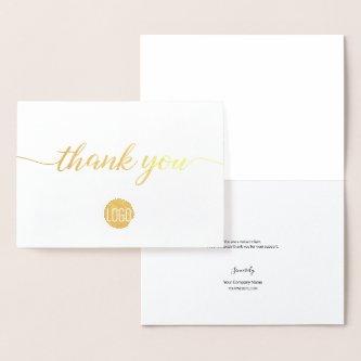
Fantastic Options for Touch Business Cards
We have plenty of great options for touch business cards. If you’re looking for the unique designs that will make you business stand out these cards are for you.
 "Touch Wood" Pilates
Business cards for Pilates Instructors. The design features an icon of a person performing Pilates. All text is fully configurable for the entry your own details.
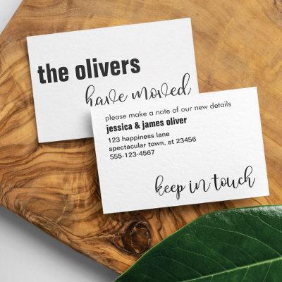
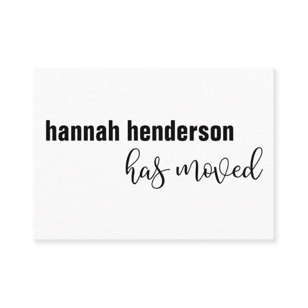 Modern Black & White Single Person Has Moved Card
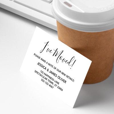
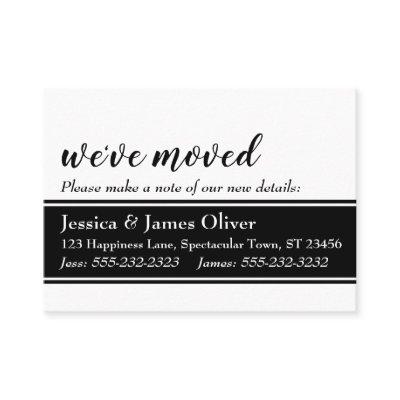
Keep your friends and family up to date with your new address using these minimal enclosure cards. The design features contrasting typography elements, in all lowercase letters. Your name appears in a bold, heavy sans serif font, on the left of the card’s front. Beneath that to the right, I’ve placed a typography graphic overlay that features a fat, modern script font, which reads “has moved”. On the back, variations of the sans serif font were used in the template setup where you will add your personal details; just use the provided field to replace my place holders with your own. These details appear left-aligned and at the top of the back. At the bottom right, using the same script font from the front, I’ve added “keep in touch”. If you would like to change the font or sizes of any of your personal details, please just click to customize further. There, too, you will be able to add more lines of text, such as additional phone numbers, should that be needed. The background was set up as an editable white; change this to any color you prefer. // A variation is also available with wording appropriate for a family’s move details. // // Designed by Melody Watson for Paper Muserie.
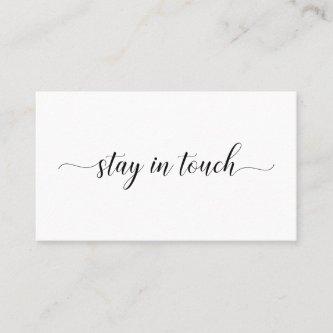
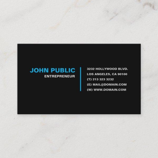 Stay in Touch
A simple but effective business card which says “Stay in Touch!”. This modern black business card includes your contact details, such as your name, title, address, phone, email and website. Feel free to personalize font type, color, size and text placement to your liking. Ideal for real estate agents, consultants, motivational speakers and professionals.
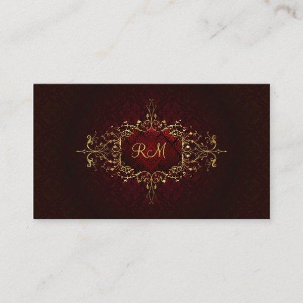 Elegant Black Touch Of Red Vintage Lace Frame
Elegant black and gold vintage ornate lace frame on damasks pattern and swirls. Touch of red color. Available on other products. Custom initials on front. This is a Template and it is fully customizable.
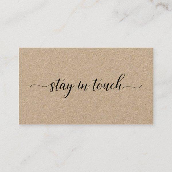 Stay In Touch Elegant Black Script Kraft Calling Card
Easily share your contact information after graduation with a premium Kraft paper calling card featuring the words “stay in touch” on the front in an elegant black script font. Add your name, the college you’ll attend, and customize the contact information on the back. Perfect for a recent graduate or anyone who wants to keep in friendly contact. Other paper types available in the sidebar.
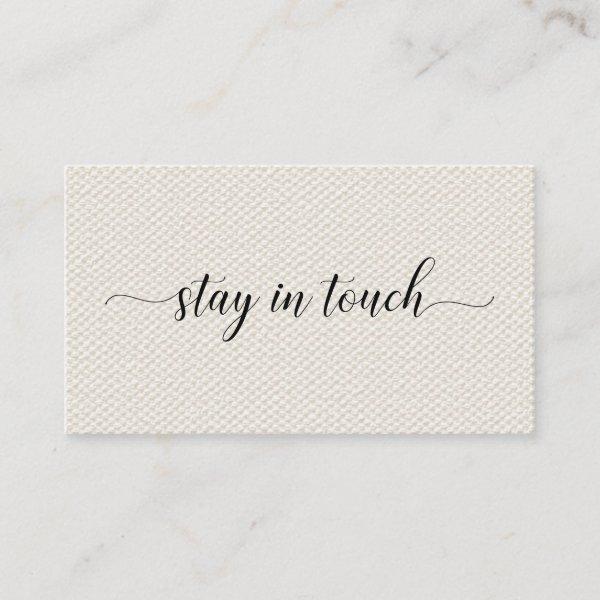 Stay In Touch Elegant Script on Beige Faux Canvas Calling Card
Easily share your contact information after graduation with a minimal calling card featuring the words “stay in touch” on the front in an elegant black script font on a beige printed faux canvas background. Add your name, the college you’ll attend, and customize the contact information on the back. Perfect for a recent graduate or anyone who wants to keep in friendly contact.
Related Designs
Here are related touch business cards. Find your business cards and create a buzz!
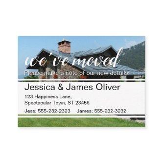
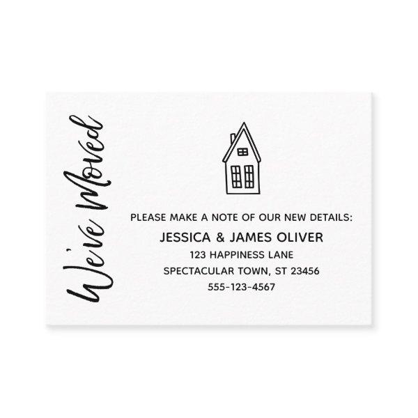 Modern "We've Moved" Card w/ Little House Drawing
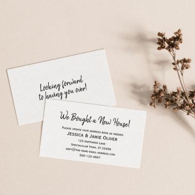
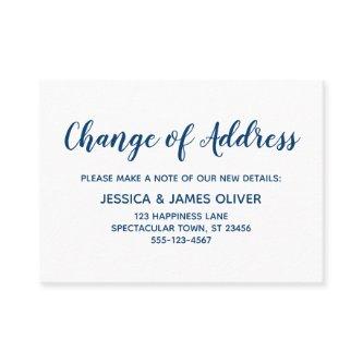
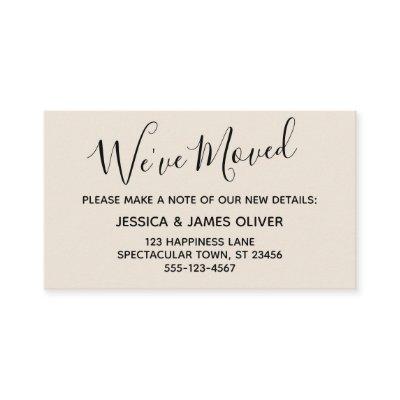
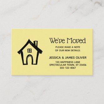
Keep your friends and family up to date with your new address using these simple, elegant enclosure cards. You can insert them into your mailings or share them in person, as you run into people you need to notify. When you want a distinctive method for letting your tribe know how to find you, this card is versatile enough for anyone. It features pretty typography graphics that read “We’ve Moved” on the front and “Keep in touch!” on the back, using a modern, casual, handwritten script font. I’ve placed a little house illustration on the front and red watercolor heart outline on the back, adding a distinctive touch. Use the template fields to add all your own details to personalize this design for your own use. If you’d like to change the pretty, simple sans-serif font I used for the editable text, or wish to move some lines elsewhere, click the link to customize the card further. The black type was placed over an editable white background; you can change the background to any color you wish. // // Designed by Melody Watson for Paper Muserie.
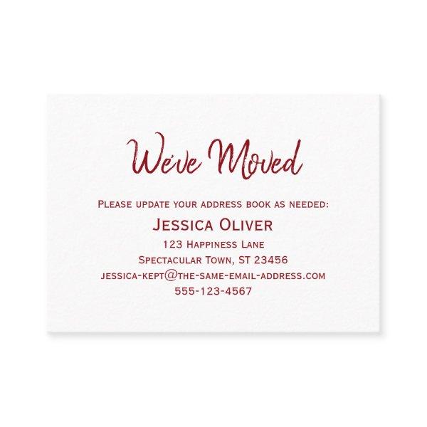 Deep Red on White "We've Moved" Card
Keep your friends and family up to date with your new address using these simple, elegant enclosure cards. Versatile notes read “We”ve Moved” on the front and “Keep in Touch!” on the back, using a modern, casual, handwritten script font. Use the template fields to add all your own details to personalize this design for your personal use. The deep red type was placed over editable white; you can change the background to any color you or even add an image, if you prefer. Likewise the fonts or their colors can be changed if you want to edit the design a bit more. // Designed by Melody Watson for Paper Muserie.
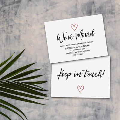
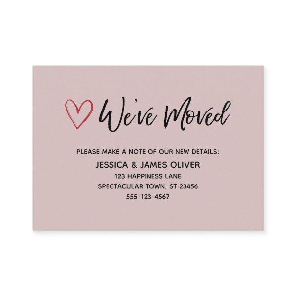 We've Moved Handwriting Red Hearts Dusty Rose
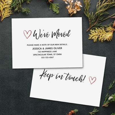
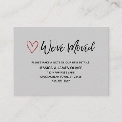
Keep your friends and family up to date with your new address using these simple, elegant enclosure cards. You can insert them into your mailings or share them in person, as you run into people you need to notify. When you want a distinctive method for letting your tribe know how to find you, this card is versatile enough for anyone. It features pretty typography graphics that read “We’ve Moved” on the front and “Keep in touch!” on the back, using a modern, casual, handwritten script font. I’ve placed a little red watercolor heart outline on each side for an added personal touch. Use the template fields to add all your own details to personalize this design for your own use. If you’d like to change the pretty, simple sans-serif font I used for the editable text, or wish to move some lines elsewhere, click the link to customize the card further. You can change the background to any color you wish. // //
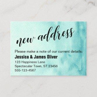
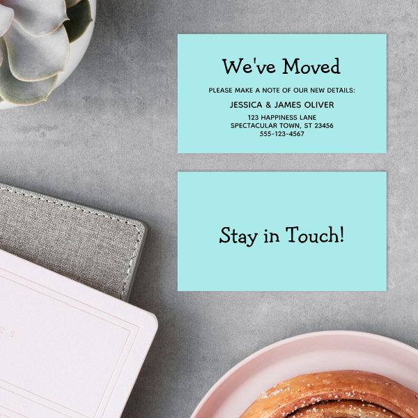 Simple, Casual, Turquoise "We've Moved" Card
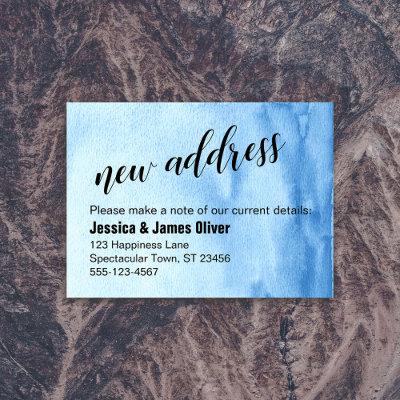
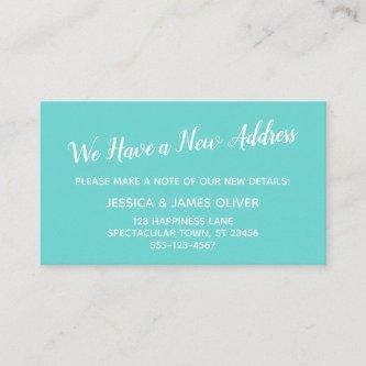
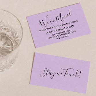
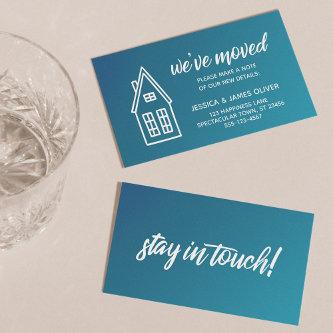
Keep your friends and family up to date with your new address using these simple, fun enclosure cards. Versatile headers read “We’ve Moved” on the front and “Stay in Touch!” on the back, using a modern, casual font. Use the template fields to add all your details to personalize this design for your own use. The black type was placed over an editable turquoise; you can change the background to any color you wish. Likewise the fonts can be changed if you’d like to edit the design a bit more. // Designed by Melody Watson for Paper Muserie.
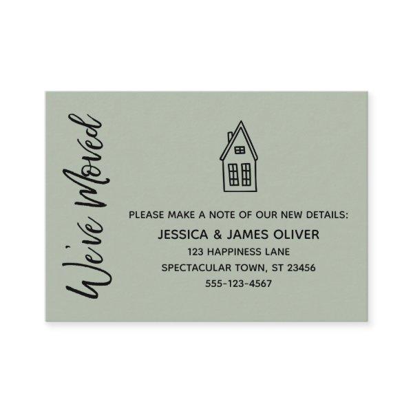 Sage "We've Moved" Card w/ Little House Drawing
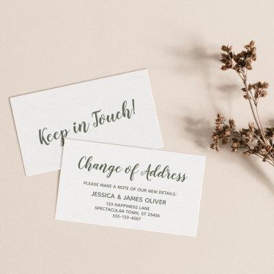
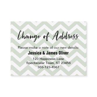
Keep your friends and family up to date with your new address using these simple, elegant enclosure cards. You can insert them into your mailings or share them in person, as you run into people you need to notify. When you want a distinctive method for letting your tribe know how to find you, this card is versatile enough for anyone. It features pretty typography graphics that read “We’ve Moved” on the front and “Keep in touch!” on the back, using a modern, casual, handwritten script font. I’ve placed a little house illustration on the front and red watercolor heart outline on the back, adding a distinctive touch. Use the template fields to add all your own details to personalize this design for your own use. If you’d like to change the pretty, simple sans-serif font I used for the editable text, or wish to move some lines elsewhere, click the link to customize the card further. The black type was placed over an editable sage background; you can change the background to any color you wish. // // Designed by Melody Watson for Paper Muserie.
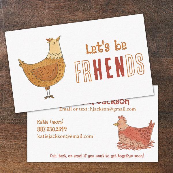 Chicken Friends Pun Kids Calling Card
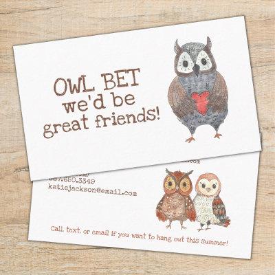
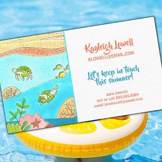
A personal calling card for kids! This cute chicken themed calling card features room for all of your contact information so your children can keep in touch with their friends over summer break or with new friends they meet while out and about! Also perfect for kids to exchange and hang out in between sports seasons! This business card just for parents and kids features adorable chicken illustrations with pun text, “Let’s be frHENds” on the front side. There is plenty of room for your email, phone numbers, address, or any other information you’d like to include on the back side! Don’t lose out on new friends – keep these mom contact cards handy while you’re at the playground, park, pool, school, or sports fields to quickly hand out to other parents so you’re sure not to lose touch!
Alternative Designs
With so many great touch business cards to choose from it can be hard finding the right one. But it helps to know that Card Bee’s catalog of business cards has something for everyone. It only takes a moment to find what you are looking for. For example we offer many different touch business cards designs, but we also have plenty of related card designs to choose from and start growing your brand. Try one of these categories.
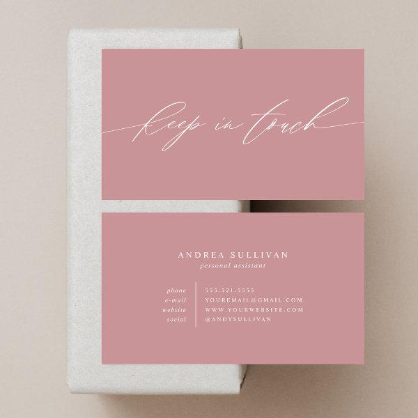 Minimalist Dusty Rose Keep in Touch Contact or
This dusty rose, minimalist contact or business card is perfect for anyone who wants to share their personal information with people they just met or potential business clients.
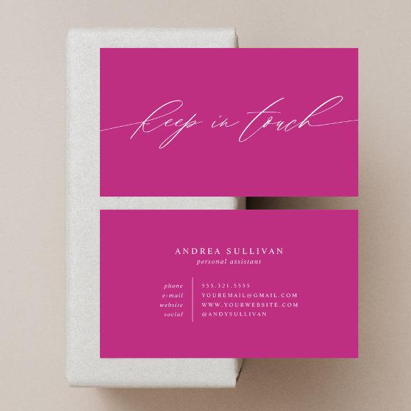 Minimalist Pink Keep in Touch Contact or
This minimalist contact or business card is perfect for anyone who wants to share their personal information with people they just met or potential business clients.
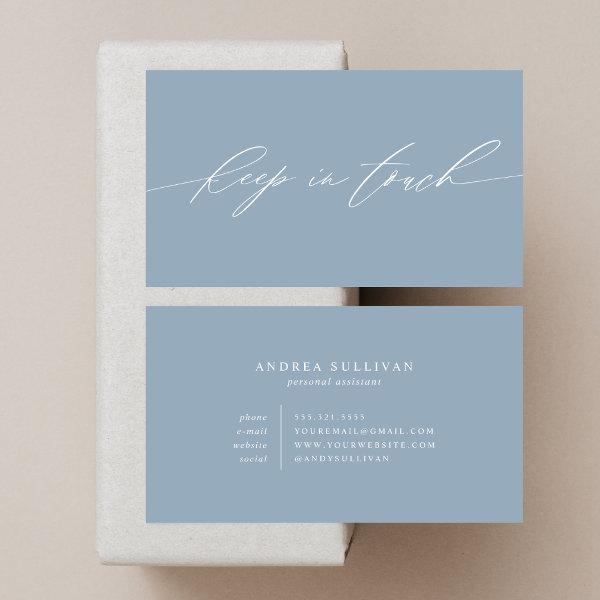 Minimalist Dusty Blue Keep in Touch Contact or
This dusty blue, minimalist contact or business card is perfect for anyone who wants to share their personal information with people they just met or potential business clients.
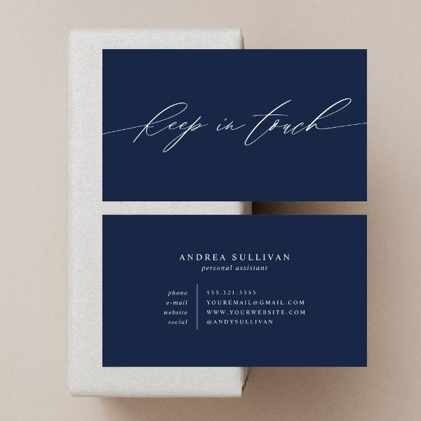 Minimalist Navy Blue Keep in Touch Contact or
This blue, minimalist contact or business card is perfect for anyone who wants to share their personal information with people they just met or potential business clients.
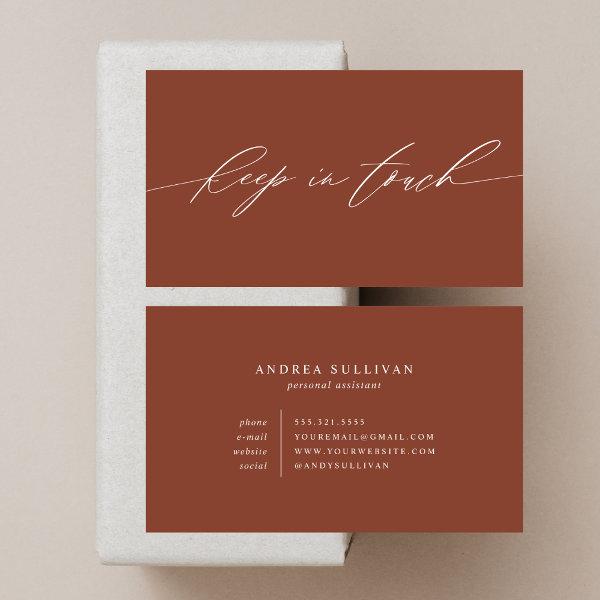 Minimalist Terracotta Keep in Touch Contact or
This terracotta, minimalist contact or business card is perfect for anyone who wants to share their personal information with people they just met or potential business clients.
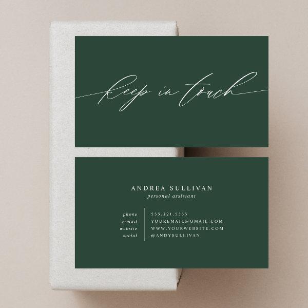 Minimalist Green Keep in Touch Contact or
This green, minimalist contact or business card is perfect for anyone who wants to share their personal information with people they just met or potential business clients.
This Technique Is Going To Completely Change The Game For Your Career Credibility
Typography business cards offer a rejuvenating break from the ordinary and predictable world of typical business card design. These fashionable and eye-catching cards go beyond the realm of ordinary fonts, embracing the artistry of lettering to make a bold statement. By expertly blending different fonts, sizes, and layouts, typography business cards effortlessly capture attention and leave a lasting impression. Together we will discover the one-of-a-kind and captivating world of typography business cards, delving into their creative potential, practical benefits, and how they can help you differentiate yourself in a sea of uniformity. So bid farewell to the generic patterns and begin an exciting journey where words become graphic masterpieces on these tiny canvases.
Let’s plunge deep into the fascinating world of touch visiting cards – examining their significance, aesthetic features, and optimal deployment methods. We have you covered whether you are a emerging business owner trying to establish your brand or a seasoned professional trying to broaden your network.
The traditional means of swapping contact information, such as writing it onto scraps of paper or relying solely on online platforms, are now considered to be outmoded methods of conducting such transactions. You can convey a professional image and capture the core of your personal brand in one organized presentation by giving careful consideration to the design of your touch business card. It makes sure that your name stays fresh in the minds of potential clients or partners long after the initial engagement.
Regardless, crafting an efficient touch business card requires more than just sticking your name and contact information onto a piece of paper and calling it good. Taking into account the preferences of both your industry and your clientele is essential when deciding on design elements like palette, font choice, and overall design style.
We’ll provide useful tips and educational viewpoints in the upcoming text to assist you in creating impressive calling cards that will leave a lasting impression when given out. Additionally, we will discover approaches to utilize these pocket-sized assets in a manner that unleashes their full potential, enabling the creation of significant connections and boosting your professional progress.
Attending conferences, gatherings or events with an abundance of opportunities requires investing adequate time into perfecting your name card as its impact has the potential to completely transform the way you play the game. Prepare yourself to unleash the hidden potential of this underutilized marketing tool and to take advantage of the possibilities it presents.
Together, let’s immerse ourselves in the realm of creating extraordinary visiting cards that challenge the norm and enable deep connections to thrive in unforeseen ways.
Consider these factors while selecting the perfect touch business cards for your requirements.
-
Get it right with choosing accurate correct measurement and dimensions: Choose a striking card shape or dimension that exudes originality, complements your brand’s ethos, and is relevant to its particular industry to stand out from the crowd. Extend your imagination and consider unconventional options, like rounded corners or intricate designs.
-
Consider functionality: Expand your business calling card’s purpose by going beyond mere contact details. Information exchange can be made more functional by including extra features like QR codes, reminders for appointments, or even tiny calendars.
-
Improve your brand by trying out new, interesting printing styles: Immerse yourself in a blend of creativity and craftsmanship by exploring an assortment of printing methods including hot foil stamping, raised lettering, UV spot coating, or traditional letterpress to infuse your touch business card design with tactile sensations and dimensional allure. You can increase your card’s attractiveness and create a memorable sensory experience by utilizing these methods.
-
Stay consistent with branding: Ensure an unified aesthetic experience by strategically aligning different visual cues on your business cards with your company’s overall branding. To create easily distinguishable branding and maintain an overall unified look within various advertising mediums, opt for consistency in font selection, aesthetic color palettes, and graphical elements.
Search for Related Touch Business Cards
Harnessing Professional Success
In a world saturated with digital communication, typography business cards offer a refreshing and tangible way to make a enduring impression. The careful selection of typefaces can convey not only your personal style but also the essence of your brand. From sleek and modern non-serif fonts to refined and sophisticated serif options, the possibilities are endless. By combining the right fonts with striking design elements, these cards turn into a strong tool for showcasing your imagination and attention to detail. So why settle for ordinary business cards when you can create a font-based masterpiece that embodies the spirit of your industry? Remember, in the realm of professional branding, choosing the appropriate typeface is just as important as choosing the right words to convey your message. Let your style of writing speak volumes about who you are and what you bring to the table – because sometimes, it’s not just what you say, but how you say it that truly matters.
Pondering over the interaction between technology and its role in shaping your professional environment becomes instrumental in making prudent choices when it comes to choosing business cards. Given the current environment marked by state-of-the-art digital technology, it is suggested to strategically embed QR codes or personalized URLs onto your business cards. By doing so, you make it easier for recipients in effortlessly accessing supplementary information or establishing online connections with you. This aim can be effectively accomplished by providing individuals with a streamlined procedure for establishing online connections, ultimately improving ease of access and promoting higher engagement levels. By embracing and emphasizing these innovations, you are successfully demonstrating your commitment to staying current with the latest developments in your industry.
Obtaining a complete understanding of the intricacies that underlie your unique line of work as well as the associated standards that go along with it is of the utmost importance. This is because these two factors are inextricably linked. Considering variations in industry expectations is important when determining the appropriate degree of formality and assessing needs for creative as well as creative elements in house cleaning business card design. Expanding upon this notion further, one may consider the scenario whereby legal practices carefully select eye-catching designs that radiate an atmosphere deeply rooted in time-honored traditions intertwined with refined poise—a clear manifestation of their dedication to upholding traditional principles. On the other hand, it is notable how graphic design agencies tend to be naturally inclined towards embracing an aesthetic paradigm thriving on dynamism and artistic expression. Employing professional standards from within your field while crafting designs for your name cards is paramount, as it allows you to form a solid connection with your desired audience and imprint an memorable impact in their memory.
It is important to focus on the visual aspects, which, when integrated in a way that is congruent and balanced, effectively represent and demonstrate the fundamental beliefs and essence of your company. Checking whether the chosen colors and imagery are consistent with anticipated standards plays a pivotal role in engaging audience attention effectively within your particular field. Fostering consistent brand recognition entails crafting an enduring visual representation integrated with every marketing element, thereby enhancing customer identification and fostering a lasting connection.
Synergy In Action
It would be a disappointment to advance to fail to grasp the profound influence that cutting-edge printing techniques and high-quality materials have on the world today. You can achieve a heightened perception of professionalism and distinctiveness aligned with your brand by using premium paper stock selections that incorporate finishes such as raised texture or metallic accents, along with unique to distinctive forms.
Make sure to conscientiously examine and assimilate knowledge about custom requirements belonging exclusively to one’s occupational field prior to finalizing any decisions related to incorporating specific design features into their networking card composition. You can create touch business cards that not only impress but also leave an indelible mark on recipients within your professional realm by gaining a complete understanding of what is deemed attractive within your industry while readily embracing technological advancements at every turn; using only the finest quality materials available; refining designs down to their purest form; and maintaining unwavering consistency with your brand identity.
Featured Touch Business Card
 Ladies Personal Contact Cards
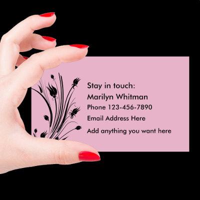
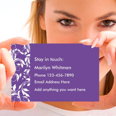
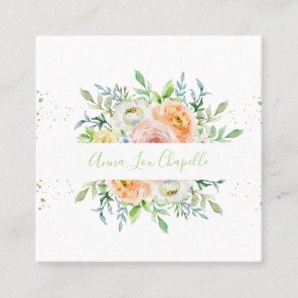
Introducing a innovative take on Ladies Personal Contact Cards that is both captivating and unique, guaranteeing that they will leave an impact that endures. Our calling cards are carefully crafted to effortlessly combine elegance and functionality, thereby encapsulating the very essence of your company. Use this personal contact card to hand out to new acquaintances, business contacts, or exchange cards with someone you want to keep in touch with. Simple design with a floral flourish for a feminine touch. These remarkable cards permit total personalization while being constructed from the finest materials, assuring an elevated professional appearance that is sure to resonate with potential clients and contacts. You can equip yourself with courage and creativity, and you can prepare the identity of your brand to achieve achievement by using these extraordinary selection of Ladies Personal Contact Cards calling card templates.
Paper Types
Here is a list of available paper types. Each paper type has its own unique qualities that deliver amazing results for your marketing efforts. Choose the style that best suites your needs and make the opportunities you deserve.
All paper types are made in the US unless otherwise stated.
- Standard Matte
» 17.5 pt thickness — 120 lb weight — 324 GSM
» Light white, uncoated matte finish with an eggshell texture.
» Made and printed in the USA
- Standard Semi-Gloss
» 16 pt thickness — 150 lb weight — 400 GSM
» Bright white, semi-gloss finish
» 50% recycled content
» FSC certified
» Paper imported from Italy;
- Signature UV Gloss
» 18 pt thickness — 325 GSM
» Bright white, high-gloss finish
» UV coating adds an additional layer of protection
» Made and printed in the USA
- Signature UV Matte
» 6 pt thickness — 130 lb weight — 352 GSM
» Cream white, matte finish
» Made with 30% post consumer fiber
» Paper is easy to write on and won’t smudge
» FSC certified; made with 100% green electricity
» Made and printed in the USA
- Signature Cream
» 21 pt thickness — 325 GSM
» Bright white, velvety soft silk finish
» Premium laminate finish adds an additional layer of protection
» Made and printed in the USA
- Premium Silk
» 16 pt thickness — 130 lb weight — 352 GSM
» Solar white, uncoated linen finish
» Embossed texture adds depth and refinement
» Made with 30% post consumer fiber
» FSC certified; made with 100% green electricity
» Made and printed in the USA
- Premium Linen
» 16 pt thickness — 130 lb weight — 352 GSM
» Solar white, uncoated linen finish
» Embossed texture adds depth and refinement
» Made with 30% post consumer fiber
» FSC certified; made with 100% green electricity
» Made and printed in the USA
- Premium Pearl
» 16 pt thickness — 130 lb weight — 350 GSM
» Soft white, coated shimmer finish
» Adds an elegant subtle sheen
» FSC certified
» Paper imported from Italy; printed in the USA
- Premium Kraft
» Kraft, smooth and refined vellum finish
» Printed with a white underlayer to help color pop
» Made with 30% post consumer fiber
» FSC certified; made with 100% green electricity
- Premium Grey
» 16 pt thickness — 130 lb weight — 352 GSM
» Neutral grey, smooth finish
» Printed with a white underlayer to help color pop
» Made with 30% post consumer fiber
» FSC certified; Made with 100% green electricity
» Made and printed in the USA
- Premium Black
» 16 pt thickness — 130 lb weight — 352 GSM
» Deep black, smooth finish
» Printed with a white underlayer to help color pop
» Made with 30% post consumer fiber
» FSC certified; made with 100% green electricity
» Made and printed in the USA
- Premium Thick
» 32 pt thickness — 240 lb weight — 650 GSM
» Light white, uncoated matte finish with an eggshell texture
» Paper is easy to write on and won’t smudge
» Made and printed in the USA
» Not available for rounded corner option
