Fantastic Options for Vintage Retro Typography Business Cards
We have plenty of great options for vintage retro typography business cards. If you’re looking for the unique designs that will make you business stand out these cards are for you.
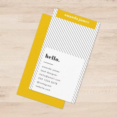
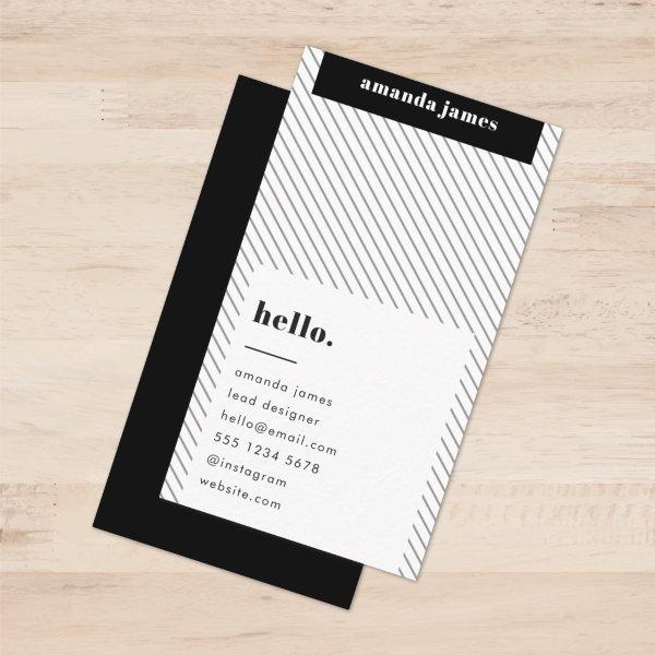 Monochrome Modern Diagonal Stripe Black and White
A minimalist diagonal stripe pattern business cards in monochrome black and white with retro vintage and contemporary typography. The text can easily be customized for a design as unique as you are!
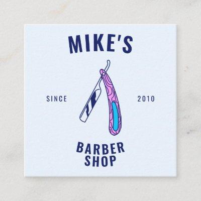
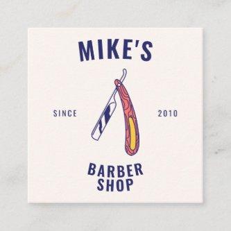
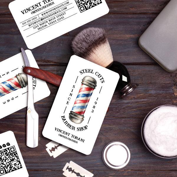 Vintage Barber Shop
Revitalize your branding with our vintage barber shop business cards! Featuring a retro watercolor painted barber pole in iconic red, white, and blue, these cards boast a unique text setup in a double arch formation surrounding the pole. The classic retro typography adds a touch of timeless charm to your branding. Cool, trendy, and utterly unique, these cards are perfect for barbers and stylists looking to make a statement. Order now and elevate your barber shop’s image with a touch of vintage flair!
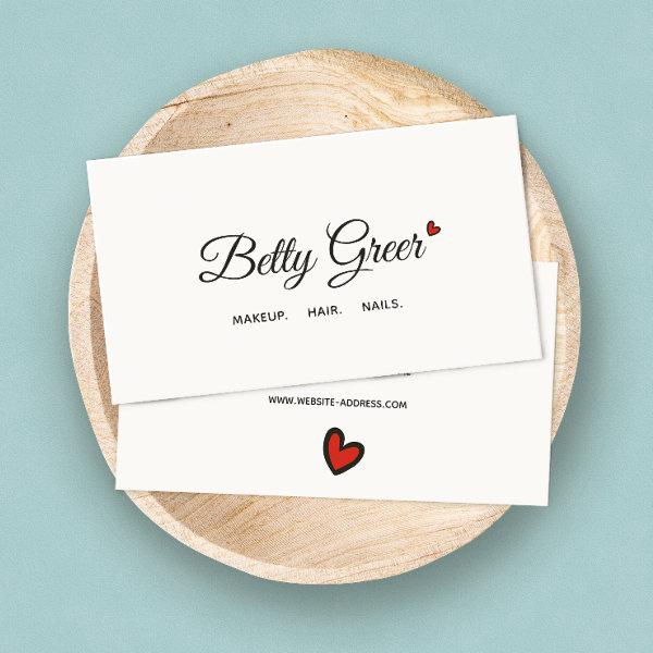 Cute Retro Red Heart Handwritten Script Typography
Clean, versatile design featuring handwritten black lettering on off-white background For additional matching marketing materials, custom design or logo inquiry, please contact me at and I will reply within hours. For shipping, cardstock inquires and pricing contact Zazzle directly.
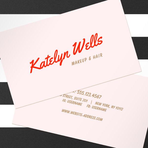
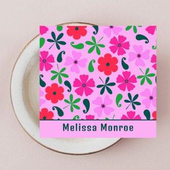
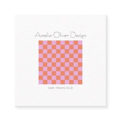
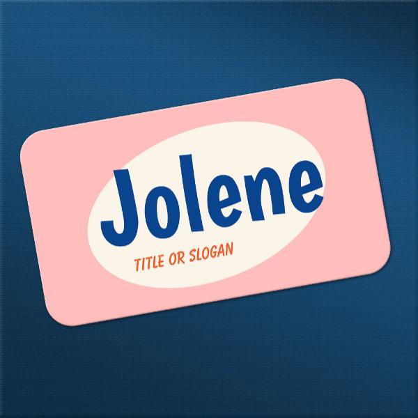 Pink Retro Typography
For additional matching marketing materials, custom design or logo inquiry, please contact me at and I will reply within hours. For shipping, cardstock inquires and pricing contact Zazzle directly.
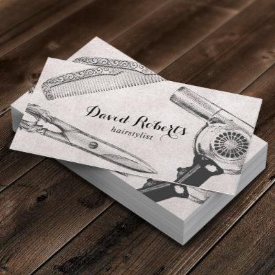
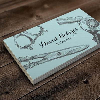
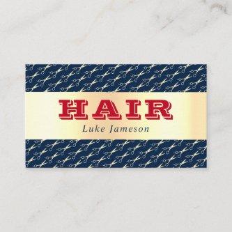
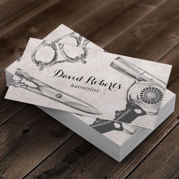 Vintage Salon Scissor & Hair Dryer Hair Stylist
Hair Stylist Vintage Scissor & Hair Dryer illustration Business Cards.
 Unique Retro Handwritten Script Typography Pink
Fun eye-catching design featuring red handwritten lettering on light pink background. For additional matching marketing materials, custom design or logo inquiry, please contact me at and I will reply within hours. For shipping, cardstock inquires and pricing contact Zazzle directly.
Related Designs
Here are related vintage retro typography business cards. Find your business cards and create a buzz!
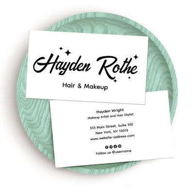
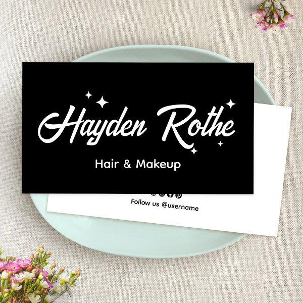 Black Retro Script Makeup and Hair Stylist
Chic and clean with simple name front with white retro style font and stars on black background.
 Retro Red Handwritten Script Typography Pink
Fun eye-catching design featuring red handwritten lettering on light pink background. For additional matching marketing materials, custom design or logo inquiry, please contact me at and I will reply within hours. For shipping, cardstock inquires and pricing contact Zazzle directly.
 Vintage Monogram Retro Typography Minimalist
A vintage monogram business card design featuring a retro typography which can easily be personalized with your name and initials to create a unique custom stationery design! The design features an aged style classic ivory cream background along with a black typeface with a complementary background on the reverse.
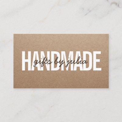
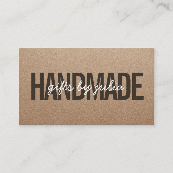 Handmade rustic brown kraft vintage white script
Handmade rustic brown kraft vintage white script
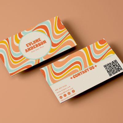
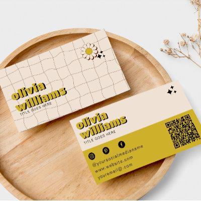
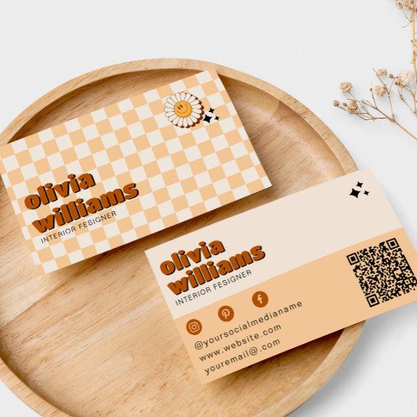 Retro Bold QR Code Boho Groovy Smiling Flower
A Vintage retro bogo chic floral business card. As you see it features a handmade groovy boho abstract squares with a groovy smiling flower. With peach beige cream colors. It has nostalgic seventies and sixties vibes and colors and groovy fonts. With customizable name and profession and QR code. That you can change by clicking on the personalize button. So Grab it and make you business unique and catchy.
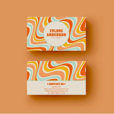
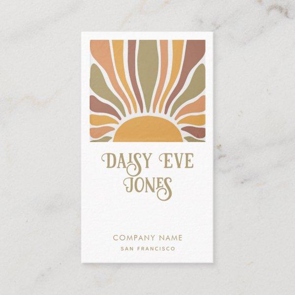 Retro Boho Terracotta Orange Green Sunburst
Boho ‘s style retro terracotta, orange and green sun and rays business cards with retro flourished typography. A ‘s and ‘s style vibe. Add your name, company, and city. The back of the card is solid lilac.

Alternative Designs
With so many great vintage retro typography business cards to choose from it can be hard finding the right one. But it helps to know that Card Bee’s catalog of business cards has something for everyone. It only takes a moment to find what you are looking for. For example we offer many different vintage retro typography business cards designs, but we also have plenty of related card designs to choose from and start growing your brand. Try one of these categories.

 Retro Handwritten Typography Light Coral Pink
Fun eye-catching design featuring blue handwritten lettering on light pink background. For additional matching marketing materials, custom design or logo inquiry, please contact me at and I will reply within hours. For shipping, cardstock inquires and pricing contact Zazzle directly.
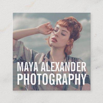
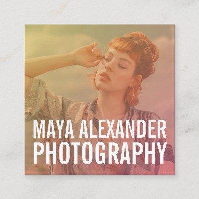
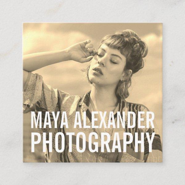 Modern classic sepia photography photo filter square
Modern classic sepia photography photo filter
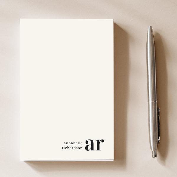 Vintage Monogram Retro Typography Minimalist Post-it Notes
A vintage monogram design featuring a retro typography which can easily be personalized with your name and initials to create a unique custom stationery design! The design features an aged style classic ivory cream background along with a black typeface.
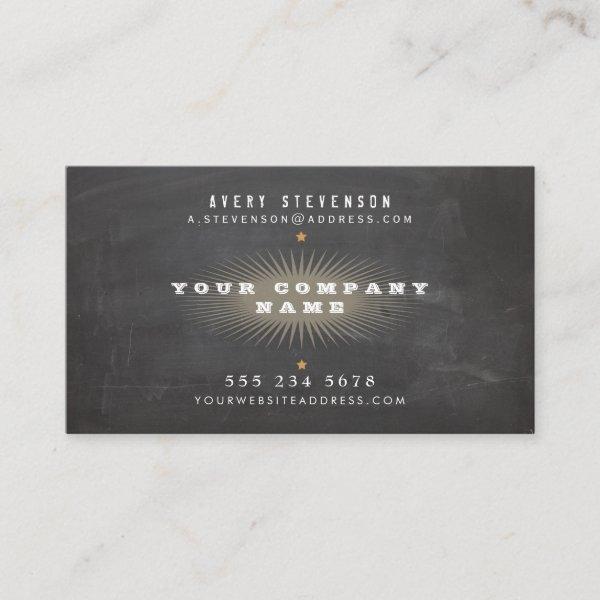 Cool Retro Rustic Black Vintage Typography
Old world ‘s era inspired typographic design. A cool, hip design. Soft taupe sun burst design and small gold star accents. Digital image of aged black background or chalkboard effect. An unique creative card excellent for freelance writers and artists as well as professionals in the fashion or entertainment industry, such as designers, filmmakers, directors, producers, vintage style photographers and stylists. Also perfect for many writing professions such as: a novelist, screenwriter, songwriter, columnist, screenwriter, freelance writer, fiction writer, artist, photographer, producers, consultants, designers, entrepreneur, bloggers, filmmaker, author, therapist and more.
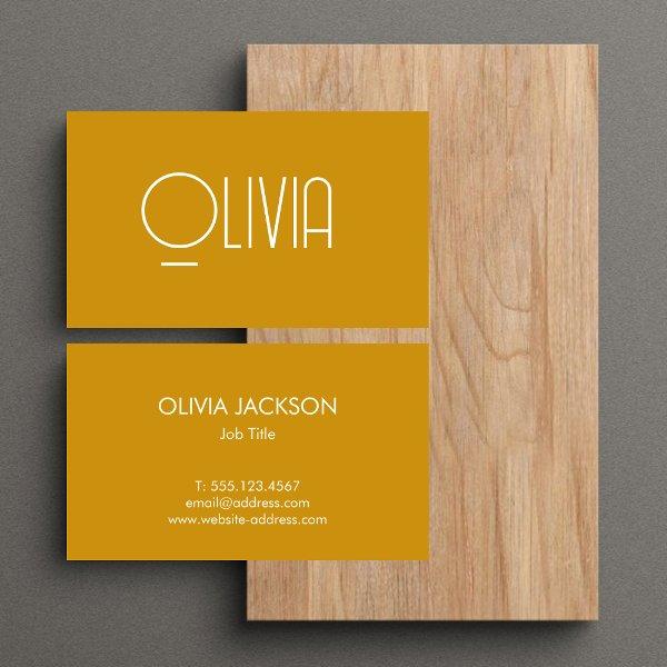 Minimalist Mustard Yellow Mute Retro
This type of business card is perfect for professionals who want to make a clean and simple statement and stand out from the crowd. It’s minimalistic and muted colors make it look professional and modern, while the white and yellow elements add a subtle pop of color.
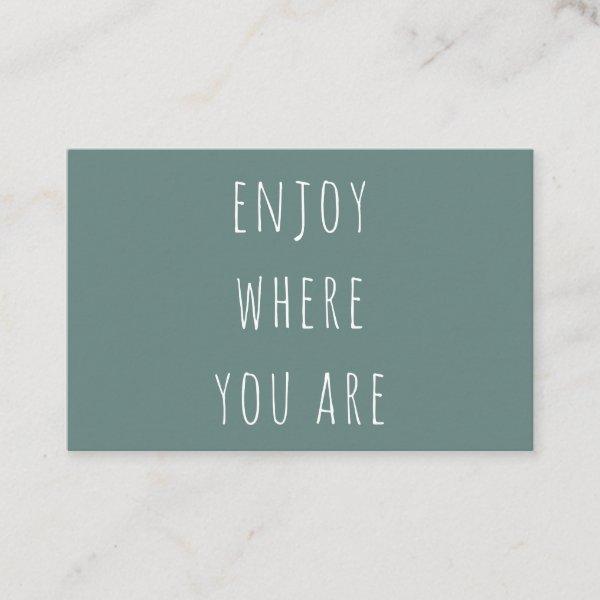 Modern Green Enjoy Where You Are Positive Quote
Modern Green Enjoy Where You Are Positive Quote
Improve Your Reputation In The Business World
“A contact card that has been creatively crafted has the potential to break the ice, which can result in new conversations and open doors to future collaborations.”
A well-thought-out marketing plan includes the inclusion of a calling card as one of its essential components, showcasing its critical significance. It is obvious that assuming a name card to fully embody a company’s story is unrealistic. It is extremely difficult to adequately put into words the degree to which a client’s first impression of your company is influenced by the company card they receive from you. This small card surely has the power to make an impression, much like your physical presentation, which may include the clothes you wear or the attaché case you use.
Before making a decision, one must carefully consider how good a card design fits with their company, sector, and personal style. If someone opts to assume the role of a funeral organizer, it is crucial that they are cautious and refrain from distributing attention-grabbing, fluorescent cards embellished with animated characters. The likelihood is very high that you would throw away a painstakingly made, meticulously designed business card into the nearest trash can designated for discarded paper if you were an expert auto mechanic, particularly in the art of converting vintage Volkswagen Beetles into thrilling dune buggies. Begin the process of designing your logo by carefully selecting a look that accurately represents and is in alignment with the brand you want to project for your targeted business.
Within this conversation, we will venture into an expedition into the realm of name cards, seeking to understand their profound implications amidst our ever-evolving digital age. Furthermore, we shall put in great effort to look for the most effective approaches and methodologies that enable us to create designs which possess both enduring impact and the ability to resonate deeply with individuals who discover them. If you are a seasoned pro aiming to elevate your brand perception or a beginner innovator with ambitions of leaving a lasting mark, this comprehensive manual will equip you with the techniques and motivation required to design a professional card that sets you apart from the crowd. Let us now venture into the fascinating domain of networking and personal branding—the very fabric in which these ostensibly ordinary pieces hold an inherent power that unendingly captures one’s attention.
-
Customize your business card to perfection by adding luxurious touches like embossing, metallic accents, and a matte or glossy finish.
-
Understanding the foundations that give a business card its memorable personality is crucial to making it unforgettable. We should emphasize on aspects like the scale of something, how it’s shaped in order that it can be functional, the arrangement in which things are arranged in relation to each other, and by using images or graphics that are eye-catching.
-
Determine suitable fonts, styles, colors, and layouts for your business cards by thinking about factors like readability (legibility), creating a unified brand image across all marketing materials (brand consistency), and incorporating harmonizing color schemes that elicit the intended emotional impact or associations.
-
Keeping the visual style of your pamphlets, leaflets, and webpage uniform will help people remember your brand.
-
In order to sustain consistency throughout all of your marketing materials, it is crucial to incorporate your brand identity into the design of your contact card. Pay attention to every aspect so that important elements like your logo design resonate well with meticulously selected color schemes meant solely for this purpose along with thoughtful selection of typefaces resulting in an captivating overall aesthetic which adheres faithfully to your existing brand guidelines.
When you are trying to design a significant vintage retro typography business card that is capable of leaving a favorable impression on potential clients or collaborators, you should constantly remind yourself that it is important to take into account even the most minor details.
Search for Vintage Retro Typography Business Cards
The Lasting Significance Of Personal Contact Information In An Time Of Technological Advancements
Vintage calling cards provide the ability of nostalgia and artistic appeal which can truly enhance your professional image. By embracing dynamic and eye-catching designs inspired by the history, you have the opportunity to mesmerize your audience and leave a lasting impression. Whether it’s through elaborate patterns, attention-grabbing colors, or unique textures, these cards exude a sense of innovation and style that sets you apart from the competition. So, don’t be afraid to embrace the retro vibes and step into a world where classic aesthetics meet contemporary professionalism. With these groundbreaking business cards, you’ll be able to showcase your brand’s identity in a way that resonates with potential clients and partners, making sure they recall you long after the initial introduction.
Merging Perspectives
Gaining a deep understanding of the guidelines and anticipations within your sector through diligent research facilitates effective choice when it comes to selecting appropriate business cards. This will guide you in determining whether the nature of your job necessitates a traditional or innovative approach. Amidst the ever-evolving realm of commerce where competition reigns supreme, it becomes imperative for professionals to bear in mind that observing decorum and adhering to ethical principles are just as essential as devising innovative strategies aimed at setting themselves apart from an assortment of contenders vying for supremacy.
The key to designing highly effective company cards lies in keeping up a straightforward approach. The effectiveness of resources is diminished when you provide an excessive information or clutter their layout. Instead, put your focus on the key elements, such as your company’s name, brand, contact details, and, if relevant, tagline.
Individuals can successfully build an air of professionalism for their brand by giving careful consideration to the layout of the details that are displayed on their business card. It is crucial to emphasize conciseness while ensuring the inclusion of vital specifics necessary for comprehensive communication; these specifics comprise furnishing us with your full legal name for clear identification, accurately disclosing your current professional title or position within an organization, providing reliable contact information, and incorporating relevant webpage URLs or social media profile links if applicable. It is recommended to be cautious when including an overabundant or outdated amount of information on the card, as this may lead to a visually cluttered display that creates confusion among those who view it.
The choice of suitable substance arises as a key deciding element while faced with selecting business cards. To ensure long-lasting and eco-friendly results, it is essential to make wise decisions, such as selecting durable resources like high-quality cardstock or eco-conscious alternatives. The act of warmly hugging a carefully designed card has the power to significantly impact and leave an enduring impression on its appreciative receivers.
In order to decide wisely about the visual components that should be included on your business cards, it is necessary to conduct an in-depth analysis of the specific needs that are associated with your line of work. By submerging yourself in industry expectations, wholeheartedly embracing technological advancements, utilizing materials of faultless quality, streamlining design elements down to their core essence, and maintaining unwavering consistency with your brand identity – you can create yoga company cards that leave an indelible impression on recipients within your specific line of work.
Paper Types
Here is a list of available paper types. Each paper type has its own unique qualities that deliver amazing results for your marketing efforts. Choose the style that best suites your needs and make the opportunities you deserve.
All paper types are made in the US unless otherwise stated.
- Standard Matte
» 17.5 pt thickness — 120 lb weight — 324 GSM
» Light white, uncoated matte finish with an eggshell texture.
» Made and printed in the USA
- Standard Semi-Gloss
» 16 pt thickness — 150 lb weight — 400 GSM
» Bright white, semi-gloss finish
» 50% recycled content
» FSC certified
» Paper imported from Italy;
- Signature UV Gloss
» 18 pt thickness — 325 GSM
» Bright white, high-gloss finish
» UV coating adds an additional layer of protection
» Made and printed in the USA
- Signature UV Matte
» 6 pt thickness — 130 lb weight — 352 GSM
» Cream white, matte finish
» Made with 30% post consumer fiber
» Paper is easy to write on and won’t smudge
» FSC certified; made with 100% green electricity
» Made and printed in the USA
- Signature Cream
» 21 pt thickness — 325 GSM
» Bright white, velvety soft silk finish
» Premium laminate finish adds an additional layer of protection
» Made and printed in the USA
- Premium Silk
» 16 pt thickness — 130 lb weight — 352 GSM
» Solar white, uncoated linen finish
» Embossed texture adds depth and refinement
» Made with 30% post consumer fiber
» FSC certified; made with 100% green electricity
» Made and printed in the USA
- Premium Linen
» 16 pt thickness — 130 lb weight — 352 GSM
» Solar white, uncoated linen finish
» Embossed texture adds depth and refinement
» Made with 30% post consumer fiber
» FSC certified; made with 100% green electricity
» Made and printed in the USA
- Premium Pearl
» 16 pt thickness — 130 lb weight — 350 GSM
» Soft white, coated shimmer finish
» Adds an elegant subtle sheen
» FSC certified
» Paper imported from Italy; printed in the USA
- Premium Kraft
» Kraft, smooth and refined vellum finish
» Printed with a white underlayer to help color pop
» Made with 30% post consumer fiber
» FSC certified; made with 100% green electricity
- Premium Grey
» 16 pt thickness — 130 lb weight — 352 GSM
» Neutral grey, smooth finish
» Printed with a white underlayer to help color pop
» Made with 30% post consumer fiber
» FSC certified; Made with 100% green electricity
» Made and printed in the USA
- Premium Black
» 16 pt thickness — 130 lb weight — 352 GSM
» Deep black, smooth finish
» Printed with a white underlayer to help color pop
» Made with 30% post consumer fiber
» FSC certified; made with 100% green electricity
» Made and printed in the USA
- Premium Thick
» 32 pt thickness — 240 lb weight — 650 GSM
» Light white, uncoated matte finish with an eggshell texture
» Paper is easy to write on and won’t smudge
» Made and printed in the USA
» Not available for rounded corner option