Fantastic Options for Vintage Typography Business Cards
We have plenty of great options for vintage typography business cards. If you’re looking for the unique designs that will make you business stand out these cards are for you.
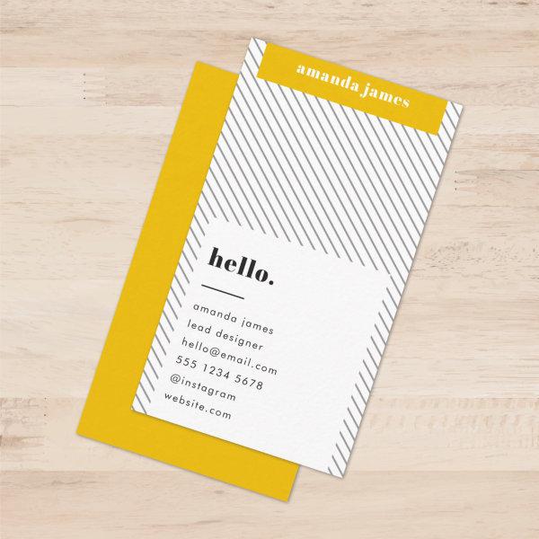 Stylish Trendy Mustard Yellow Diagonal Stripe
A minimalist diagonal stripe pattern business cards in mustard yellow with retro vintage and contemporary typography. The text can easily be customized for a design as unique as you are!
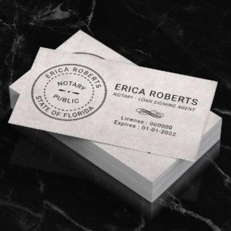
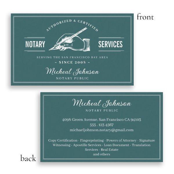 Vintage Professional Teal Custom Notary Services
Vintage Professional Teal Custom Notary Services Business Card. A professional vintage styled notary public business card. This design is eye-catching yet delivers the important information with clarity. It also has an old-school trustworthy style! Need help with this template or more customization? Contact the designer by clicking on the ‘Message’ button below.
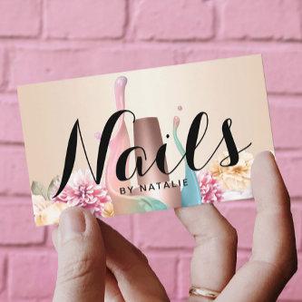
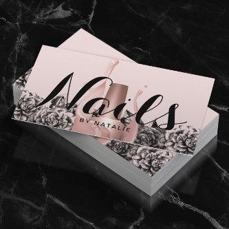
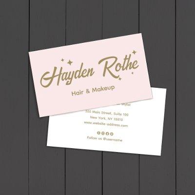
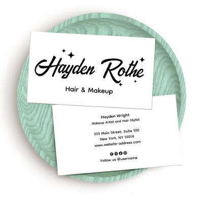
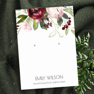
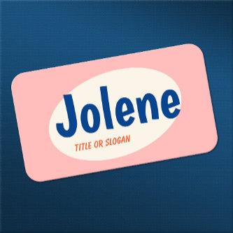
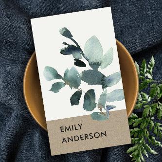
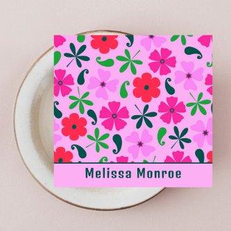
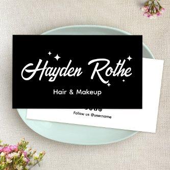
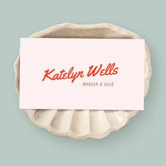
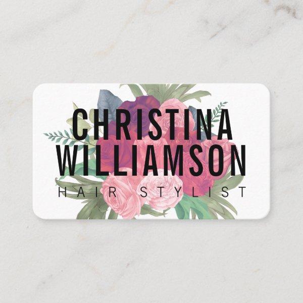 Modern white bold text blush pink vintage florals
Modern white bold text blush pink vintage florals
 Elegant Gold Script
This elegant gold script business card is perfect for a small business owner, consultant, stylist and more! The minimalist gold and white design features fancy romantic typography with modern glam style. Customizable in any color. Keep the design minimal and classy, as is, or personalize it by adding your own graphics and artwork.
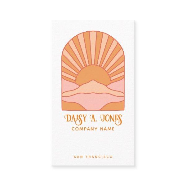 Boho Retro Sunrise
Boho ‘s style orange sunrise and mountains business card with retro flourished typography. A ‘s and ‘s style vibe. Add your name, company, and city. The back of the card is solid orange with white type.
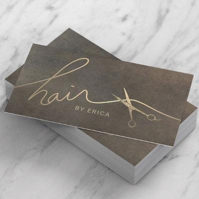
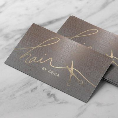
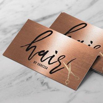
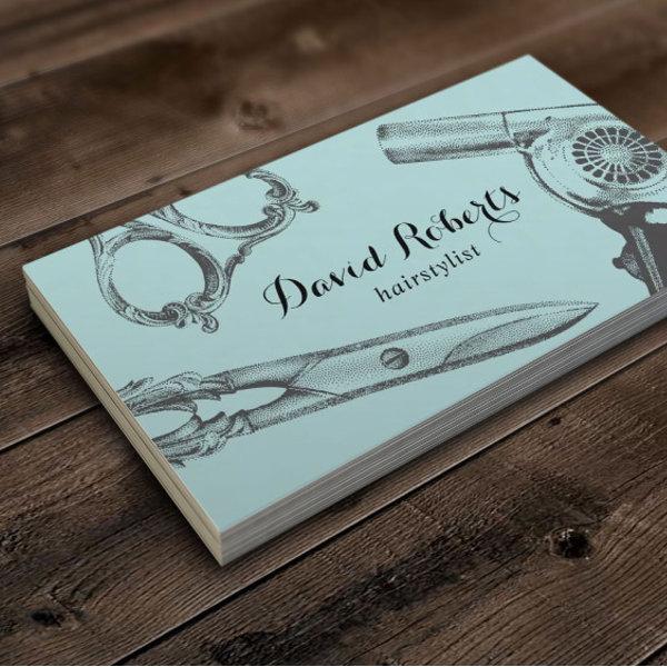
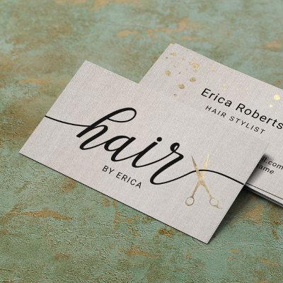
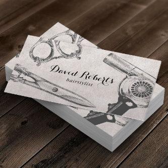
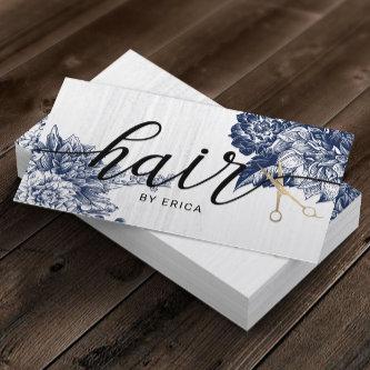
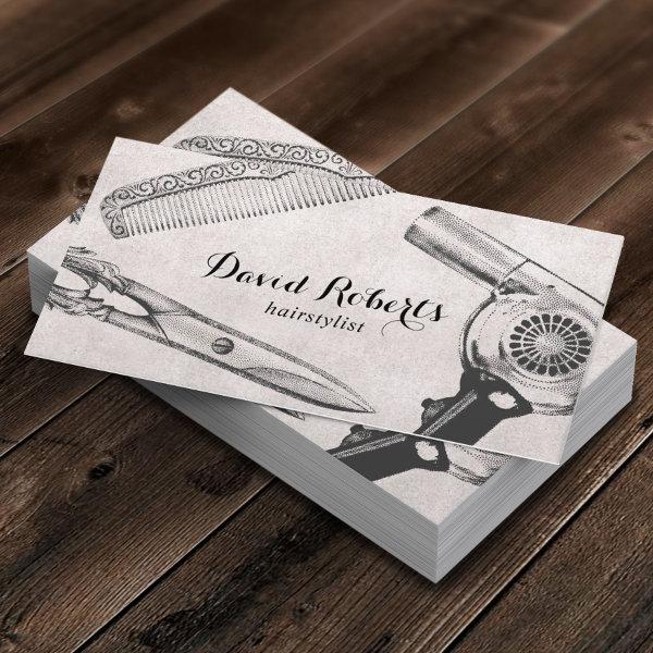 Vintage Scissor Comb & Hair Dryer Hair Stylist
Vintage Scissor Comb & Hair Dryer illustration Business Cards.
Related Designs
Here are related vintage typography business cards. Find your business cards and create a buzz!
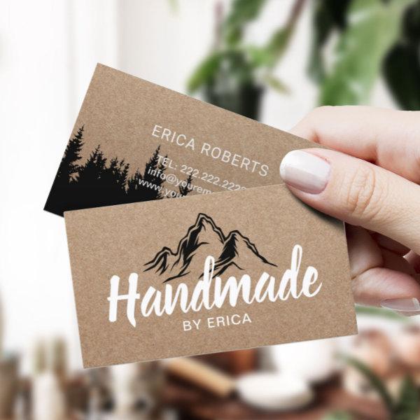 Handmade Products Mountain Typography Rustic Kraft
Handmade Products Mountain Typography Rustic Kraft Business Cards.
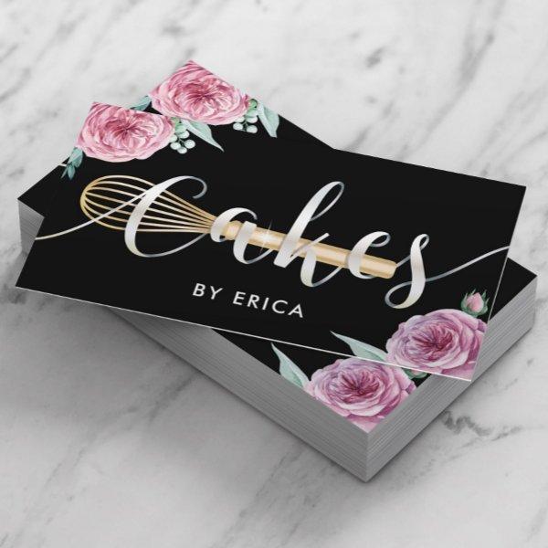 Pastry Chef Cake Bakery Modern Floral Typography
Cake Bakery Modern Floral Typography Pastry Chef Business Cards.
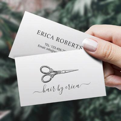
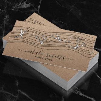
 Hair Stylist Vintage Scissor & Hair Dryer Teal
Hair Stylist Vintage Scissor & Hair Dryer Teal Business Cards.
 Minimal Simple Retro Feminine Blush Pink
A simple stylish custom design with retro typography on a blush pink background. The text, including your monogram and nickname, can easily be personalized to make a design as unique as you are! The perfect trendy bespoke design for personal or business use!
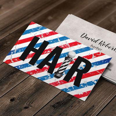
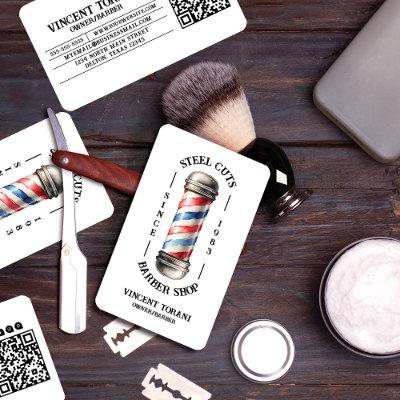
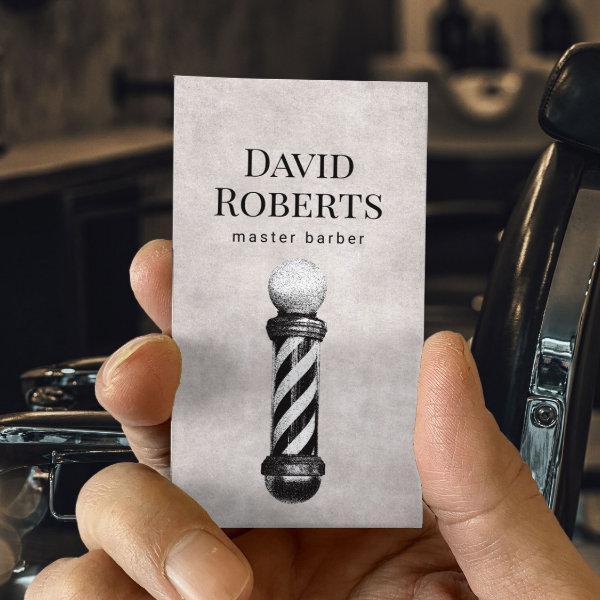 Barber Shop Vintage Barber Pole Barbershop Hair
Barber Shop Vintage Barber Pole Barbershop Hair Business Cards.
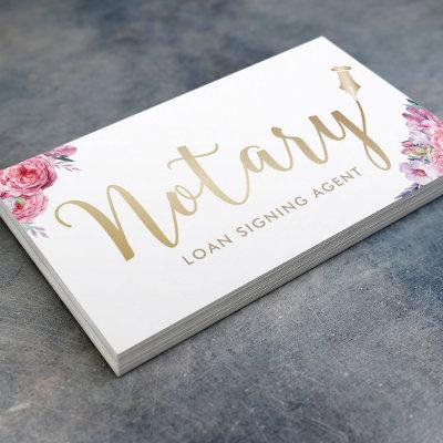
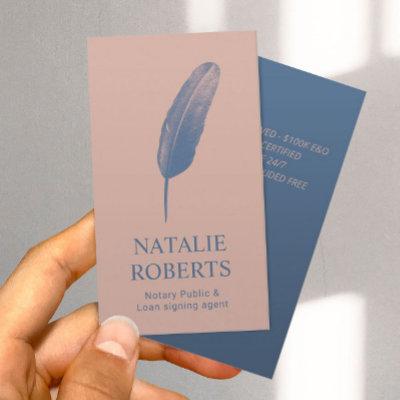
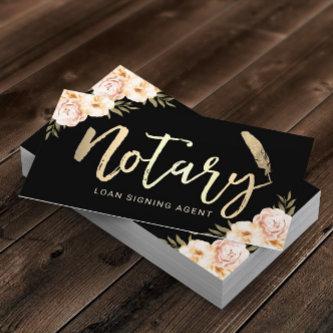
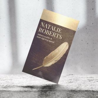
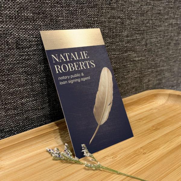 Notary Loan Signing Agent Navy & Gold Quill
Modern Gold Border Navy Blue Notary Loan Signing Agent Business Card.

Alternative Designs
With so many great vintage typography business cards to choose from it can be hard finding the right one. But it helps to know that Card Bee’s catalog of business cards has something for everyone. It only takes a moment to find what you are looking for. For example we offer many different vintage typography business cards designs, but we also have plenty of related card designs to choose from and start growing your brand. Try one of these categories.
 Retro Red Handwritten Script Typography Pink
Fun eye-catching design featuring red handwritten lettering on light pink background. For additional matching marketing materials, custom design or logo inquiry, please contact me at and I will reply within hours. For shipping, cardstock inquires and pricing contact Zazzle directly.
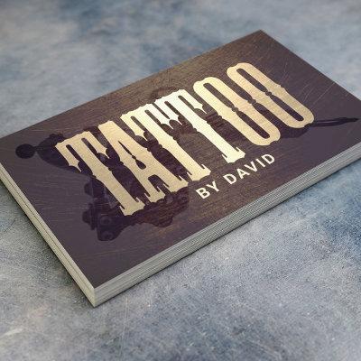
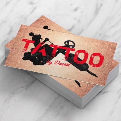
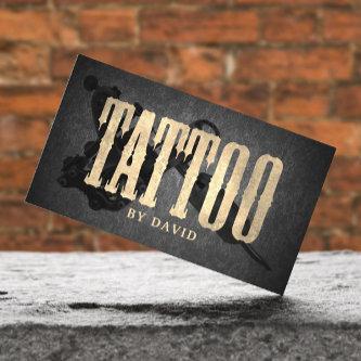
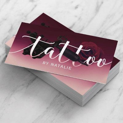
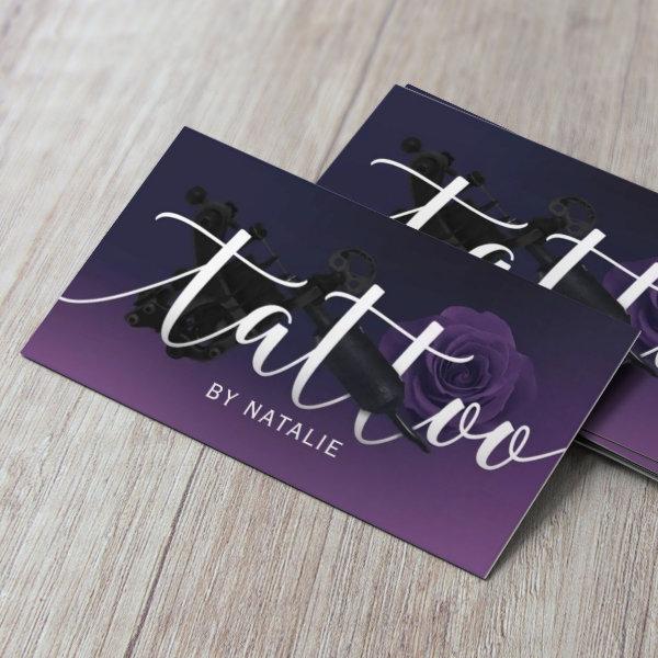 Tattoo Artist Gun & Flower Typography Deep Purple
Tattoo Artist Tattoo Gun & Flower Typography Elegant Purple Business Cards.
 Vintage Monogram Retro Typography Minimalist
A vintage monogram business card design featuring a retro typography which can easily be personalized with your name and initials to create a unique custom stationery design! The design features an aged style classic ivory cream background along with a black typeface with a complementary background on the reverse.
Hair Stylist Scissor & Hand Logo Beauty Salon Rustic Chalkboard Business Cards.
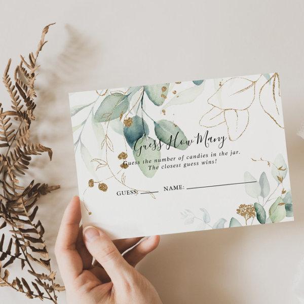 Gold Eucalyptus Guess How Many Game Card
This gold eucalyptus guess how many game card is perfect for a rustic bridal shower or baby shower. This artistic design features hand-drawn watercolor gold and green foliage, inspiring natural beauty.
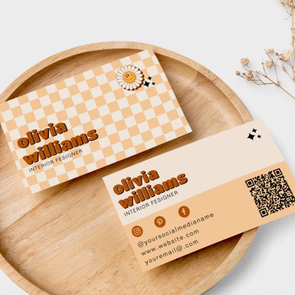 Retro Bold QR Code Boho Groovy Smiling Flower
A Vintage retro bogo chic floral business card. As you see it features a handmade groovy boho abstract squares with a groovy smiling flower. With peach beige cream colors. It has nostalgic seventies and sixties vibes and colors and groovy fonts. With customizable name and profession and QR code. That you can change by clicking on the personalize button. So Grab it and make you business unique and catchy.
Why Contact Cards Are Still Relevant In A Digital Age
Does the annoyance of having to rummage through your purse, in vain, for a contact’s details in the midst of an important business meeting, deeply resonate with you? Are you curious in providing potential clients and collaborators an enduring keepsake that embodies your professionalism, making it impossible for them to forget about it? Disregard all other distractions and focus on the plainness of a simple name card. Marvel at how such a seemingly meaningless paper possesses enormous power in fostering connections and remains an essential tool cherished by experts in every imaginable field. Embark with us on a captivating adventure into the realm of business card aesthetics, as we explore how to craft designs that leave a lasting impression by capturing your brand’s essence and effectively transmitting key information. Join our journey as we discover the hidden potential behind crafting unforgettable business cards that will elevate your networking capabilities to new heights, regardless of whether you have traversed the realm of entrepreneurship or are venturing forth into uncharted territories. This will allow you to take your networking capabilities to new heights.
Be sure to consider about each of these crucial aspects before deciding on the layout for your company’s vintage typography business cards.
-
Pay careful attention to ensure good paper quality: The haptic characteristics of your vintage typography business card make it easier to make an impression that remains in the mind of the recipient. Focus your energy on determining the quality of the designated papers and making sure that it is consistently high. Choose a sumptuous cardstock that feels solid in your hands. Matte or glossy finishes can contribute to the overall elegance and sophistication of your design as well.
-
Show off your portfolio: If your professional path aligns with industries valuing creativity and inventiveness, it behooves you to ponder incorporating genuine representations or visual excerpts effectively illustrating the range of your portfolio onto the often overlooked but entirely viable canvas offered by the reverse side featured on common corporate calling cards. When you utilize this approach, you provide prospective customers an instantaneous glance at your work, which piques their interest and compels them to discover the wide array of services that you provide.
-
Stay consistent with branding: Confirm that the overall vision for your brand for your company is reflected in the design aesthetics of your calling cards and that these designs are in line with the vision. By using the same typefaces, colors, and graphics throughout all of your marketing materials, you can improve consumers’ ability to remember your brand and create a visually appealing aesthetic that is continuous.
-
Create an unforgettable memory: For maximum interest, include visually appealing elements on your therapist networking card, such as vivid colors, bold typography, or distinctive patterns. Consider the possibility of incorporating a unique signature element that amplifies the essence and distinctiveness of your brand, such as your company’s logo.
Embodying Your Brand Identity And Conveying Key Information At A Glance
The use of a vintage aesthetic for business cards is a modern demonstration of one’s style for design. These unique playing cards not only celebrate the memories of the past but also embrace the contemporary times with their stylish appeal. The abstract designs and vibrant colors embrace a sense of energy and thrill that grabs attention instantly. With these cards in hand, professionals can confidently make their mark in any field, leaving a lasting impression on clients and partners alike. So why settle for ordinary when you can enhance your brand with vintage beams abstract trendy business cards that truly reflect your unique personality and passion for excellence? Embrace this timeless trend and make your professional presence unforgettable.
It is of the utmost importance to acquire a comprehensive understanding of the complexities that are characteristic of your particular industry, as well as the associated expectations that go hand in hand with those complexities. Industries can demonstrate differences with regards to the suitable extent of professionalism as well as the expected degree of creativity and creativity when designing business cards. In support of this argument, let’s take the specific case of a legal practice whose deliberate choice would be to adopt an aesthetically pleasing visual representation that signifies their commitment to maintaining long-established conventions and displaying elegance; on the other hand, when it comes to a graphic design agency, they tend to gravitate towards an aesthetic perspective fueled by dynamic visuals and artistic creativity. Ensuring that you follow the established standards and practices within the industry when designing your visiting cards is essential for forging an significant connection with your target audience and making a lasting impression.
If you want your visiting cards to be successful in the marketplace, you should strive for a layout that is uncomplicated and straightforward. The efficiency of materials is diminished if you overwhelm recipients with too much information or unnecessarily clutter their layout. Rather than becoming sidetracked by marginal matters, make a deliberate decision to concentrate solely on what is truly important: prominently displaying your company’s name and logo design, as well as providing clear contact information and an important tagline where applicable.
Consciously weigh in all relevant factors related to specialized needs within one’s industry, ensuring careful selection of fitting design components for an important business card. You can make calling cards that really stick with people in your industry if you let your imagination run wild, learn the ins and outs of the field, fully embrace technological advances, use only the highest quality materials, pare down designs to their essence, and never stray from your brand’s core values.
Search for Vintage Typography Business Cards
Paper Types
Here is a list of available paper types. Each paper type has its own unique qualities that deliver amazing results for your marketing efforts. Choose the style that best suites your needs and make the opportunities you deserve.
All paper types are made in the US unless otherwise stated.
- Standard Matte
» 17.5 pt thickness — 120 lb weight — 324 GSM
» Light white, uncoated matte finish with an eggshell texture.
» Made and printed in the USA
- Standard Semi-Gloss
» 16 pt thickness — 150 lb weight — 400 GSM
» Bright white, semi-gloss finish
» 50% recycled content
» FSC certified
» Paper imported from Italy;
- Signature UV Gloss
» 18 pt thickness — 325 GSM
» Bright white, high-gloss finish
» UV coating adds an additional layer of protection
» Made and printed in the USA
- Signature UV Matte
» 6 pt thickness — 130 lb weight — 352 GSM
» Cream white, matte finish
» Made with 30% post consumer fiber
» Paper is easy to write on and won’t smudge
» FSC certified; made with 100% green electricity
» Made and printed in the USA
- Signature Cream
» 21 pt thickness — 325 GSM
» Bright white, velvety soft silk finish
» Premium laminate finish adds an additional layer of protection
» Made and printed in the USA
- Premium Silk
» 16 pt thickness — 130 lb weight — 352 GSM
» Solar white, uncoated linen finish
» Embossed texture adds depth and refinement
» Made with 30% post consumer fiber
» FSC certified; made with 100% green electricity
» Made and printed in the USA
- Premium Linen
» 16 pt thickness — 130 lb weight — 352 GSM
» Solar white, uncoated linen finish
» Embossed texture adds depth and refinement
» Made with 30% post consumer fiber
» FSC certified; made with 100% green electricity
» Made and printed in the USA
- Premium Pearl
» 16 pt thickness — 130 lb weight — 350 GSM
» Soft white, coated shimmer finish
» Adds an elegant subtle sheen
» FSC certified
» Paper imported from Italy; printed in the USA
- Premium Kraft
» Kraft, smooth and refined vellum finish
» Printed with a white underlayer to help color pop
» Made with 30% post consumer fiber
» FSC certified; made with 100% green electricity
- Premium Grey
» 16 pt thickness — 130 lb weight — 352 GSM
» Neutral grey, smooth finish
» Printed with a white underlayer to help color pop
» Made with 30% post consumer fiber
» FSC certified; Made with 100% green electricity
» Made and printed in the USA
- Premium Black
» 16 pt thickness — 130 lb weight — 352 GSM
» Deep black, smooth finish
» Printed with a white underlayer to help color pop
» Made with 30% post consumer fiber
» FSC certified; made with 100% green electricity
» Made and printed in the USA
- Premium Thick
» 32 pt thickness — 240 lb weight — 650 GSM
» Light white, uncoated matte finish with an eggshell texture
» Paper is easy to write on and won’t smudge
» Made and printed in the USA
» Not available for rounded corner option