
Fantastic Options for Pharmacy Business Cards
We have plenty of great options for pharmacy business cards. If you’re looking for the unique designs that will make you business stand out these cards are for you.
 Pain Relief Medical
Pain relief medical business cards for pain management center or medical group. Modern design with teal mint green design elements and medical symbol, along with easy text layout to personalize. Best business cards template designed for themes related to neck and back pain, neuropathic pain, or pain consultants.
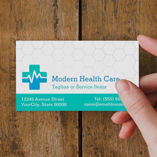
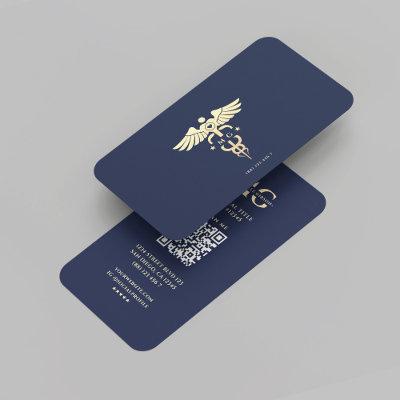
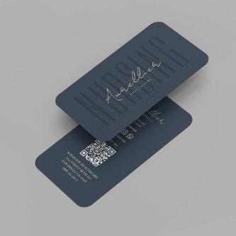
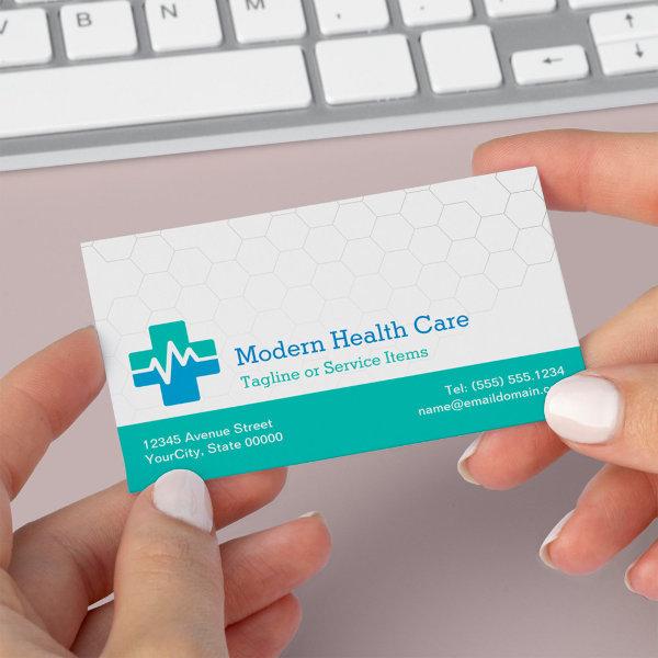 Modern Medical HealthCare – White Green Blue
This business card is tailored for medical professionals who want to convey a sense of reliability and innovation. The clean and minimalist design with a white, green, and blue color palette represents cleanliness, health, and technology. It’s an ideal choice for doctors, nurses, or healthcare administrators. What sets this card apart is its QR code feature, allowing easy access to your contact information and website.
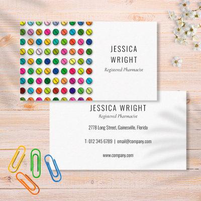
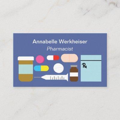
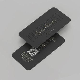
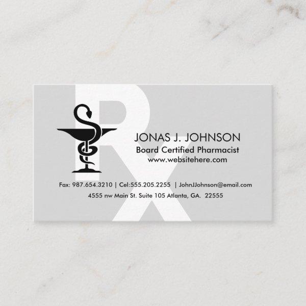
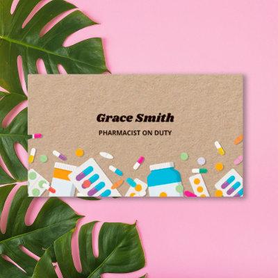
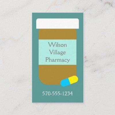
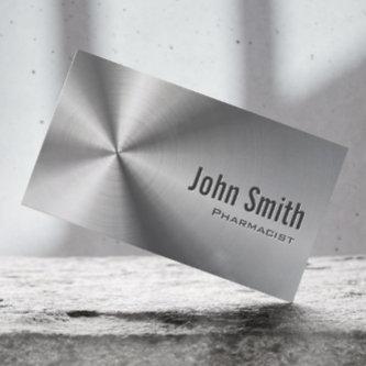
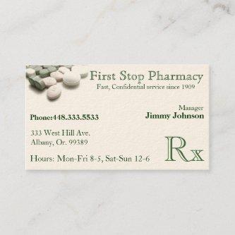
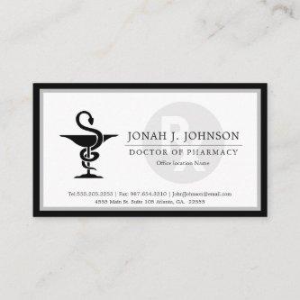
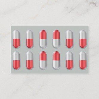
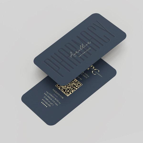
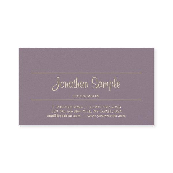
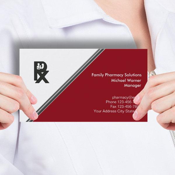 Pharmacy
Modern pharmacy business card template in a classy design with silver design element and text space and layout you can customize online. Designed for a retail pharmacy or medical dispensary.
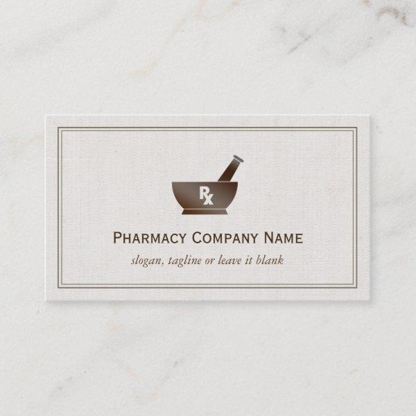 RX Symbol Pharmacy Chemist Company – Classic Linen
The Sample Image: Stylish Medical RX Symbol Pharmacy Corporation – Classic Beige Linen Look Personalized Business Card Template. All text style, colors, sizes can be modified to fit your needs. If you need any customization, please contact me.
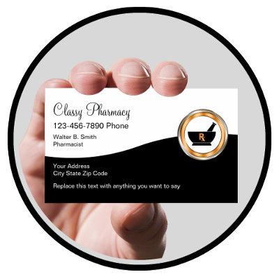
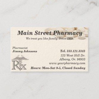
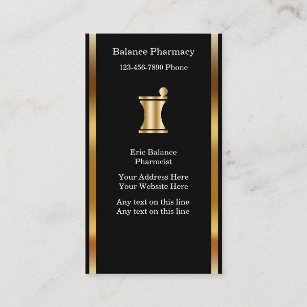 Classy Pharmacy
Classy pharmacy business cards with simulated gold pharmaceutical symbol printed on the front, along with great text layout you can personalize to suit your pharmacy business. Designed for a retail pharmacy, pharmaceutical supplies, or drug store.
 Modern Medical Health Care – White Green Blue Magnet
Make a lasting impression with this modern and functional Medical Healthcare Business Card Magnets. These magnets feature a sleek and professional design, with the added convenience of a magnetic backing that allows them to easily stick to metal surfaces, ensuring that your clients will keep and have easy access to your contact information. Perfect for doctors, nurses, hospitals, clinics, medical offices and other healthcare providers, these magnets will ensure your contact information is always at your client’s fingertips. And with the ability to customize the magnets using Zazzle’s user-friendly design tool, you can easily tailor them to fit your unique personal style and brand.
Related Designs
Here are related pharmacy business cards. Find your business cards and create a buzz!
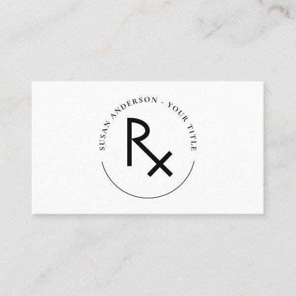
 Pharmacist Custom Name Bowl of Hygenia Symbol
Custom RX symbol pharmacist business cards.
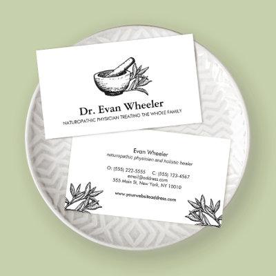
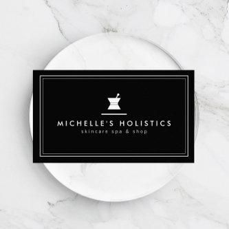
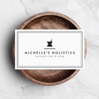
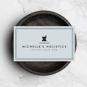
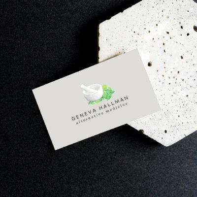
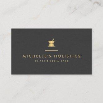
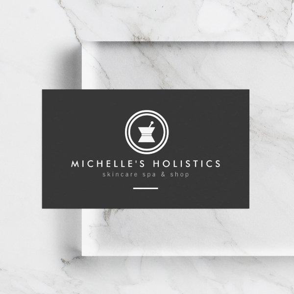 Modern Apothecary Holistic Medicine Dark Gray
A clean, modern design of an apothecary logo with your name or business name creates a unique identity on this business card template. The minimal aesthetic is memorable and professional. © AM CREATIVE
 Pharmacy Pharmacist Medication List
MEDICATION LIST ON THE BACK. CLIENTS WILL ALWAYS HAVE YOUR CARD WITH THEM.
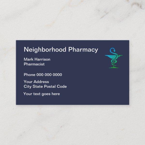 Neighborhood Pharmacy And Pharmacist
Neighborhood Pharmacy business cards with pharmacy symbol and clean simple layout for a retail or online pharmacy.
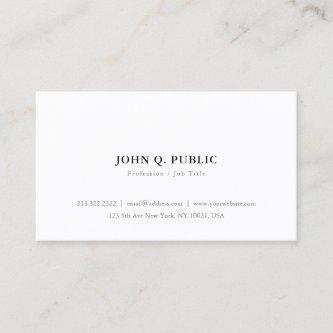
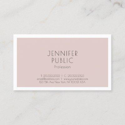
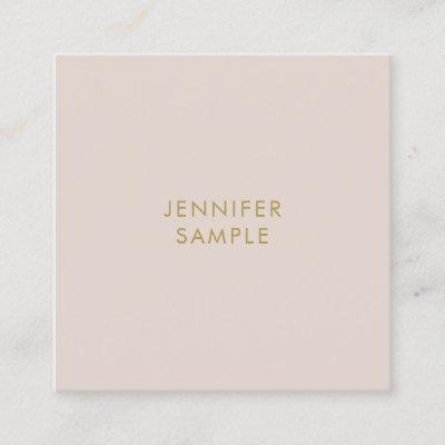
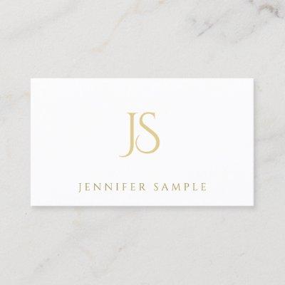
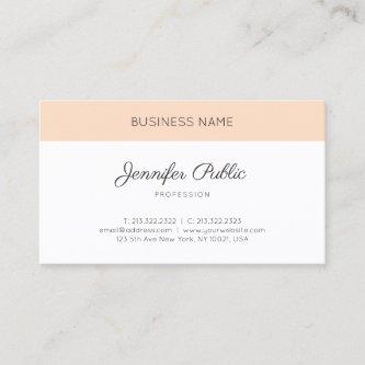
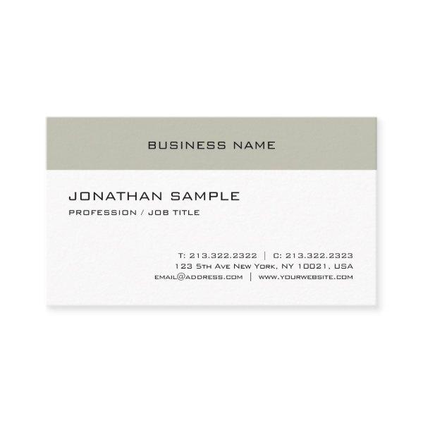 Modern Elegant Minimalist Design Trendy Template
Modern Elegant Minimalist Design Trendy Template Business Card. Perfect for Real Estate Agents, Accountants, Realtors, Brokers, Attorneys, Lawyers, Doctors, Corporate Professionals, Stylists, Architects, Engineers, Directors, Managers, Consultants, Designers, Teachers, Musicians, all professions.
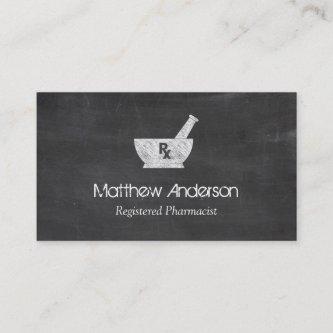
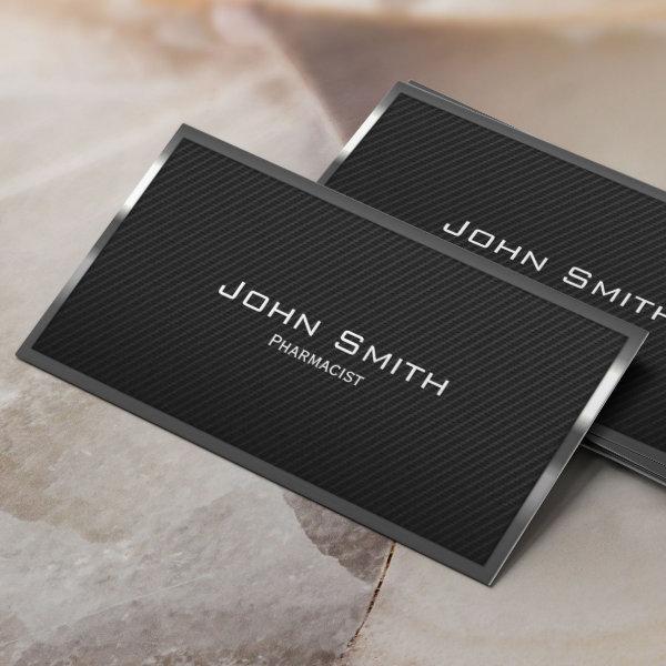 Pharmacist Black Carbon Fiber Medical
Black Carbon Fiber Pharmacist Business Card.

Alternative Designs
With so many great pharmacy business cards to choose from it can be hard finding the right one. But it helps to know that Card Bee’s catalog of business cards has something for everyone. It only takes a moment to find what you are looking for. For example we offer many different pharmacy business cards designs, but we also have plenty of related card designs to choose from and start growing your brand. Try one of these categories.

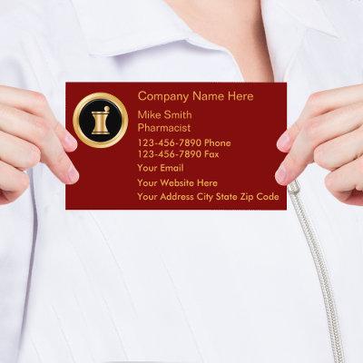
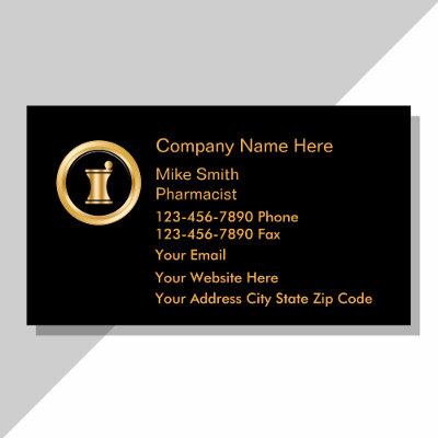
 Pharmacy RX
Pharmacy Mortar Pestle Logo Business Card
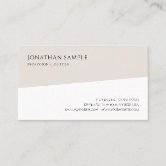
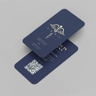
 Modern Monogram Pharmacy Pharmacist ElegantBlue
Modern Monogram Pharmacy Pharmacist Elegant Blue Gold business card with QR code
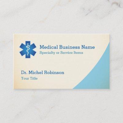
 First Aid Symbol, Pharmacy, Pharmacists
First Aid Symbol, Pharmacy, Pharmacists Business Cards by The Business Card Store.
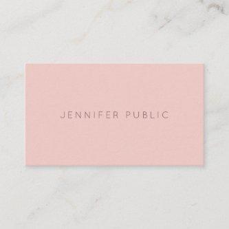
 Pink White Modern Simple Elegant Plain Trendy
Pink White Modern Simple Elegant Plain Trendy Business Card. Perfect for Real Estate Agents, Accountants, Realtors, Brokers, Attorneys, Lawyers, Doctors, Corporate Professionals, Stylists, Architects, Engineers, Directors, Managers.
 Minimalist Elegant Blue Green Simple Plain Modern
Minimalist Elegant Blue Green Simple Plain Modern Business Card. Perfect for Real Estate Agents, Accountants, Realtors, Brokers, Attorneys, Lawyers, Doctors, Corporate Professionals, Stylists, Architects, Engineers, Directors, Managers, all Professions.
 Handwritten Script Chic Gold Beauty Salon Luxury
Handwritten Script Chic Gold Striped Premium Pearl Finished Luxury Beauty Salon Business Card. Perfect for Real Estate Agents, Accountants, Realtors, Brokers, Attorneys, Lawyers, Doctors, Corporate Professionals, Stylists, Architects, Engineers, Directors, Managers, Teachers, Businessman, Businesswoman, Ceo, VIP, all professions.
Networking Cards: Improve Your Work Image With This One Unknown Secret Weapon
Are you currently feeling tiredness emanating from repeatedly presenting ordinary and undeniably generic business cards, eventually leading to their unfortunate misplacement within an individual’s purse or their hasty disposal in waste containers? It’s time to shake things up and make a memorable impression with photograph business cards. These unique and eye-catching cards not only showcase your personal details but also provide a glimpse into your character and innovation. Let’s look into the benefits of image business cards and how they can help you stand out from the competition in a saturated market. So, let’s dive in and discover why photo visiting cards are worth every pixel.
visual attributes, and effective utilization techniques. Should you identify as an enthusiastic entrepreneur seeking guidance in solidifying and promoting your personal brand or as a seasoned expert eager to extend professional relationships, we’ve got everything covered for you.
The process of swapping contact information has progressed beyond the stages of rapidly writing it down on scraps of paper or relying solely on digital alternatives. A professionally crafted calling card can be a physical representation of your personal brand and reflect the core of professionalism with ease. It leaves an impact that persists to echo in the minds of potential clients or partners well beyond the initial phase of the process has concluded.
Additionally, crafting an efficient pharmacy business card needs more than just writing your name and contact information on a piece of paper. When deciding on a color scheme, font, and overall design style that not only resonate with your business but also cater to the specific preferences of your target audience, it is essential to give careful consideration to a variety of design elements such as color scheme, font choice, and overall design style.
Our aim in this article is to furnish you with valuable ideas and stimulating viewpoints so that your created tutoring business cards may leave an everlasting impression on their recipients. Additionally, we shall examine strategies aimed at unlocking the complete potential of these compact tools in nurturing meaningful connections and propelling yourself professionally forward.
It is essential to allocate time and effort into polishing your networking card because of its transformational features in order to maximize your experience at conferences and networking events that are filled to the brim with potential prospects and avenues for growth. This will allow you to maximize the opportunities that come your way. Get ready to discover its secret capacities and make the most of the potential of this compact but powerful promotional tool.
Together, let’s begin on a shared quest to discover the complexities involved in designing remarkable business cards capable of unlocking doors to unforeseen prospects and fostering authentic connections beyond previous comprehension.
Before choosing on the best template for your pharmacy business cards, give some thought to the following factors:
-
Adopt creative methods for a fantastic outcome: Immerse yourself in a blend of creativity and craftsmanship by exploring an array of printing methods including foil stamping, embossing, UV spot coating, or traditional letterpress to infuse your visiting card design with tactile sensations and dimensional allure. Adopting these approaches enhances the appearance while also giving the receiver a memorable experience that helps them remember your card.
-
Avoid clutter and simplify: Achieve an impressive design on your calling card by keeping the focus on essential information rather than cluttering it with extra text or graphics. Sustain an unfussy and straightforward layout, ensuring that the relevant contact details are easily readable. Strategically placed empty spaces can be used to strike a balance while emphasizing important components.
-
Separate yourself from the pack: Make use of visually appealing design elements like attractive color palettes, striking typographical arrangements, and unique pattern selections to give your visiting card a unique identity and leave a lasting impression. Think about using a distinctive symbol, such as a expertly crafted company logo, to symbolize and enhance recognition for the overall identity associated with your brand.
-
Consider functionality: Investigate groundbreaking ways to develop your pharmacy business cards so that they can perform additional functions in addition to sharing contact information. You can incorporate additional functional elements like QR codes, appointment reminders, or even mini calendars that serve a purpose beyond just sharing details.
-
Show off your portfolio: If your professional journey is aligned with fields that place a high value on creativity and inventiveness, it would behoove you to consider incorporating authentic representations or visual excerpts that effectively illustrate the depth and range of your creative body of work onto the frequently ignored but entirely viable canvas offered by the backside landscape featured on common corporate calling cards. This would be a good idea for you to consider if your career trajectory aligns with fields that place a high value on originality and inventiveness. Employing this method promises potential clients a rapid introductionary glimpse to your work, generating curiosity as they seek more information about the valuable services they stand to gain from partnering with you.
A Memento Of Your Identity And Services In The Cutthroat Corporate World
Within the world of photography, where the power of visual storytelling resides within each captured shot, a calling card surpasses its physical form to embody a profound significance. It becomes a representation of your unique artistic perspective and a glimpse into the amazing experiences you have immortalized through your lens. The layout of your photography card should be an expression of your artistic vision, with carefully chosen images or graphics that evoke emotion and curiosity. The selection of materials must also reflect the premium craftsmanship of your work, leaving a lasting impression in the hands of those who hold it. By creating a engaging and memorable business card, you are not only showcasing your talent but encouraging others to take part in a visual journey with you.
When deciding on your preferred set of business name cards, one realizes the significance of making an educated choice about suitable materials. The key to achieving long-lastingness and sustainable practices lies in making considerate choices, such as opting for durable resources like high-quality cardstock or environmentally-conscious alternatives. When someone personally clutches an beautifully designed note, they possess the ability to profoundly touch the lives of those who receive it, eliciting strong reactions and forging lasting connections.
The most efficient way for determining which photography photo business cards are best suited to meet your requirements is to carry out investigation on your industry and become knowledgeable about its norms, requirements, and expectations. By engaging in this meticulous assessment process, individuals can acquire a greater understanding of whether their profession necessitates a more conventional or creative approach, empowering them to make well-informed decisions about how to navigate the intricacies of their chosen career path. Bear in mind that giving equal importance to professionalism and standing out from the competition is key.
Keep in mind that maintaining things simple can often lead to the best results when it comes to designing effective business cards. When faced with an excessive influx of data or when faced with a disorganized layout design, recipients may easily become overwhelmed; as a result, this detrimental effect compromises material efficiency. Focus on the most vital aspects at hand rather than spreading your efforts out across several sections. Particularly emphasize your company’s name, logo representation, easily accessible contact information, and, if appropriate, an captivating tagline.
Underestimating or disregarding the extensive consequences stemming from employing cutting-edge print methods combined with high-quality materials would be an risky course of action. Elevating the overall image of expertise and distinctiveness connected to your company is attainable by utilizing high-quality paper stock choices that encompass finishes like embossing or metallic printing, and even exploring unconventional shapes.
Putting The Big Picture Together
When designing a layout for your business card, give some thoughtful consideration to the specialized requirements that are associated with your industry. You can make name cards that make a positive and lasting impression on recipients within your field by first gaining an understanding of the expectations of the industry, then embracing technology, then using quality materials, then simplifying the design, and finally maintaining consistency with your brand identity throughout the entire process.
Search for More Business Cards
Paper Types
Here is a list of available paper types. Each paper type has its own unique qualities that deliver amazing results for your marketing efforts. Choose the style that best suites your needs and make the opportunities you deserve.
All paper types are made in the US unless otherwise stated.
- Standard Matte
» 17.5 pt thickness — 120 lb weight — 324 GSM
» Light white, uncoated matte finish with an eggshell texture.
» Made and printed in the USA
- Standard Semi-Gloss
» 16 pt thickness — 150 lb weight — 400 GSM
» Bright white, semi-gloss finish
» 50% recycled content
» FSC certified
» Paper imported from Italy;
- Signature UV Gloss
» 18 pt thickness — 325 GSM
» Bright white, high-gloss finish
» UV coating adds an additional layer of protection
» Made and printed in the USA
- Signature UV Matte
» 6 pt thickness — 130 lb weight — 352 GSM
» Cream white, matte finish
» Made with 30% post consumer fiber
» Paper is easy to write on and won’t smudge
» FSC certified; made with 100% green electricity
» Made and printed in the USA
- Signature Cream
» 21 pt thickness — 325 GSM
» Bright white, velvety soft silk finish
» Premium laminate finish adds an additional layer of protection
» Made and printed in the USA
- Premium Silk
» 16 pt thickness — 130 lb weight — 352 GSM
» Solar white, uncoated linen finish
» Embossed texture adds depth and refinement
» Made with 30% post consumer fiber
» FSC certified; made with 100% green electricity
» Made and printed in the USA
- Premium Linen
» 16 pt thickness — 130 lb weight — 352 GSM
» Solar white, uncoated linen finish
» Embossed texture adds depth and refinement
» Made with 30% post consumer fiber
» FSC certified; made with 100% green electricity
» Made and printed in the USA
- Premium Pearl
» 16 pt thickness — 130 lb weight — 350 GSM
» Soft white, coated shimmer finish
» Adds an elegant subtle sheen
» FSC certified
» Paper imported from Italy; printed in the USA
- Premium Kraft
» Kraft, smooth and refined vellum finish
» Printed with a white underlayer to help color pop
» Made with 30% post consumer fiber
» FSC certified; made with 100% green electricity
- Premium Grey
» 16 pt thickness — 130 lb weight — 352 GSM
» Neutral grey, smooth finish
» Printed with a white underlayer to help color pop
» Made with 30% post consumer fiber
» FSC certified; Made with 100% green electricity
» Made and printed in the USA
- Premium Black
» 16 pt thickness — 130 lb weight — 352 GSM
» Deep black, smooth finish
» Printed with a white underlayer to help color pop
» Made with 30% post consumer fiber
» FSC certified; made with 100% green electricity
» Made and printed in the USA
- Premium Thick
» 32 pt thickness — 240 lb weight — 650 GSM
» Light white, uncoated matte finish with an eggshell texture
» Paper is easy to write on and won’t smudge
» Made and printed in the USA
» Not available for rounded corner option