
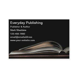
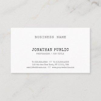
Fantastic Options for Publisher Business Cards
We have plenty of great options for publisher business cards. If you’re looking for the unique designs that will make you business stand out these cards are for you.
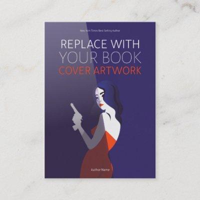
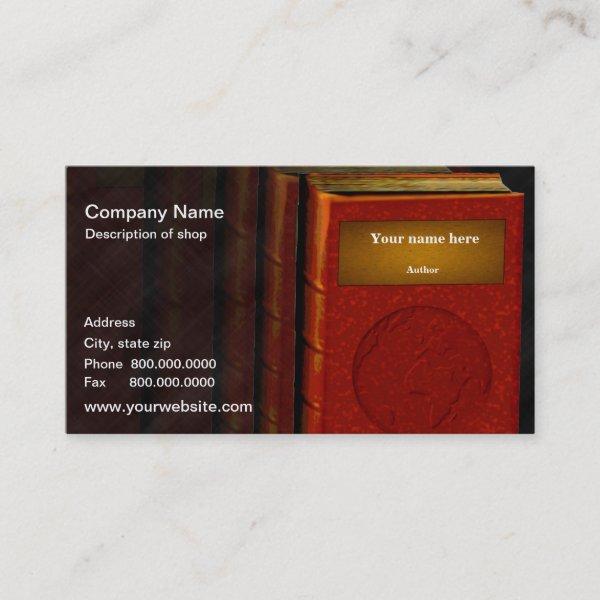
 White Book Cover Author
A fully customizable business card tempate for published authors that is perfect promotional items for conventions or book signings. Replace the “book cover” image with your own novel’s cover, and add your own contact information. You can also change the font style, color and size to fit your needs.
 Aqua and Black Book Cover Author
A fully customizable business card template for published authors that is perfect promotional items for conventions or book signings. Replace the “book cover” image with your own novel’s cover, and add your own contact information. You can also change the font style, color and size to fit your needs. Black and aqua colors.
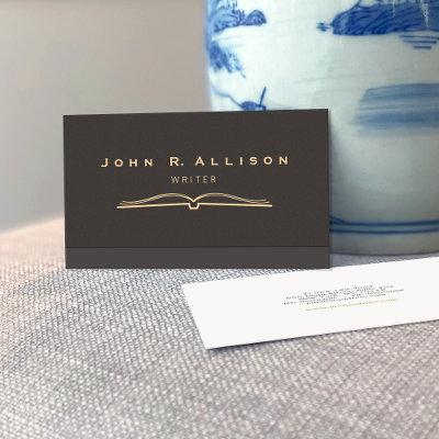
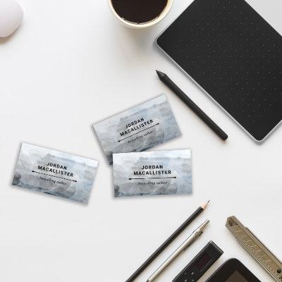
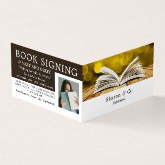
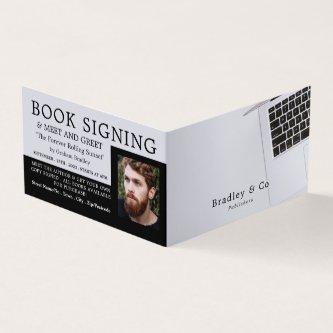
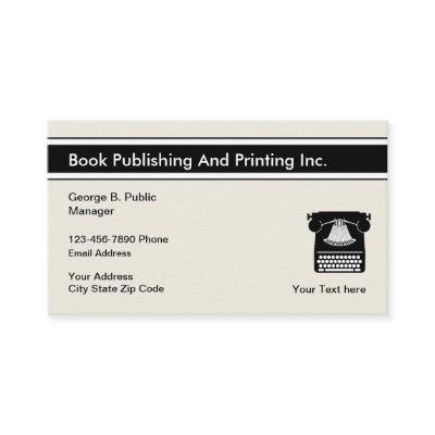
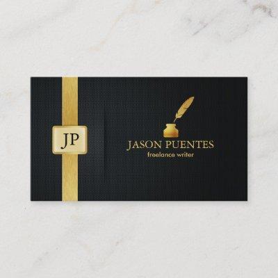
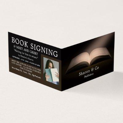
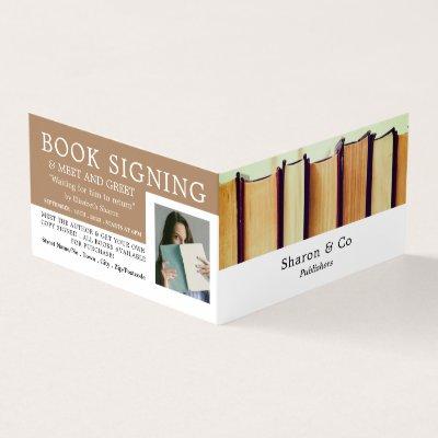
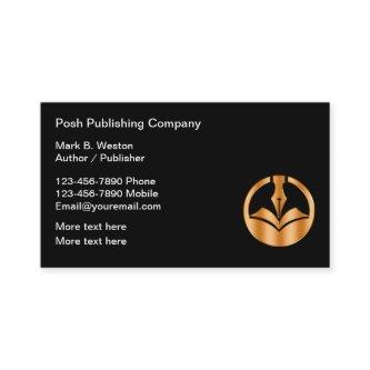
 Author/Publisher
Author or publisher business card template- use our image or add your photograph to this business card template for great looking professional business cards.
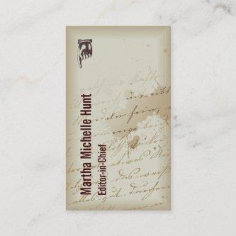
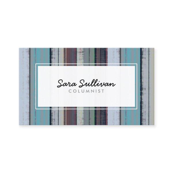 Columnist Retro Stripe Pattern Publishing
This striking professional columnist publishing business card features a elegant grunge dark stripe pattern on the background of the card. Your name is in an informal cursive handwritten font and title in simple easy to read letters, appear within a simple off white rectangle text panel, while your other contact details and logo appear on the back of the card. Perfect for use as a business card for printing, publishing, literature, literary arts, writing, advertising themes.
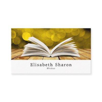
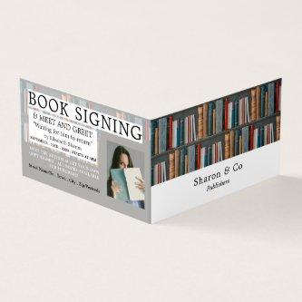
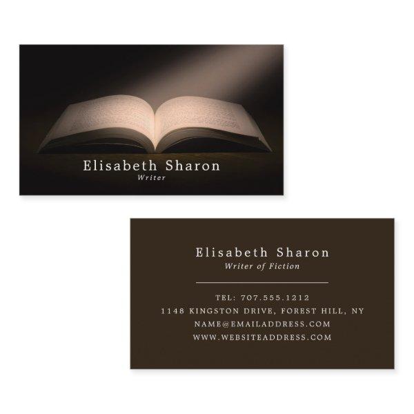 Open Book, Writers
Open Book, Writers Business Cards by The Business Card Store.
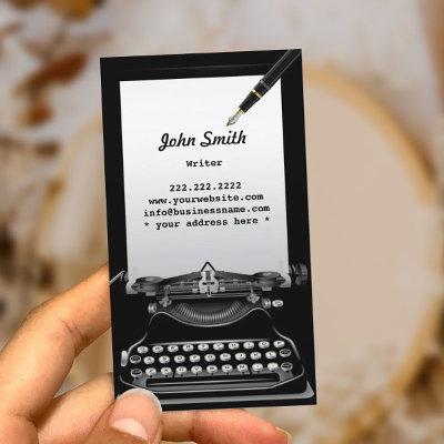
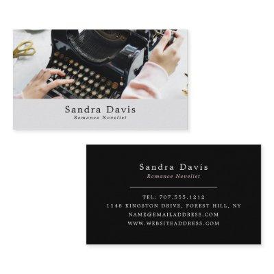
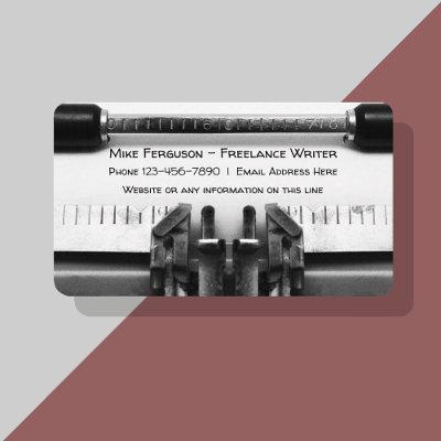
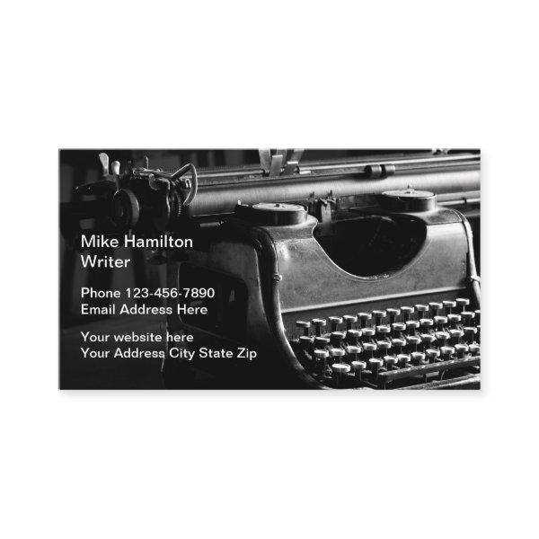
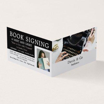
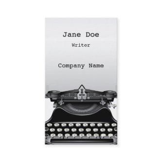
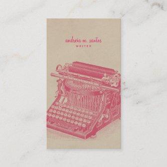
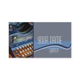
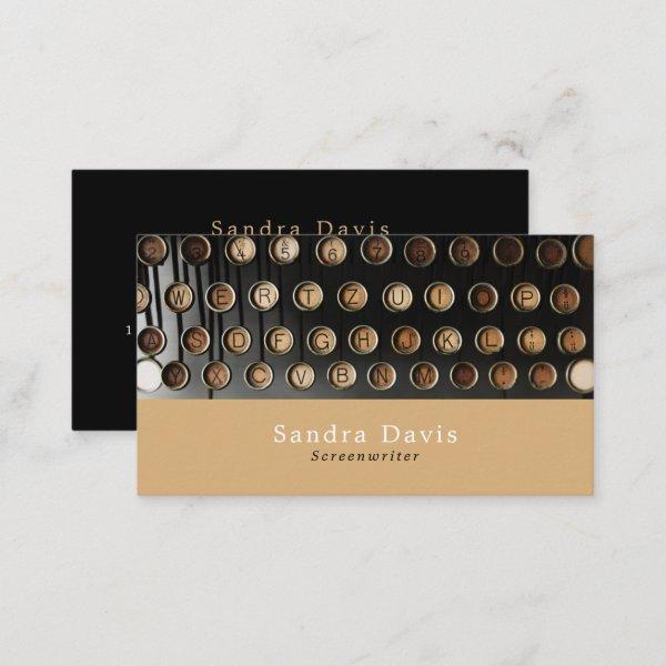 Vintage Typewriter, Writers
Vintage Typewriter, Writers Business Cards by The Business Card Store.
Related Designs
Here are related publisher business cards. Find your business cards and create a buzz!
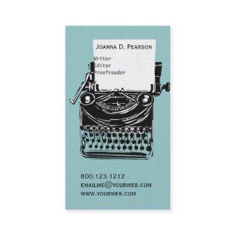

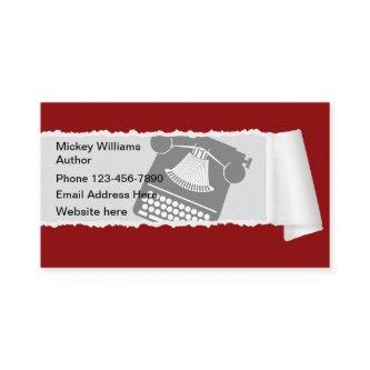
 Retro Theme Old Time Writer Typewriter
Retro themed writer business cards in a simple design with image of an old time typewriter in the background and space for your contact information along with blank space on the back you can use to promote your latest book, your blog, or website.
 Trendy Creative Classic Design Smart Plain Retro
Classic Creative Design Smart Plain Retro Professional Business Card. Perfect for Real Estate Agents, Accountants, Realtors, Brokers, Attorneys, Lawyers, Doctors, Corporate Professionals, Stylists, Architects, Engineers, Directors, Managers, Consultants, Designers, Teachers, Musicians, all professions.
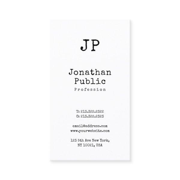
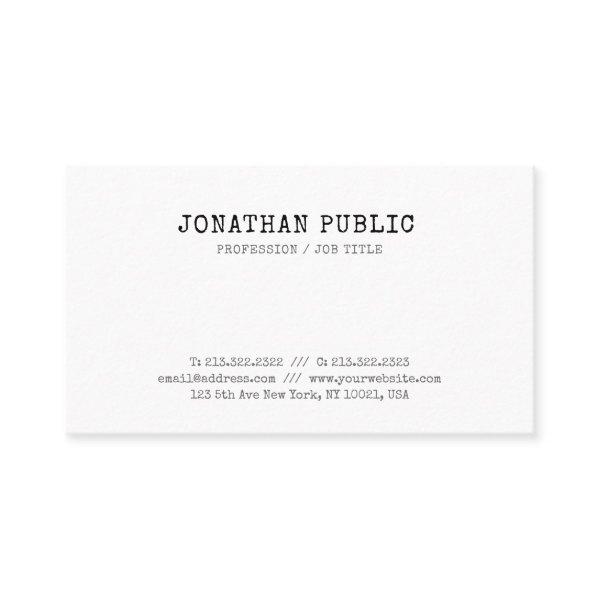
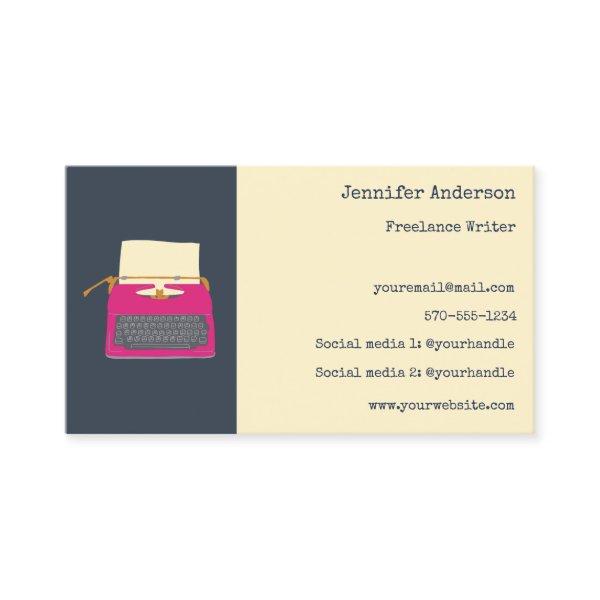 Authors Writers Editors Custom Typewriter
This business card features cute illustrations of vintage typewriters with a bright magenta or fuchsia pink typewriter against a navy blue background on the front and a yellow typewriter on the back making it perfect for promoting your work as a freelance writer, author, editor or other publishing professional.
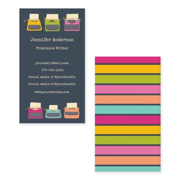 Authors Writers Editors Custom Typewriters
This business card features cute illustrations of vintage typewriters in candy colors against a navy blue background making it perfect for promoting your work as a freelance writer, author, editor or other publishing professional.
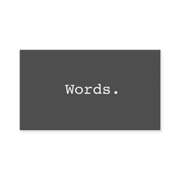 Modern simple writer publisher editor
Modern, simple yet elegant personal profile or business card featuring the word “Words” written in the font courier. The text can easily be changed to something else. Customizable contact information on the back, gray and orange text. For custom requests please use the store contact link above. Stylish, contemporary design. Great for writers, publishers, printers, editors, journalists, translators, speech therapists or anyone who is working with written or spoken language.
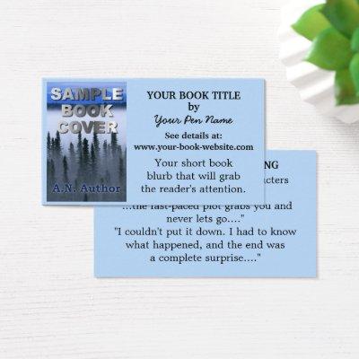
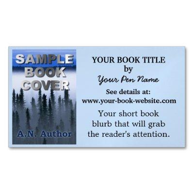
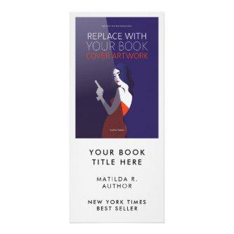
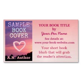
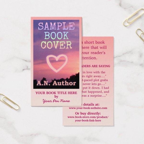 Writer Author Promotion Big Book Cover Pink Ombre
Use this easy writer / author pink business card template to promote your new book. Simply fill in the “Personalize It” fields. “Change” the sample book cover to your own. Add the title and your name to the front. On the back, there’s room for a short attention-grabbing blurb, quotes from your readers (or an excerpt from the story), your novel or nonfiction book’s website and where the book can be bought. The background has a pretty pink-white gradient color. Click “Customize It” to rearrange elements or change fonts. This is a simple, bold promotional business card for any writer to use for marketing. The pretty pink would look good for a romance novel.

Alternative Designs
With so many great publisher business cards to choose from it can be hard finding the right one. But it helps to know that Card Bee’s catalog of business cards has something for everyone. It only takes a moment to find what you are looking for. For example we offer many different publisher business cards designs, but we also have plenty of related card designs to choose from and start growing your brand. Try one of these categories.
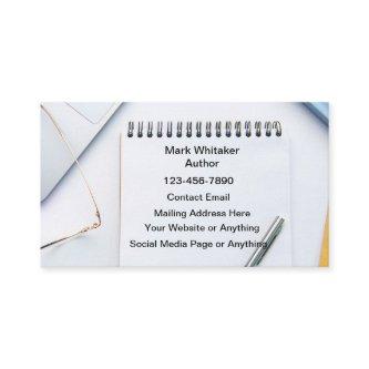

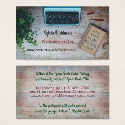
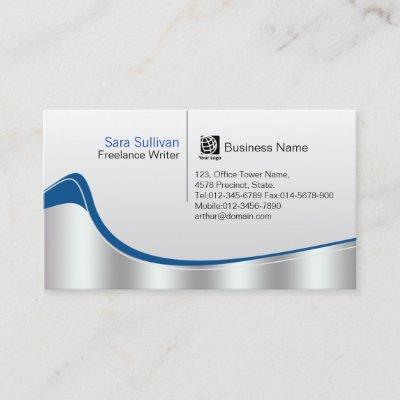
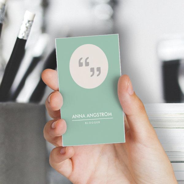 for writer or blogger
A modern and fresh design for your writing or blogging business.
 Vintage Classic Look Elite Design Plain Trendy
Vintage Classic Look Elite Design Plain Trendy Business Card. Perfect for Real Estate Agents, Accountants, Realtors, Brokers, Attorneys, Lawyers, Doctors, Corporate Professionals, Stylists, Architects, Engineers, Directors, Managers, Consultants, Designers, Teachers, Musicians, all professions.
 Vintage Design Sleek Plain Retro Professional
Vintage Design Sleek Plain Retro Professional Business Card. Perfect for Real Estate Agents, Accountants, Realtors, Brokers, Attorneys, Lawyers, Doctors, Corporate Professionals, Stylists, Architects, Engineers, Directors, Managers, Consultants, Designers, Teachers, Musicians, all professions.
 Classic Vintage Look Elegant Design Plain Trendy
Classic Vintage Look Elegant Design Plain Trendy Business Card. Perfect for Real Estate Agents, Accountants, Realtors, Brokers, Attorneys, Lawyers, Doctors, Corporate Professionals, Stylists, Architects, Engineers, Directors, Managers, Consultants, Designers, Teachers, Musicians, all professions.
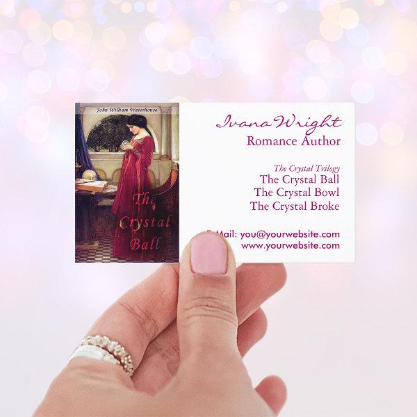
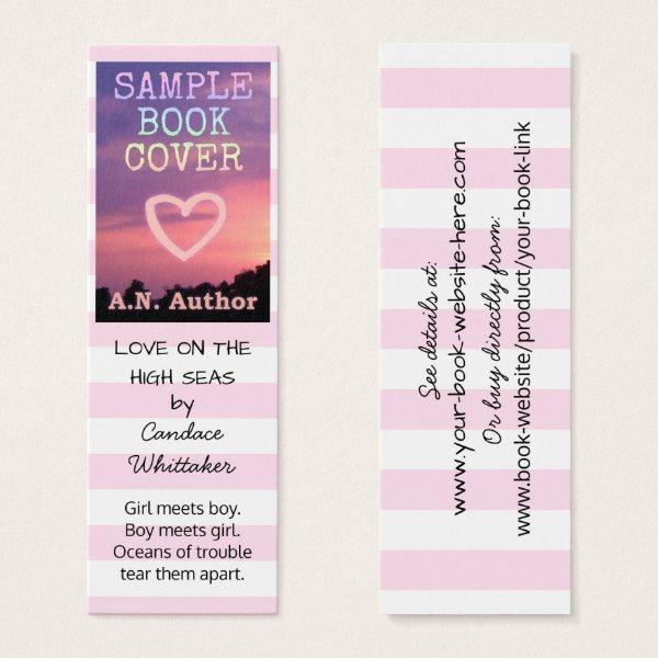 Writer Author Romance Promotion Bookmark Stripes
Publishing a romance novel or lighthearted young adult book? These skinny mini business cards are perfect for fiction writers to advertise a new novel. With a light white and pink striped background and black text, these cards have a sweet simplicity. Easily add your book cover image or an author photo. Follow the template instructions or click “Customize It” to make adjustments. Everything can be rearranged, resized or deleted, including the stripes! The light pink can even be changed to a different shade. This is a simple, pretty promotional business card for marketing your novel. Tip: Please note the size dimensions of these mini cards to make sure they will fit your needs.
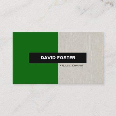
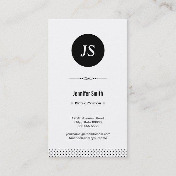 Book Editor – Clean Black White
Book Editor – Clean Black White Stylish Business Card for you.
Dos And Don’ts Of Visiting Card Protocol
Take advantage of social networks scope while making sure your initial impression is never forgotten. In today’s fierce business environment, it’s more important than ever to distinguish yourself from others and make connections that will last. The unrecognized contact information is your ticket to success in reaching this goal.
Let’s embark on a mind-boggling journey into the universe of calling cards – exploring their significance. Consider us your go-to source whether you are a young entrepreneur with aspirations of creating your own brand or a seasoned professional looking to grow your network.
The conventional methods of exchanging contact information, such as writing it onto scraps of paper or relying solely on online platforms, are now outdated. The design of your professional calling card should be thought of as a visual language that can fluently speak both professionalism and the representation of your one-of-a-kind personal brand. It strongly builds your brand in the minds of prospective customers or partners, enabling them to keep you in mind long after the initial contact you had with them.
However, making a great calling card requires more than just writing your contact information on a sheet of paper. To achieve the desired end goal efficiently, it is crucial to thoughtfully consider various elements such as color palette, choosing fonts, and overall design aesthetic that align with both your sector and target audience.
This piece’s goal is to give you useful advice and insightful viewpoints so you can create exceptional publisher contact cards that will leave a lasting impression on those who receive them. We’ll also examine strategies for making the most of your time and vitality, cultivating meaningful connections, and spurring career growth.
It is crucial to spend time improving your publisher business card as it can be a game-changer to get the most out of connecting and conference opportunities that are full of potential clients and chances. Brace yourself for unlocking its hidden abilities and grabbing the opportunities presented by this diminutive, yet effective marketing device.
Let us embark together on this joint journey to explore the art of crafting colorful business cards that are unmatched in their ability to unlock doors to endless potential and facilitate profound connections in a way that cannot be achieved by anything else.
Before placing a larger purchase, consider requesting a sample set of business cards to ensure the final product satisfies your expectations. Here are a few additional considerations that cannot be ignored:
-
A wide-ranging and eclectic choice.
-
Exuding elegance by combining stylish textured designs with opulent gold or silver foil accents.
-
Limited monetary resources available.
Search for More Publisher Business Cards
Utilize our website’s resources to find the perfect publisher business cards that go with both your unique style and your line of work.
Easily Promoting Skills And Expertise Beyond Initial Contact
Every aspect of your business card should be given thoughtful consideration, and well designed typography helps you emphasize the most significant elements. From the selection of fonts to the arrangement and spacing of each letter, typography business cards offer a canvas for showcasing your imaginative prowess. With a well-crafted layout that harmonizes form and function, these cards can captivate recipients and leave a memorable impression on their minds. Whether you opt for sleek and contemporary sans-serif fonts or elegant and timeless serifs, typography business cards allow you to express your unique style and personality through the artistry of letterforms. So, next time you give out your meticulously designed typography business card, be prepared for heads to turn and chats to start as your professional brand takes center stage.
It is of the utmost importance to accumulate a comprehensive understanding of the complexities that are inherent to your chosen industry in addition to the exact expectations that are associated with it. Different fields require varying measures of professionalism, creativity, and novelty in name card design. By presenting this scenario, we can see how it would be appropriate for a law firm to choose a design that radiates tradition and elegance; on the contrary, it is expected that most graphic design agencies will gravitate towards an aesthetic that is more vibrant and artistically expressive. It is vital to uphold the established criteria endorsed by experienced professionals in the domain while crafting designs for your business cards, as this will enable you to deeply connect and resonate with and resonate in the memories of those individuals whom you aim to impress.
When striving for success with your calling cards, don’t forget that keeping things straightforward is always a reliable bet. Material effectiveness is reduced when you overwhelm recipients with an excessive amount of information or create a messy layout. Readjust your emphasis to concentrate on the important components; in particular, your corporation’s identifying features such as its registered name, emblematic visuals, reliable contact data and where appropriate, an engaging tagline.
Consider how each part of the design on your handyman name card can serve as an accurate representation of the demands of your industry, and give this careful consideration. Unleash your creativity by delving into the complexities of industry expectations while fully embracing technological advancements, utilizing nothing but top-tier materials for construction purposes, distilling designs down to their purest form, and maintaining unwavering consistency with your brand identity – these ingredients synergistically combine to produce publisher business cards that make a lasting impact on individuals within your field.
Paper Types
Here is a list of available paper types. Each paper type has its own unique qualities that deliver amazing results for your marketing efforts. Choose the style that best suites your needs and make the opportunities you deserve.
All paper types are made in the US unless otherwise stated.
- Standard Matte
» 17.5 pt thickness — 120 lb weight — 324 GSM
» Light white, uncoated matte finish with an eggshell texture.
» Made and printed in the USA
- Standard Semi-Gloss
» 16 pt thickness — 150 lb weight — 400 GSM
» Bright white, semi-gloss finish
» 50% recycled content
» FSC certified
» Paper imported from Italy;
- Signature UV Gloss
» 18 pt thickness — 325 GSM
» Bright white, high-gloss finish
» UV coating adds an additional layer of protection
» Made and printed in the USA
- Signature UV Matte
» 6 pt thickness — 130 lb weight — 352 GSM
» Cream white, matte finish
» Made with 30% post consumer fiber
» Paper is easy to write on and won’t smudge
» FSC certified; made with 100% green electricity
» Made and printed in the USA
- Signature Cream
» 21 pt thickness — 325 GSM
» Bright white, velvety soft silk finish
» Premium laminate finish adds an additional layer of protection
» Made and printed in the USA
- Premium Silk
» 16 pt thickness — 130 lb weight — 352 GSM
» Solar white, uncoated linen finish
» Embossed texture adds depth and refinement
» Made with 30% post consumer fiber
» FSC certified; made with 100% green electricity
» Made and printed in the USA
- Premium Linen
» 16 pt thickness — 130 lb weight — 352 GSM
» Solar white, uncoated linen finish
» Embossed texture adds depth and refinement
» Made with 30% post consumer fiber
» FSC certified; made with 100% green electricity
» Made and printed in the USA
- Premium Pearl
» 16 pt thickness — 130 lb weight — 350 GSM
» Soft white, coated shimmer finish
» Adds an elegant subtle sheen
» FSC certified
» Paper imported from Italy; printed in the USA
- Premium Kraft
» Kraft, smooth and refined vellum finish
» Printed with a white underlayer to help color pop
» Made with 30% post consumer fiber
» FSC certified; made with 100% green electricity
- Premium Grey
» 16 pt thickness — 130 lb weight — 352 GSM
» Neutral grey, smooth finish
» Printed with a white underlayer to help color pop
» Made with 30% post consumer fiber
» FSC certified; Made with 100% green electricity
» Made and printed in the USA
- Premium Black
» 16 pt thickness — 130 lb weight — 352 GSM
» Deep black, smooth finish
» Printed with a white underlayer to help color pop
» Made with 30% post consumer fiber
» FSC certified; made with 100% green electricity
» Made and printed in the USA
- Premium Thick
» 32 pt thickness — 240 lb weight — 650 GSM
» Light white, uncoated matte finish with an eggshell texture
» Paper is easy to write on and won’t smudge
» Made and printed in the USA
» Not available for rounded corner option