Fantastic Options for Third Eye Business Cards
We have plenty of great options for third eye business cards. If you’re looking for the unique designs that will make you business stand out these cards are for you.
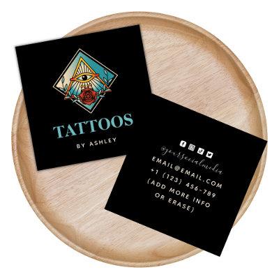
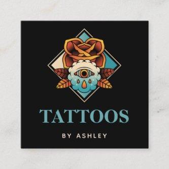
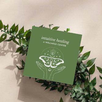
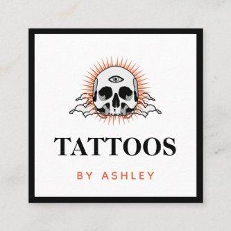
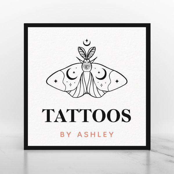 Tattoo Artist Butterfly Aesthetic Third Eye Mystic Square
These cool business cards would be perfect for Tattoo artist or Tattoo salon. Easily add your own details, by clicking on the “personalize this template” option. If you have any design related questions/requests or need help with customization, please do not hesitate to contact us.
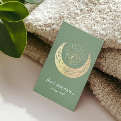
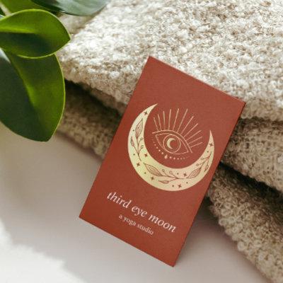
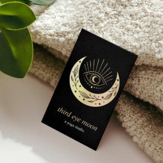
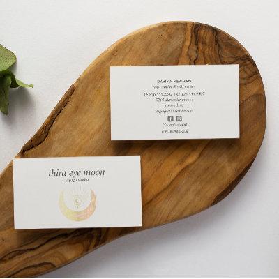
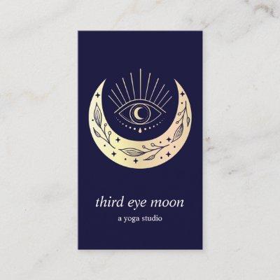
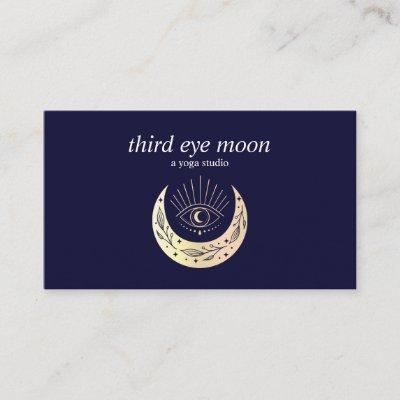
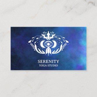
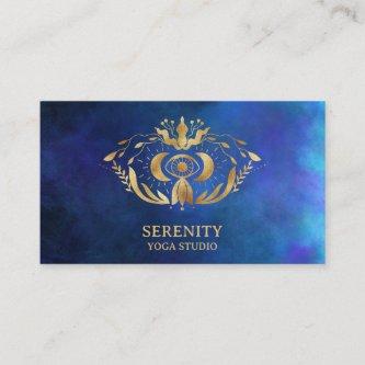
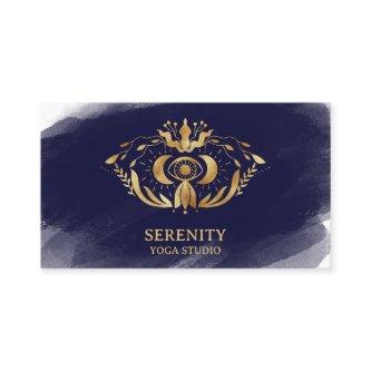
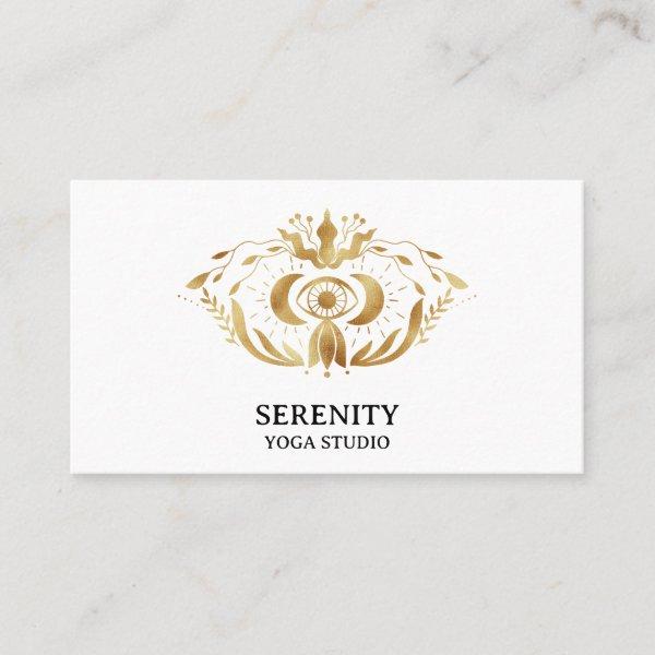
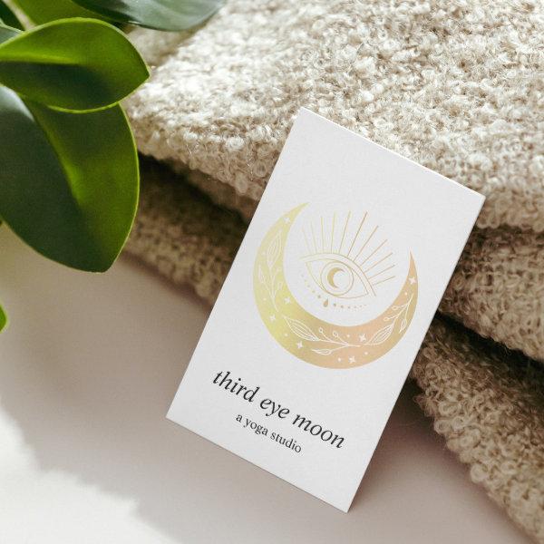 Holographic Third EYE Moon Yoga Holistic Coach
Elegant business cards in vertical layout for yoga studio, massage studios, massage therapy, meditation teacher, natural health counselor, spas or wellness professionals feature a gold holographic illustration of a third eye over crescent moon on a trendy white background. Customize the front with two lines of custom text and add your full contact details to the back using the template. Include social icons. Also available in square format A chic design for any yoga studio, wellness industry or holistic health related profession Other colors available For matching material or custom request please write at
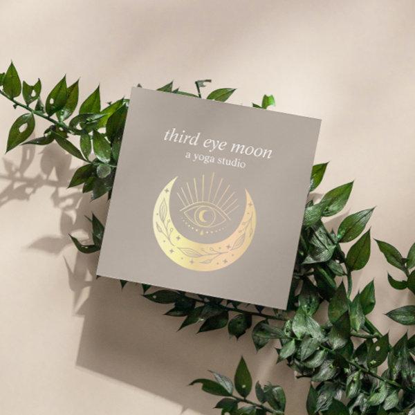
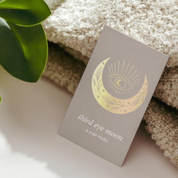 Holographic Third EYE Moon Yoga Holistic Coach
Elegant business cards in vertical layout for yoga studio, massage studios, massage therapy, meditation teacher, natural health counselor, spas or wellness professionals feature a gold holographic illustration of a third eye over crescent moon on a trendy taupe background. Customize the front with two lines of custom text and add your full contact details to the back using the template. Include social icons. Also available in square format A chic design for any yoga studio, wellness industry or holistic health related profession Other colors available For matching material or custom request please write at
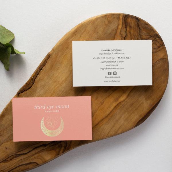
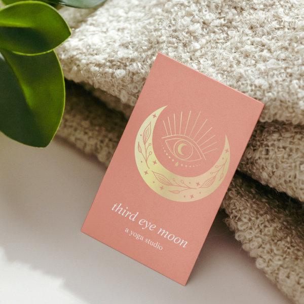 Holographic Third EYE Moon Yoga Holistic Coach
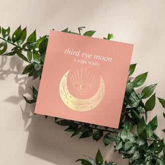
Elegant business cards in vertical layout for yoga studio, massage studios, massage therapy, meditation teacher, natural health counselor, spas or wellness professionals feature a gold holographic illustration of a third eye over crescent moon on a trendy and cool coral background. Customize the front with two lines of custom text and add your full contact details to the back using the template. Include social icons. Also available in square format A chic design for any yoga studio, wellness industry or holistic health related profession Other colors available For matching material or custom request please write at
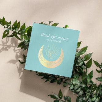
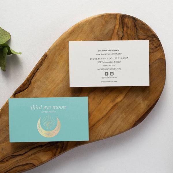
 Holographic Third EYE Moon Yoga Holistic Coach
Elegant business cards in vertical layout for yoga studio, massage studios, massage therapy, meditation teacher, natural health counselor, spas or wellness professionals feature a gold holographic illustration of a third eye over crescent moon on a impressive teal blue background. Customize the front with two lines of custom text and add your full contact details to the back using the template. Include social icons. Also available in square format A chic design for any yoga studio, wellness industry or holistic health related profession Other colors available For matching material or custom request please write at
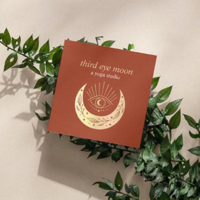
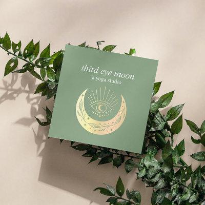
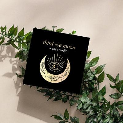
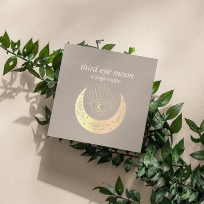
 Holographic Third EYE Moon Yoga Spiritual Coach Square
Elegant business cards for yoga studio, massage studios, massage therapy, meditation teacher, natural health counselor, spas or wellness professionals feature a gold holographic illustration of a third eye over crescent moon on a classic taupe background. Customize the front with two lines of custom text and add your full contact details to the back using the template. Include social icons A chic design for any yoga studio, wellness industry or holistic health related profession Other colors available For matching material or custom request please write at
Related Designs
Here are related third eye business cards. Find your business cards and create a buzz!
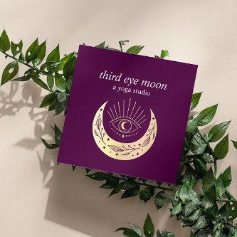
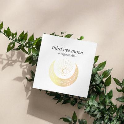
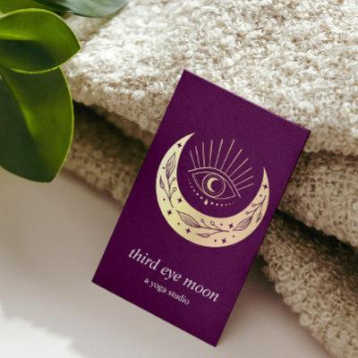
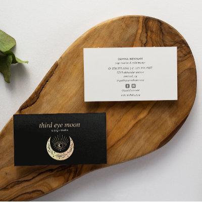
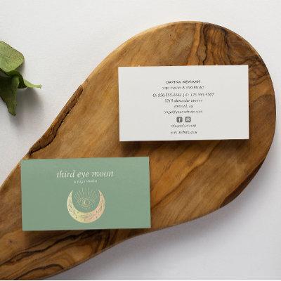
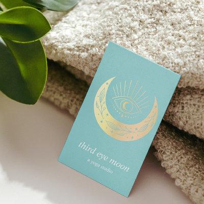
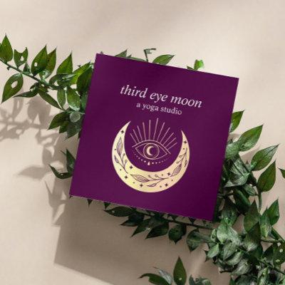
 Holographic Third EYE Moon Yoga Spiritual Coach
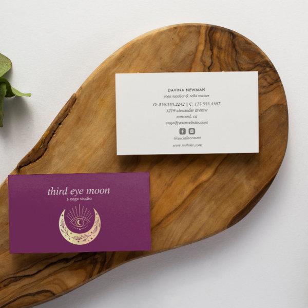
Elegant business cards for yoga studio, massage studios, massage therapy, meditation teacher, natural health counselor, spas or wellness professionals feature a gold holographic illustration of a third eye over crescent moon on a impressive purple burgundy background. Customize the front with two lines of custom text and add your full contact details to the back using the template. Include social icons. Also available in square format A chic design for any yoga studio, wellness industry or holistic health related profession Other colors available For matching material or custom request please write at
 Holographic Third EYE Moon Yoga Spiritual Coach
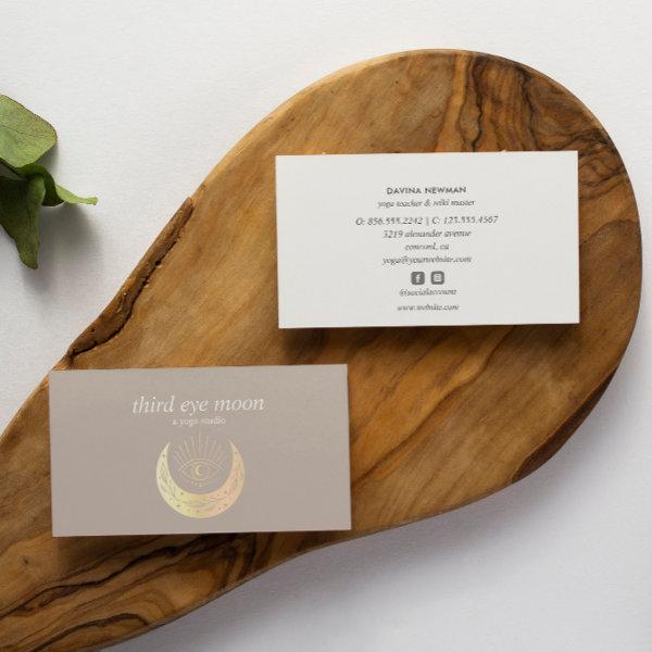
Elegant business cards for yoga studio, massage studios, massage therapy, meditation teacher, natural health counselor, spas or wellness professionals feature a gold holographic illustration of a third eye over crescent moon on a classic and timeless taupe color background. Customize the front with two lines of custom text and add your full contact details to the back using the template. Include social icons. Also available in square format A chic design for any yoga studio, wellness industry or holistic health related profession Other colors available For matching material or custom request please write at
 Holographic Third EYE Moon Yoga Spiritual Coach
Elegant business cards for yoga studio, massage studios, massage therapy, meditation teacher, natural health counselor, spas or wellness professionals feature a gold holographic illustration of a third eye over crescent moon on a impressive purple burgundy background. Customize the front with two lines of custom text and add your full contact details to the back using the template. Include social icons. Also available in square format A chic design for any yoga studio, wellness industry or holistic health related profession Other colors available For matching material or custom request please write at
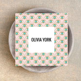
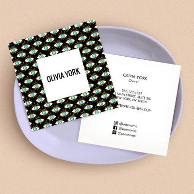
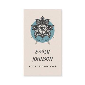
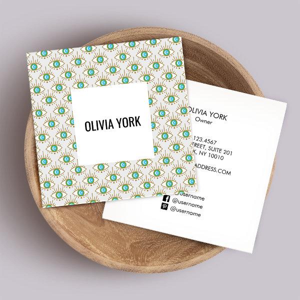 Cute Trendy Third Eye pattern Square
For additional matching marketing materials please contact me at For more premade logos visit Original design by Maura Reed.
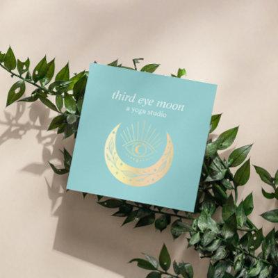
 Holographic Third EYE Moon Yoga Spiritual Coach Bu
Elegant business cards for yoga studio, massage studios, massage therapy, meditation teacher, natural health counselor, spas or wellness professionals feature a gold holographic illustration of a third eye over crescent moon on a impressive teal blue background. Customize the front with two lines of custom text and add your full contact details to the back using the template. Include social icons. Also available in square format A chic design for any yoga studio, wellness industry or holistic health related profession Other colors available For matching material or custom request please write at
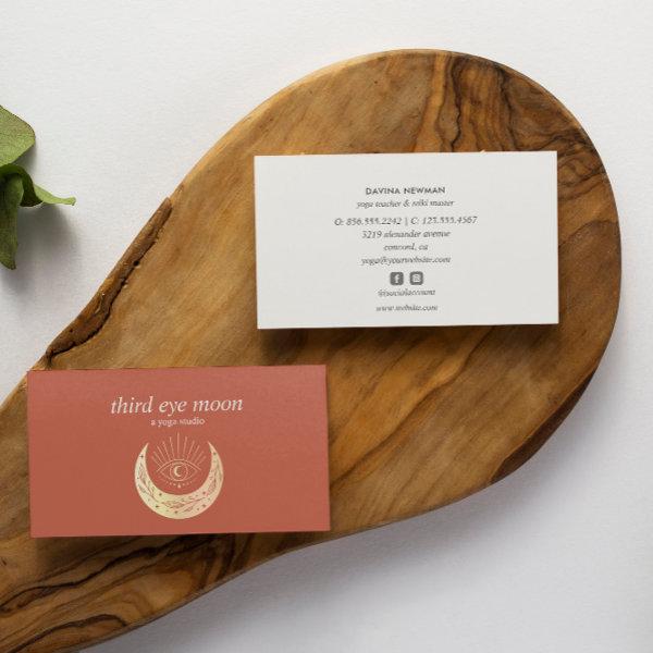 Holographic Third EYE Moon Yoga Spiritual Coach
Elegant business cards for yoga studio, massage studios, massage therapy, meditation teacher, natural health counselor, spas or wellness professionals feature a gold holographic illustration of a third eye over crescent moon on a impressive warm hearth rust color background. Customize the front with two lines of custom text and add your full contact details to the back using the template. Include social icons. Also available in square format A chic design for any yoga studio, wellness industry or holistic health related profession Other colors available For matching material or custom request please write at
Alternative Designs
With so many great third eye business cards to choose from it can be hard finding the right one. But it helps to know that Card Bee’s catalog of business cards has something for everyone. It only takes a moment to find what you are looking for. For example we offer many different third eye business cards designs, but we also have plenty of related card designs to choose from and start growing your brand. Try one of these categories.

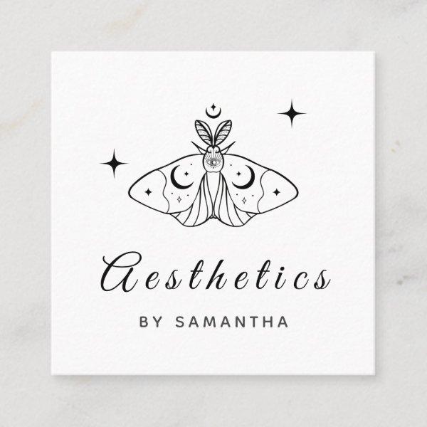 Aesthetics Line Art Butterfly & Sparkles Third Eye Square
These cool business cards would be great for esthetician/ makeup artist. Easily add your own details by clicking on the “personalize this template” option. If you have any design related questions/requests, please do not hesitate to contact us.
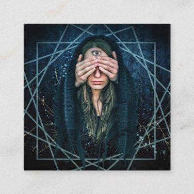
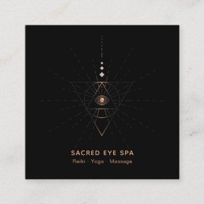
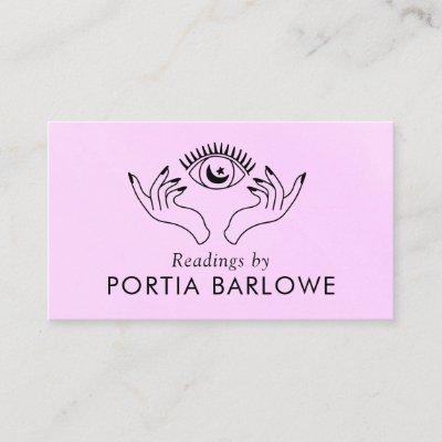
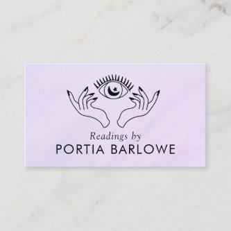
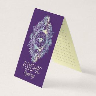
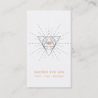
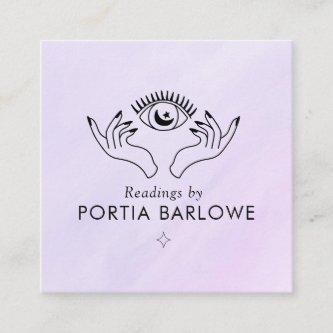
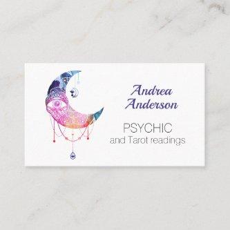
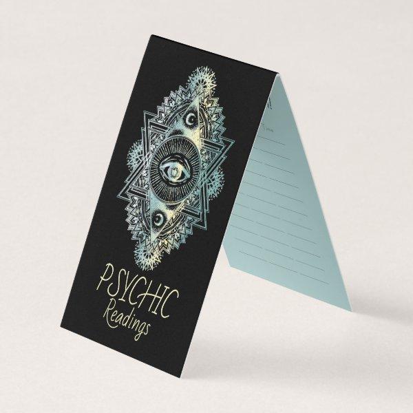 Third Eye Psychic
Great Business Card for Professionals. Psychic Reading, Tarot Cards etc. incl. Time Schedule
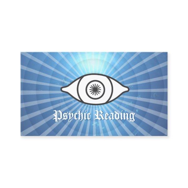 The Third Eye Psychic Reading Blue
The Third Eye Psychic Reading Ocean Blue Business Card.
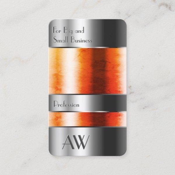 Eye Catching Silver Box Orange Liquids and Letters
YOUR FAVORITE – Modern and professional business supplies. Make a lasting impression with this eye catching and quality business card template featuring a striking aluminium silver box with glass and orange liquids optics. Easily customize these cards to your brand. I wish you much pleasure with this item!
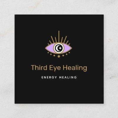
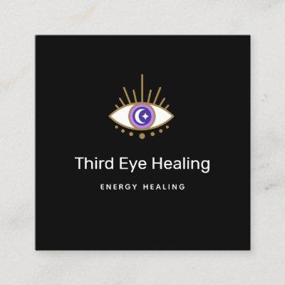
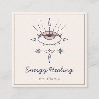
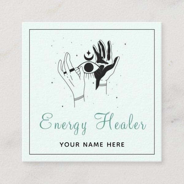 Energy Healer Mystic Hands Third Eye Cosmic Modern Square
These modern, cool business cards would be perfect for energy healer/psychic. Easily add your details by clicking on the “personalize this template” option. If you have any design related questions/requests, please do not hesitate to contact us.
 Holistic Celestial Moon Third Eye Yoga Business Ca
Holistic Celestial Moon with Third Eye crest design hand drawn by Savanamm. Faux glitter gold foil on black watercolor background
Dos And Don’ts Of Exchanging Networking Cards
Make your mark in the domain of professional connections. It is still vital to establish a unique stance and cultivate long-lasting relationships in the modern business world, which is transforming quickly. The third eye business card, a seemingly insignificant item that nevertheless holds meaningful weight, is the single most important factor in determining whether or not this objective will be achieved.
Accompany us on an engaging exploration of third eye business card dynamics – understanding their importance, visual components, and effective usage strategies. If you are an accomplished professional who is looking to grow your network or if you aspire to be an ambitious businessperson who is working hard to build your brand identity, we are here to offer comprehensive assistance in either of these endeavors.
We’ve come a considerable distance from the days when exchanging contact information required writing numbers on scraps of paper or relying solely on electronic means. An well-crafted contact card combines style and usability, demonstrating professionalism and serving as a tangible symbol of your personal brand. It forms a lasting impact on the thoughts of potential clients or partners, allowing them to keep you in mind for a considerable amount of time after your initial contact with them.
Additionally, creating a thriving contact card requires more than simply printing your name and phone number on a piece of paper. It requires thorough consideration of a variety of elements, such as color palette, font, and overall design style, to ensure they are in line with both the norms of your field and the preferences of your intended audience.
Presented here are practical recommendations and insightful observations intended to assist you in producing noteworthy third eye business cards that engrave themselves upon the memories of their recipients. Additionally, we shall investigate the art of harnessing these compact resources to their fullest potential, enabling you to establish meaningful relationships and advance your career.
It is vital to invest time refining your photo booth corporate card as it can be a major factor to get the most out of connecting and conference opportunities that are full of potential clients and chances. Prepare to reveal its covert capabilities and optimize the possibility of this simple but powerful marketing tool.
Together, let us begin a collective journey, delving deep into the craftsmanship needed for forging memorable business cards; they will serve as portals to new opportunities and facilitate meaningful connections like never encountered.
Before settling on a particular design for your third eye business cards, take into consideration the following factors:
-
Stay consistent with branding: Make sure your business cards’ design flows naturally with the rest of your brand’s collateral. Use consistent fonts, color schemes, and other design elements across all of your advertising to build brand recognition and maintain a steady visual tone.
-
Choose high-quality papers: The feel of your visiting card can have an impact on how lasting it is to the recipient. Focus your efforts on evaluating and maintaining the superior quality of the selected paper type in terms of texture and strength. Select a type of paper of premium grade if you want your end result to convey a sense of majesty while also feeling substantial in your hands. Incorporate gloss or gloss finish options to achieve a more polished and sophisticated look in your design.
-
Show off your portfolio: If your professional journey is aligned with fields that place a high value on creativity and innovation, it would behoove you to consider incorporating genuine representations or visual excerpts that effectively illustrate the extent and range of your creative body of work onto the frequently ignored but entirely viable canvas offered by the backside landscape featured on common corporate calling cards. This would be a good idea for you to consider if your career trajectory aligns with fields that place a high value on originality and inventiveness. By implementing this strategy, you will be able to offer prospective customers with a firsthand look at the work that you do, which will arouse their interest and inspire them to discover the ways in which your services can satisfy their requirements.
-
Identify the accurate measurement and shape: Deviating from the standard rectangular third eye business card and adopting innovation by going with a unique shape or size that reflects your brand’s values or the nature of your industry is a fantastic way to be distinct. By expanding limits past their predetermined limits and considering unique shapes like sleekly curved edges or meticulously designed die-cut structures, you can embrace the essence of originality and ignite your passion for groundbreaking designs.
Search
Sharing Contact Information And Demonstrating Professional Through Cards


In a world saturated with digital communication, font business cards offer a refreshing and touchable way to make a enduring impression. The careful choosing of fonts can convey not only your personal style but also the essence of your brand. From sleek and modern non-serif fonts to refined and classy serif options, the possibilities are endless. By blending the right typography with eye-catching visual elements, these cards transform into a strong tool for showcasing your imagination and attention to detail. So why settle for ordinary business cards when you can create a typographic masterpiece that embodies the spirit of your industry? Remember, in the realm of professional branding, choosing the right typeface is just as important as choosing the right words to convey your message. Make sure that your style of writing communicate about who you are and what you bring to the table – because sometimes, it’s not just what you say, but how you say it that truly matters.
When you allocate sufficient time and effort in meticulously selecting the most important watercolor company cards available, prospective customers or corporate partners operating within your particular field will immediately recognize and appropriately appreciate the unwavering commitment you demonstrate towards professionalism. This will allow them to quickly distinguish and recognize your dedication to professionalism. Moreover, this will have a beneficial impact on the people who are involved in the project. Through its carefully selected and organized materials and aesthetic presentation, the professional portfolio becomes an external reflection of an individual’s systematic approach in constructing and maintaining their distinctive personal brand.
Think about the aspects of design that perfectly represent and personify the distinctive brand persona of your company. Achieving visual cohesion with the chosen shade palettes, typeface styles, and image selection is crucial for satisfying the prevalent norms within your specific industry. Your brand’s recognition will consolidate further as we establish an aesthetically cohesive visual representation across all marketing materials.
When faced with selecting business cards, it is vital to deliberate on how technology harmonizes with and enhances your professional endeavors, ensuring optimal representation within your field. In today’s modern society, which is dominated by state-of-the-art digital technology, it is highly recommended to intelligently integrate QR codes or personalized URLs onto your business cards. This practice facilitates recipients in effortlessly accessing supplementary information and establishing online connections with you. By providing a smooth means for recipients to interact with you online, this objective can be realized. You are displaying your commitment to keeping up with the most latest advances in your field by welcoming and adopting these technological innovations.
It is of the utmost importance to obtain a profound understanding of the detailed operations that are inherent within your unique industry, as well as the related expectations that are intertwined with it. The degree to which typography business cards should embody formality, originality, or uniqueness may vary within distinct industries. In order to provide a more extensive examination, let’s delve into the specific example of legal practices making intentional choices to embrace visually captivating designs that emanate an aura steeped in age-old customs and refined gracefulness—a clear indication of their dedication to upholding well-established conventions. Conversely, it is notable how graphic design agencies tend to be drawn towards an aesthetic paradigm brimming with dynamism and artistic expression. Connect smoothly with your targeted audience and make a lasting impression by crafting architect business card designs that adhere to professional guidelines.
Recognizing that business cards encompass a level of significance that extends well beyond their appearance as basic paper cannot be overstated. On another hand, they act as successful networking devices that can unlock doors to potential possibilities if carefully created and distributed. Embrace this priceless opportunity to shape a powerful self-presentation and consistently make a unforgettable imprint with each distribution of your business card.
Paper Types
Here is a list of available paper types. Each paper type has its own unique qualities that deliver amazing results for your marketing efforts. Choose the style that best suites your needs and make the opportunities you deserve.
All paper types are made in the US unless otherwise stated.
- Standard Matte
» 17.5 pt thickness — 120 lb weight — 324 GSM
» Light white, uncoated matte finish with an eggshell texture.
» Made and printed in the USA
- Standard Semi-Gloss
» 16 pt thickness — 150 lb weight — 400 GSM
» Bright white, semi-gloss finish
» 50% recycled content
» FSC certified
» Paper imported from Italy;
- Signature UV Gloss
» 18 pt thickness — 325 GSM
» Bright white, high-gloss finish
» UV coating adds an additional layer of protection
» Made and printed in the USA
- Signature UV Matte
» 6 pt thickness — 130 lb weight — 352 GSM
» Cream white, matte finish
» Made with 30% post consumer fiber
» Paper is easy to write on and won’t smudge
» FSC certified; made with 100% green electricity
» Made and printed in the USA
- Signature Cream
» 21 pt thickness — 325 GSM
» Bright white, velvety soft silk finish
» Premium laminate finish adds an additional layer of protection
» Made and printed in the USA
- Premium Silk
» 16 pt thickness — 130 lb weight — 352 GSM
» Solar white, uncoated linen finish
» Embossed texture adds depth and refinement
» Made with 30% post consumer fiber
» FSC certified; made with 100% green electricity
» Made and printed in the USA
- Premium Linen
» 16 pt thickness — 130 lb weight — 352 GSM
» Solar white, uncoated linen finish
» Embossed texture adds depth and refinement
» Made with 30% post consumer fiber
» FSC certified; made with 100% green electricity
» Made and printed in the USA
- Premium Pearl
» 16 pt thickness — 130 lb weight — 350 GSM
» Soft white, coated shimmer finish
» Adds an elegant subtle sheen
» FSC certified
» Paper imported from Italy; printed in the USA
- Premium Kraft
» Kraft, smooth and refined vellum finish
» Printed with a white underlayer to help color pop
» Made with 30% post consumer fiber
» FSC certified; made with 100% green electricity
- Premium Grey
» 16 pt thickness — 130 lb weight — 352 GSM
» Neutral grey, smooth finish
» Printed with a white underlayer to help color pop
» Made with 30% post consumer fiber
» FSC certified; Made with 100% green electricity
» Made and printed in the USA
- Premium Black
» 16 pt thickness — 130 lb weight — 352 GSM
» Deep black, smooth finish
» Printed with a white underlayer to help color pop
» Made with 30% post consumer fiber
» FSC certified; made with 100% green electricity
» Made and printed in the USA
- Premium Thick
» 32 pt thickness — 240 lb weight — 650 GSM
» Light white, uncoated matte finish with an eggshell texture
» Paper is easy to write on and won’t smudge
» Made and printed in the USA
» Not available for rounded corner option